What types of images are best to get more attention – more readers – on LinkedIn?
The following posts are current examples of some of the best photos and graphics on LinkedIn right now.
Follow these examples when creating LinkedIn posts to get maximum exposure.
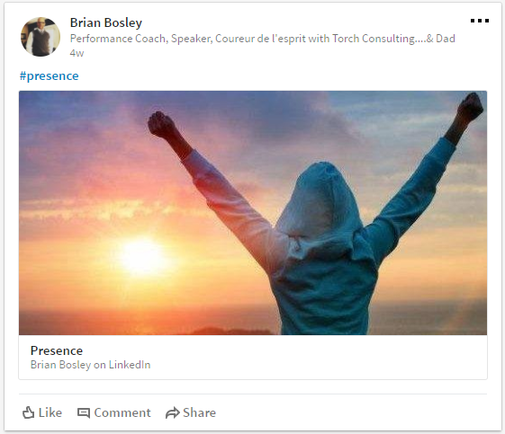 Use emotion in your images. Above, this image uses colors, textures, and action (raising the arms) to convey its message of “triumph.”
The Best Images Elicit Emotion
People enjoy feeling positive emotions. One way you can get the attention of your target audience is to use an image that creates a powerful emotion.
The image above caught my eye when it was first posted, then again when I saw it a month later in my news feed.
Why? Because it makes me happy – I enjoy looking at the image because it makes me feel like the person in the photo. It elicits a joyful response in me, the reader (potential customer), so I stop to look at it.
How to Do It:
- Select a specific emotion to elicit (i.e. “triumph” or “joy”)
- Choose an image that produces the emotion you selected.
- Get some feedback from a variety of people – especially if you think your message may be unclear. The best way to find out if your audience will be receptive to your message? Test it!

Takeaway:
Choose a visual representation of the feeling you want to create. Think of colors, textures, and words that create this feeling in you. Once you think you’ve found the perfect image to make your target audience “feel” something, test it out. Ask people in your target audience demographic what their initial reaction is to your image. Next, pair your image with meaningful text that fits the feeling of the photo.
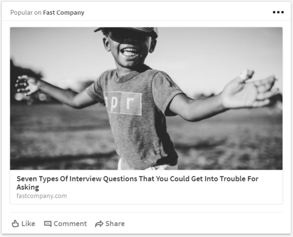
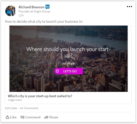
The final post is powerful because it expresses a strong feeling in a very clear way.
The Best Images Convey a Clear Message
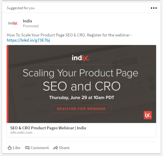
Make your point quickly and clearly. Period. This is a clean, straightforward ad design from Indix that completely supports the goal of this ad, which is to get the target audience to click the button.
The design feels so clean because of a few simple elements: (a) sans serif font; (b) limited color palette – only 3 colors are used; and (c) strategic use of color – one color – the deep coral color is used sparingly to highlight very specific words in the ad. Against the neutral chocolate brown background, the coral grabs your attention. The thin, white font used for explanatory text both cools down the design and balances it.

How to Do It:
- Write down the goal of your ad.
- Target a specific audience with specific wants and needs. (You’ll have to understand your target audience to do this.) Craft a message just for them.
- Par down the text until it contains as few words as possible, but still gets the message across clearly.
- Keep the background solid, or as nearly solid as you can.
- Create contrast between the text and the background.
- Make the words on the button, or the Call-To-Action (CTA), very clear. Tell your readers what you want them to do.
- Stick with one, easy-to-read font that matches your overall brand identity. (Learn more about creating a compelling brand for your company.)
Takeaway:
Be obvious. Tell your readers exactly what they need to know. Use strong action words. Keep your font very simple, and make sure that your post’s background and text contrast.
The Best Images Use Unexpected Colors
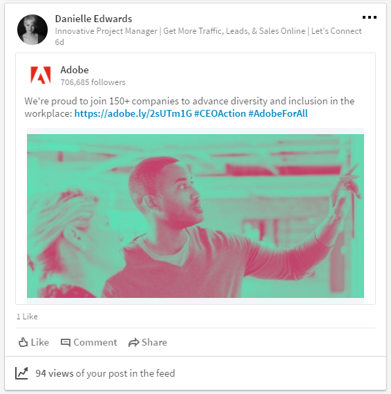
To catch your reader’s eye, create posts that use color or texture in an unconventional way.
I shared this post because I loved the unique colors. It reminds me of an Andy Warhol print and looks almost like a film negative.
Color used out of context, in an artistic way, is a fun way to get attention.
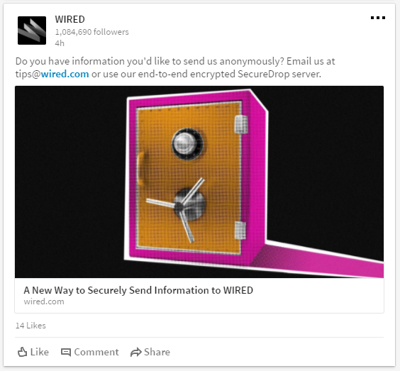
The image above, from a wired.com post, is modern and intriguing. Texture adds interest once the pop of unexpected color gets your attention.
How to Do It:
- Select a photo for your post.
- Use Photoshop or an image editor to manipulate the color of the image. Use a color that’s out of context to capture attention.
- Keep your color palette to two colors; make sure these two colors work well together and create enough contrast to be differentiated from one another.
- To choose the best colors for your post, do some color research. Ask yourself questions like, “What resonates with my target audience?” and “What colors are unexpected and interesting?”.
Takeaway:
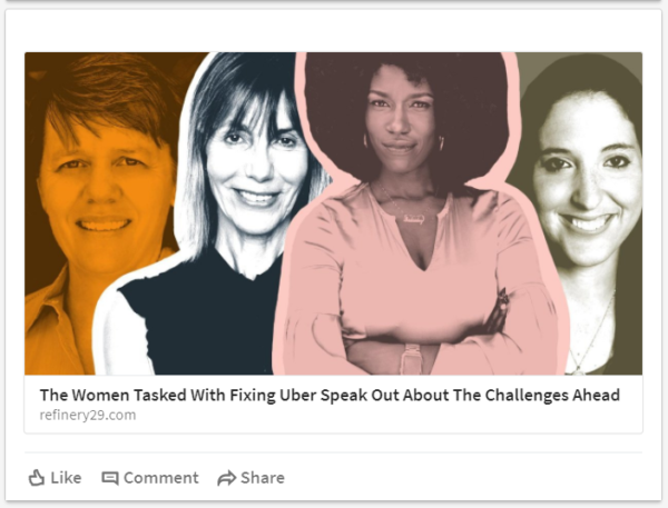
Use color in an unexpected and unique way to get attention.
A unique or out-of-context image is a strong tool that you can use again and again to grab the interest of your readers.
The Best Images Tell a Story
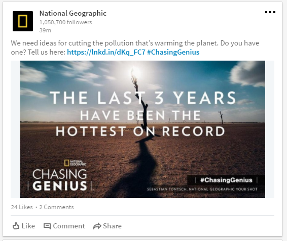
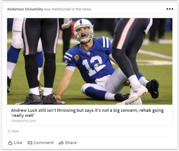
If you really want your images to stand out on LinkedIn, tell a story with your image.
Readers want authenticity, but they also want quality. You need both to tell a story.
In a research study conducted by National Press Photographers Association (NPPA), the importance of “storytelling” to photography was mentioned by nearly every subject.
How to Do It:
- Include context in the photo, so the viewer gets a sense of the setting, time, and place.
- Capture real life, documentary-type images. Viewers prefer these types of photos over posed or staged photos.
- Shoot images that show emotions, faces, and interaction between people.

Takeaway:
Tell a story with your photos, don’t just snap a picture. It’ll resonate with your audience and get more eyes on your LinkedIn post.
The Best Images Show Faces
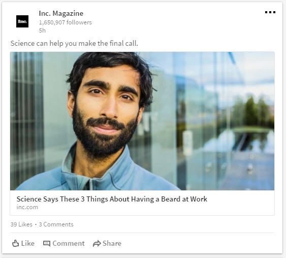
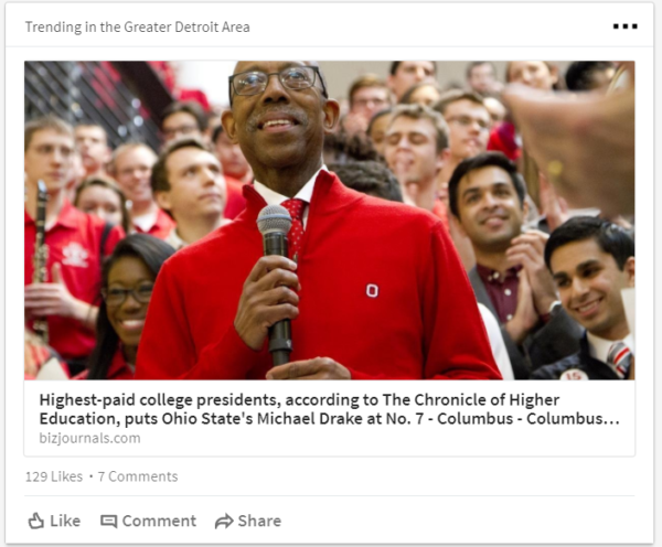
Photos of attractive people can be used in your LinkedIn strategy to increase post views. An image of a person’s face can create the feeling of empathy. It is also an effective way to connect to your audience and personalize your company’s brand. (From 3 Ways to Increase Your Conversion Rate With Images [Case Studies] by Unbounce.com)
How to Do It:
- Take photos of real people in your company.
- Use a professional photographer to take company portraits.
- Only use photos of people’s faces when it makes sense.

Takeaway:
If you use a person’s face in your post, be sure it makes sense to your audience. To get the best photos, hire a professional photographer.
Professional photographers are more easily able to capture beautiful photos due to their experience and the equipment they use.
The Best Images are Professional, not Amateur
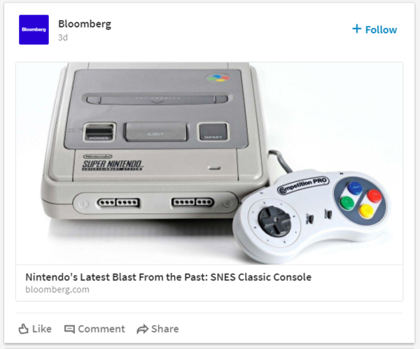
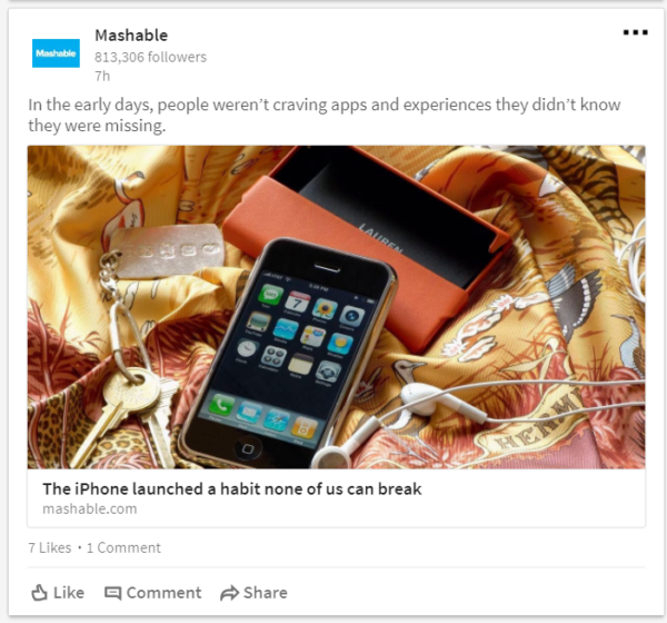
To get the effect that you want from your images and your posts, use professional photography.
Studies have sown that the average person can tell if a photo is professional or amateur 90% of the time. Professional photos are twice as likely to be viewed longer and shared more often than amateur photos.
How to Do It:
- Invest in professional photography.
- Create a photo list of images you need. (For step-by-step instructions, check out How to Create a Photo List)
- Know your company’s brand – ensure the photographs support it
- Know your target audience – what makes sense to them? what do they find most appealing?

Takeaway:
Professional photos are an investment, but it pays off.
Your audience wants sharp, attractive, artistic images that relay a story and connect to them, personally.
You can only get this with a professional photographer.
The Best Images are Graphics & Illustrations
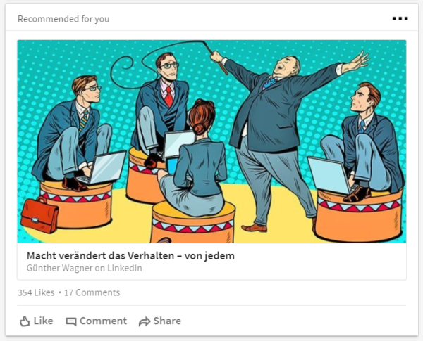
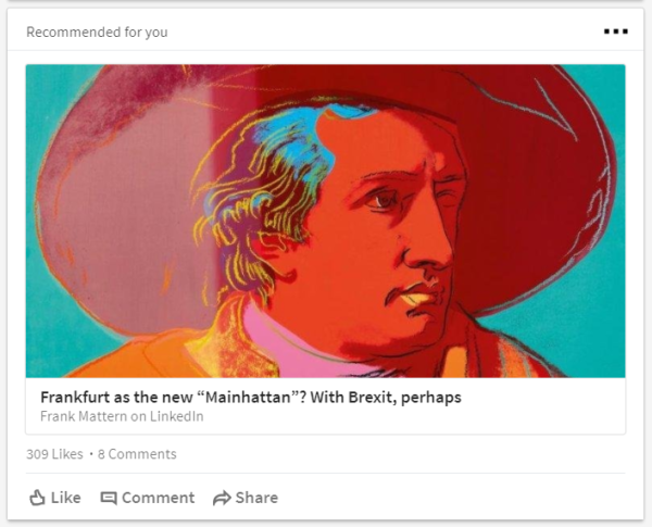
Colorful and artistic, graphics and illustrations work very effectively in LinkedIn posts to grab and keep viewers’ attention.
How to Do It:
- Find a source for graphics and illustrations. You may need several sources, from online graphic websites to professional illustrators and animators.
- If you enjoy editing photos, you can adjust the colors, textures, and nearly anything else you can think of in Photoshop.
- Know an artist who wants to promote his or her artwork? Trade services – offer to use their art exclusively in return for a better rate.

Takeaway:
Graphics and illustrations are fun to use and fun to view, making them an excellent choice to use as visuals on your LinkedIn posts.
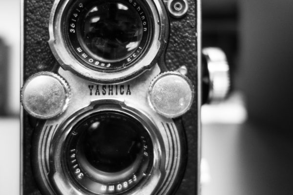
Want to Take Better Photos with Your Phone?
- Take better photos, quick and easy
- The solutions offered in the eBook are very simple and most involve only one or two steps.
- Detailed images of each solution are also included.
- Download your free copy of our eBook today and start taking better photos right away!

