Typography is the art of manipulating type into a readable, yet visually appealing arrangement for display. Designers select typefaces, point size, leading, tracking, kerning, font combinations, and more when arranging type. We’re seeing more and more websites embrace this design trend in 2018.
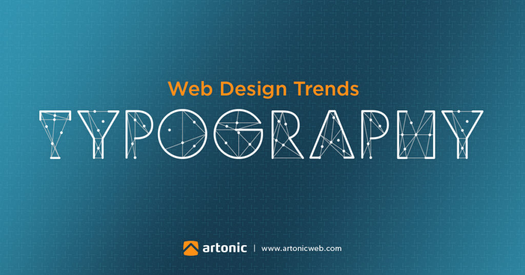
Typography as a Web Design Trend
In the last several years, web designers across the globe have embraced typography. From size trends to custom fonts, when it comes to web design in 2018, typography is where it’s at.
Why is Typography a Popular Web Design Trend?
Typography is a popular trend in web design right now. Why? Why are so many designers using typography in their website designs?
Many web designers use typography intentionally. That’s important, because typography and the way we work with it is crucial to the look and feel, character, and effectiveness of a website.
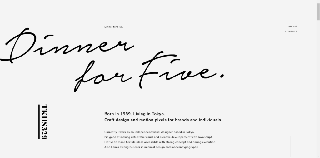
Current Typography Trends
Typography trends are an effective way to brand your website, create a unique look and feel, and enhance the overall user experience. Typography trends include:
Typography Trend #1 – SIZE
From BIG to small: sizing type to extreme sizes is in right now. It makes sense; size often is a major influence on the level of importance an element has in a design.
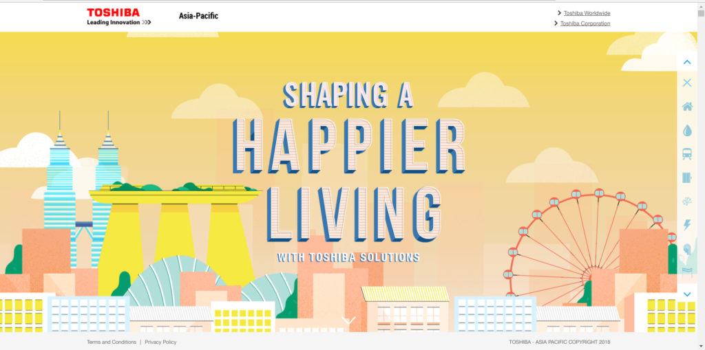
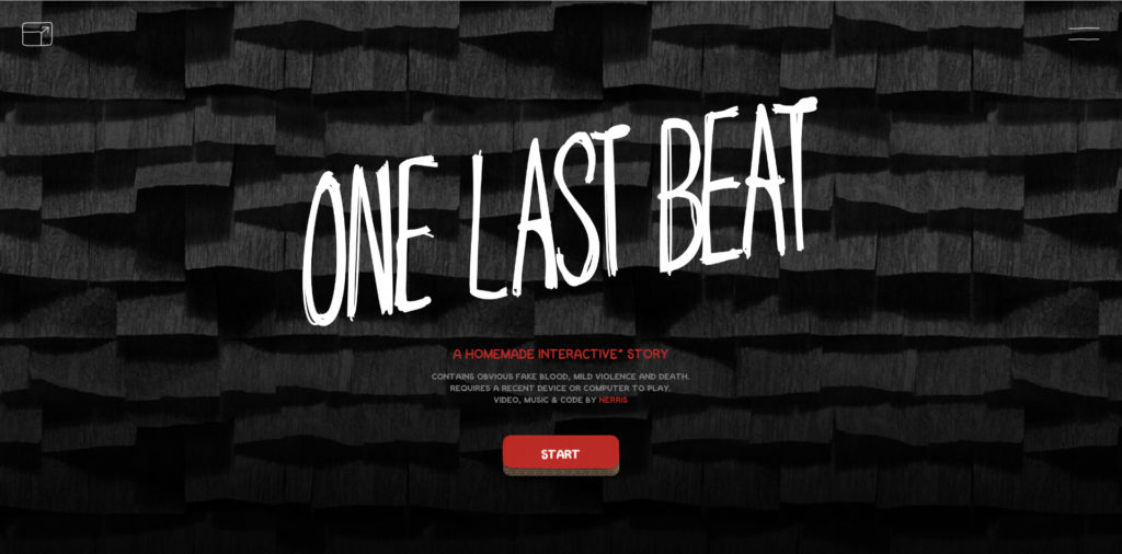
Large typography commands attention. When used properly, and in moderation, large type will grab the attention of a user and give a website a great deal of character. Sans serif fonts are often associated with this trend.
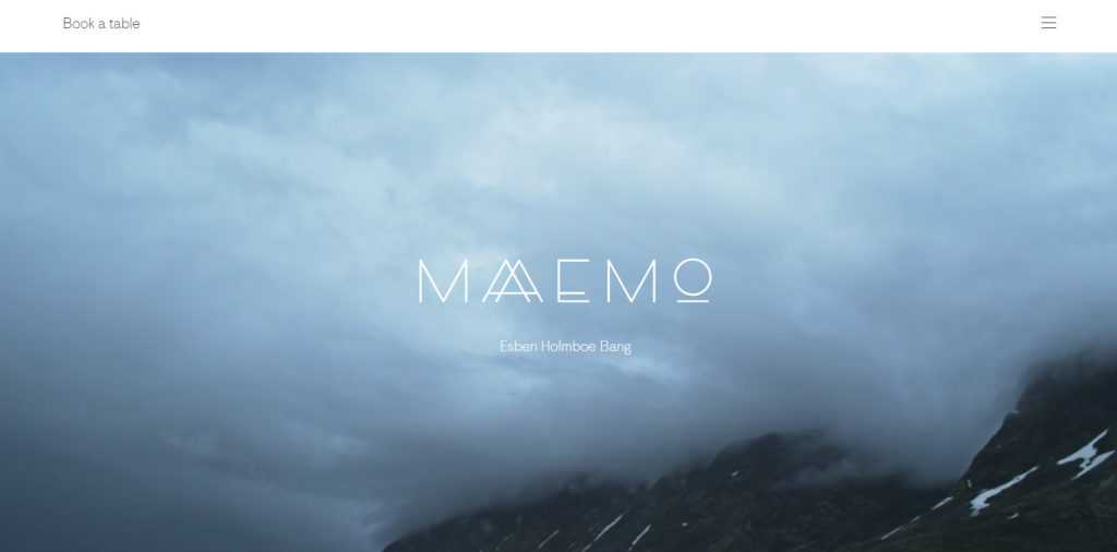
In contrast, small fonts can create a unique and elegant look. Small type is often used with ample white (or negative) space, is often dark in color, simple, and works well with hero images. Small typography does not take away from other elements the designer may want to emphasize.
Typography Trend #2 – SUPERIMPOSE
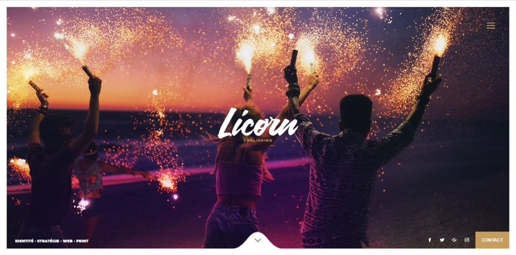
Typography superimposed over imagery is another trend we’re seeing a lot right now. Superimposing or placing type on top of an image can give a website’s presence a powerful boost.
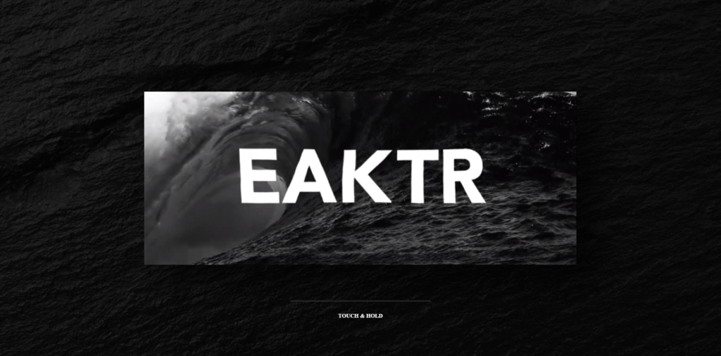
However, the designer needs to be cautious of a few things when applying this trend:
Contrast: the type must be readable. If the image is too busy, the text will get lost, and things just get messy.
Legibility: Again, it’s important that the font choice is easy to read despite the chosen image.
Typography Trend #3 – (not so) SIMPLE
Taking a common typeface and transforming it in an interesting way can be great way to add creative flare to a design.

If you want to use this trend in your website design, keep a few things in mind. First, don’t compromise the meaning of the word by altering the typeface. Second, the word or message needs to be legible. It’s not worth the effort if no one can read it.
Typography Trend #4 – CUSTOM
Creating a custom font is nice way to integrate branding into a website.
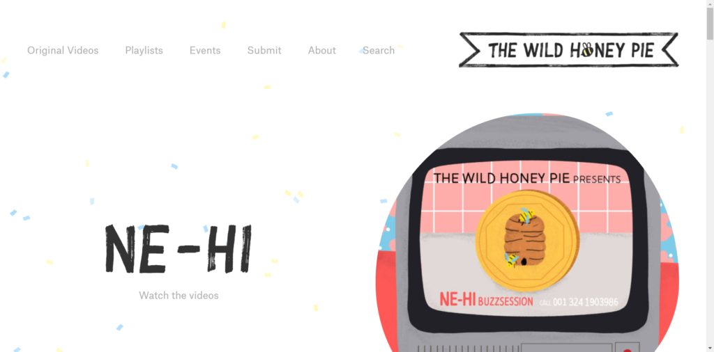
Want to use this trend in your website design? Here are some considerations:
When using a custom type font, be sure the custom typography harmonizes well with the rest of the site. Additionally, make sure it’s compatible across browsers and platforms. Some fonts cannot be viewed on all website browsers or platforms, so ensure your typography is compatible before you publish it.
Typography Trend #5 – ARTISTIC
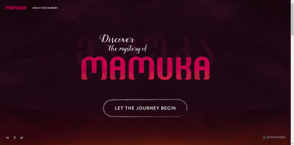
If used sparingly, fun fonts will elevate the look and feel of a site.
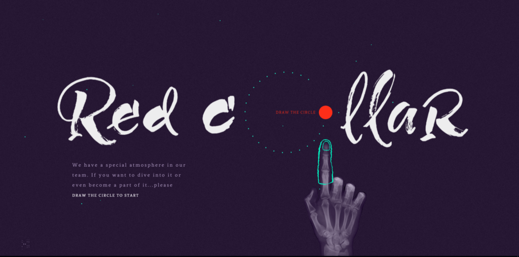
As with all typography trends, there are a few considerations.
One, is it legible? Can you read the word? Are users able to see the text clearly? If you’re unsure, get the opinions of others.
Two, this typography trend is best used for headlines or special embellishments. Don’t use a highly artistic type font for more than a few words, at most. This type of typography is engaging and interesting to users, but when overused, it can cause exhaustion and strain on the eyes.
How to Use Typography on Your Website
When to apply these trends is largely based on the end goal of the website and who it represents.
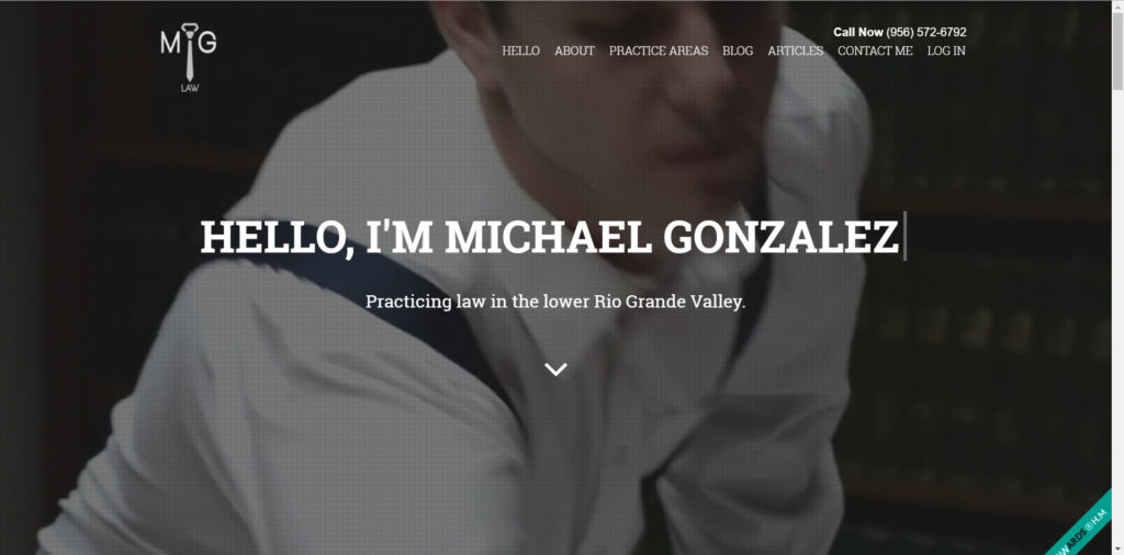
A lawyer may opt for a more traditional typeface to portray a professional, conservative look. Serif fonts are often used is this case.
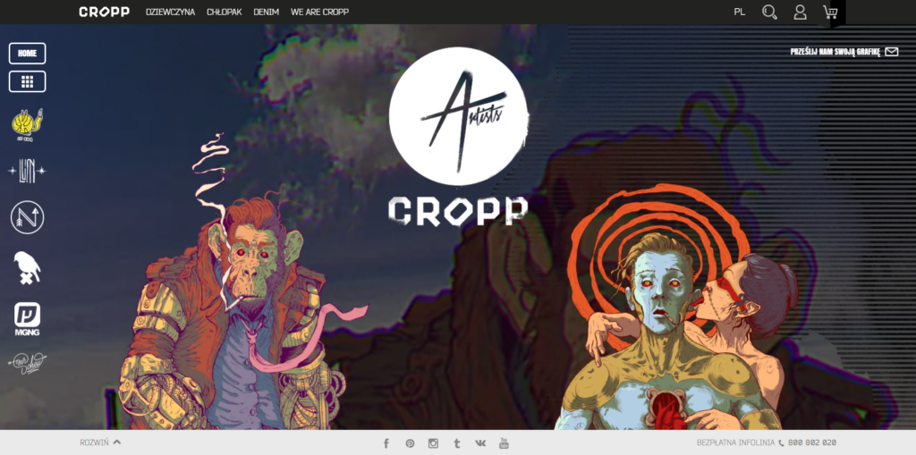
An artist may want his/her site to reflect the work they create. A hand-drawn, creative font may be the best option here. (This is a great example of custom illustrations used in website design.)
A tech company may choose to use a sans serif font, as they tend to be simple, and clean.
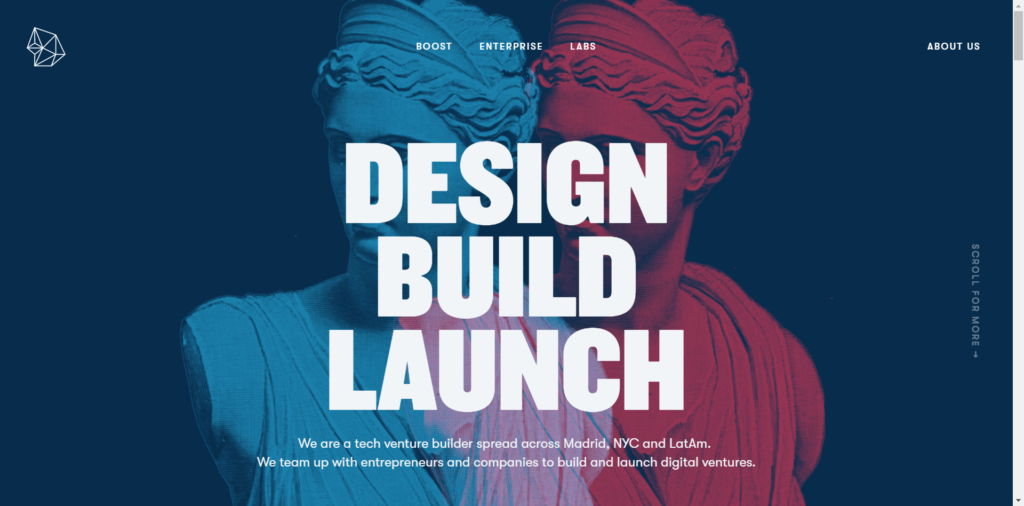
Ultimately, type choices and treatment all depend on the brand they represent and the target audience. Will these font combinations serve the end goal well? That’s the real question to ask here.
Examples of Good & Bad Typography
The Good
The website designs below are excellent examples of the professional use of typography. These designs are intricate, unique, and detailed.
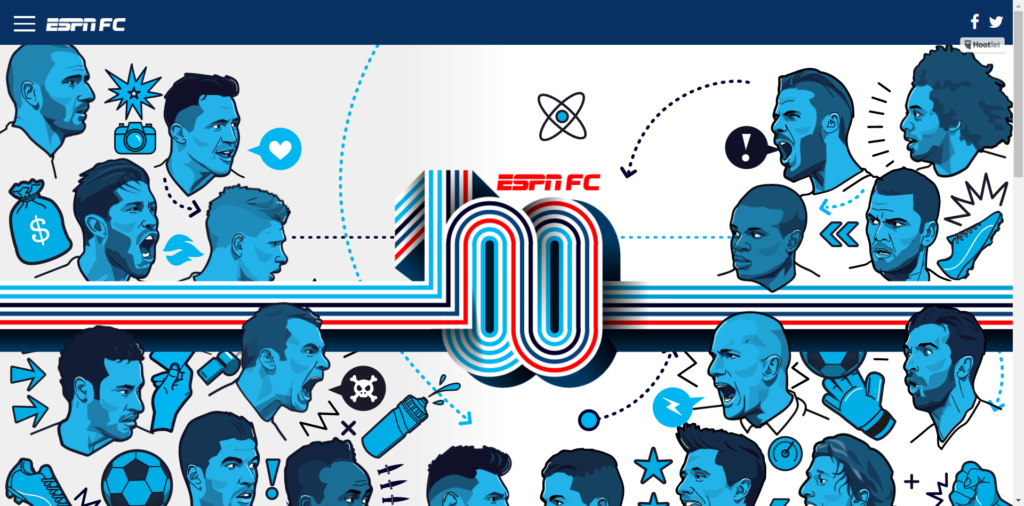
The typography used in the ESPN website works very well with the subject matter: it’s sporty, vibrant, and intriguing.
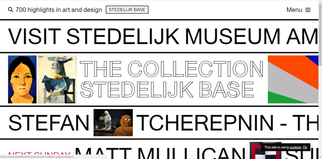
Below is a website for an art museum. The use of clean lines, lots of white space, and minimal graphics allows viewers to enjoy the design despite its intricacy.
The Bad
Several websites do not use typography in the best way. Type is used to communicate to users. Users must be able to read and understand the words. Otherwise, the design loses its effectiveness by distorting its message.
The following websites are difficult to read and understand. Proper leading and kerning is crucial for readability, as is whitespace.
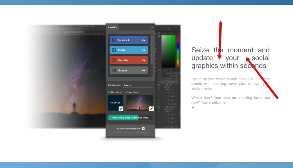
A lot of text in a heavy font makes this family law website a burden for users to experience.
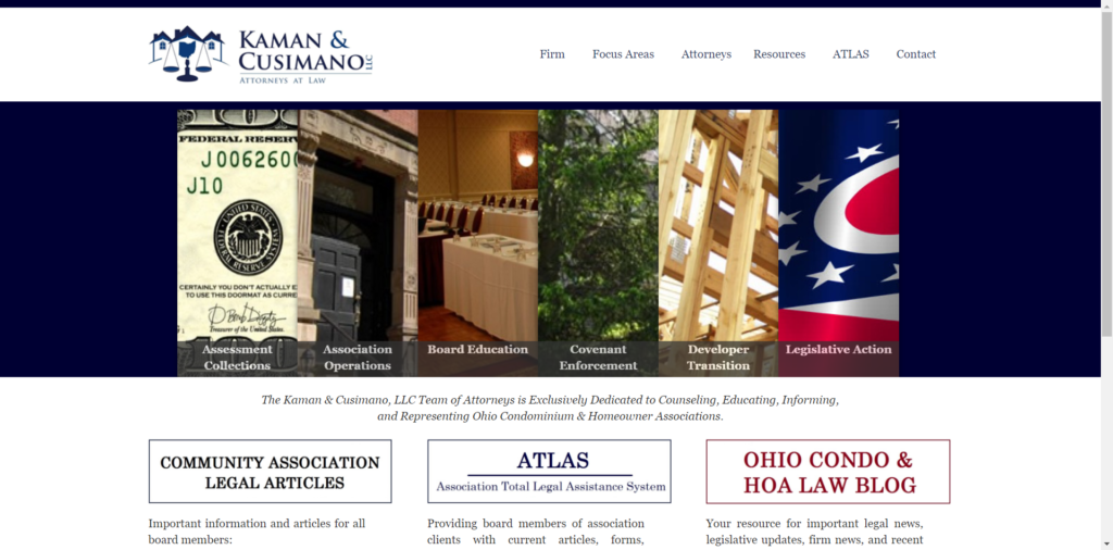
Below, a busy image distorts the text (and its message) and makes it hard for users to decipher the words.

How Artonic Uses Typography in Web Design
We use typography in our website designs to support the brand’s message and character. The typography for each website is chosen or created based on the company’s brand identity.
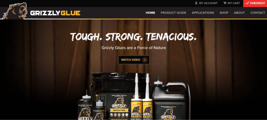
For example, on Grizzly Glue’s website, a no-nonsense message is express with a hand-drawn, sans serif font in all caps.
The Adrian College Graduate Studies website is another example of Artonic’s use of typography in web design.
The juxtaposition of clean typography beneath a studious yet elegant script creates the perfect balance between inspiration and respectability.

More Resources for Web Design
Thinking about designing a website for your business? The following resources will help you discover the best way to create a website that users love.
This free ebook, 10 Stats About the Value of Photography & Videography in Web Design, is a must-read for any business exploring website design. Inside, you’ll find solid stats that make the case for custom photos and videos on your website.
Say Hello!
Give Artonic a call or email us if you’re interested in website design, development, or marketing.
Michigan, USA

