Artonic offers photography and videography services – and we really enjoy those projects! Authentic photography makes a website design pop like nothing else! It’s especially helpful when your web designer is also your photographer.
Because of the great value of photography and videography in web design, we highly recommend it for our clients. If you’re considering a new website or a redesign, you’ll want to think about photography. Will you use stock photos or authentic photos of your business? Check out the following examples of web design photography by Artonic.
The following examples are all local Michigan businesses like Morning Fresh Bakery, Coin-Op Canteen, Jackson Area Transportation Authority (JATA), and 3D PT. Most are in Adrian or Tecumseh, Michigan.
Morning Fresh Bakery Web Design Photography
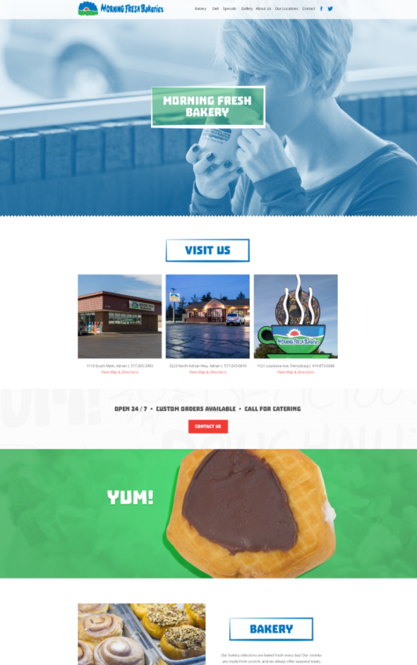
Morning Fresh Bakery, located in Adrian, Michigan, uses authentic photography in its website design. Artonic created the following banner designs – one is full color; the other is covered by the color blue. The first banner effectively highlights the Call-To-Action button, Contact Us by using red to color the button and differentiate it from the rest of the design (notice how the button color reflects the spot of red in the logo located in the top left corner).
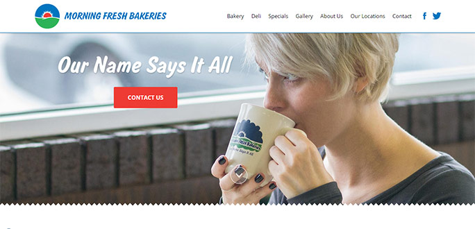
This version of the homepage banner highlights uses a color overlay to focus users’ eyes on the logo and business name.
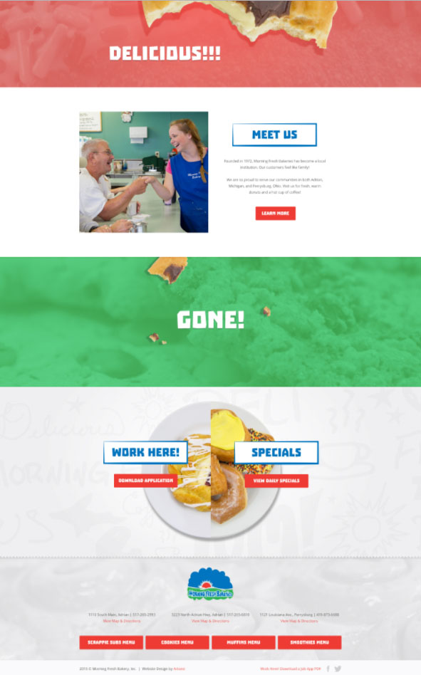
You’ll see more photography as you scroll down the homepage. Check out the images of the doughnut as it gets eaten while you scroll down the page.
The lower section of the homepage continues the design with fun, colorful, and real photos inside the bakery. Photos of mouth-watering donuts and pastries look great and show the bakery’s products in a delicious light.
Coin-Op’s Website Showcases Lovely Photography
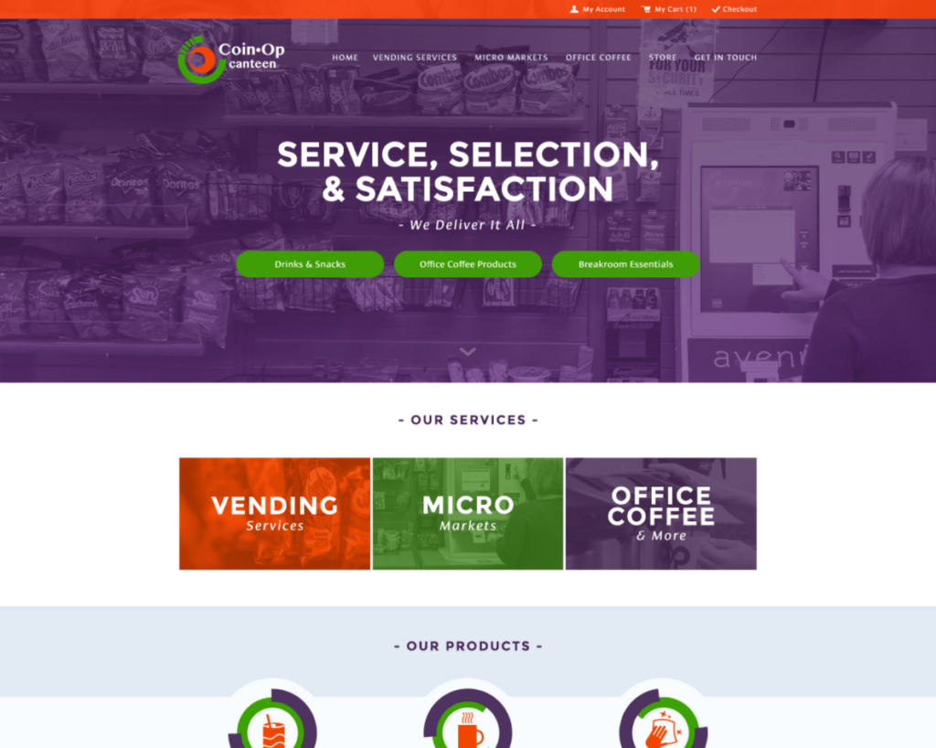
The e-commerce website design for Coin-Op Canteen, located in Adrian, Michigan, uses authentic photography throughout the design. The homepage banner is legible because of the dark overlay; if the image didn’t have this element, the text and buttons would not be as prominent as they are.
Scroll to the bottom of the website, and you’ll find more great photos of products and an employee. It adds personality and legitimacy to the website design. The soft drinks are isolated (the background has been removed) and create an intriguing break between the higher level content and the company’s contact information.
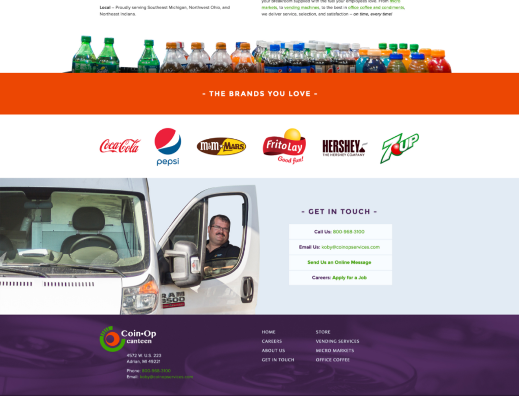
Like many of Artonic’s web designs, photos are used to add texture and interest. In the Coin-Op website, the footer utilizes a closeup photo of can tops with a very deep purple overlay in a way that’s legible and attractive.
Landing Pages Use Photography Effectively
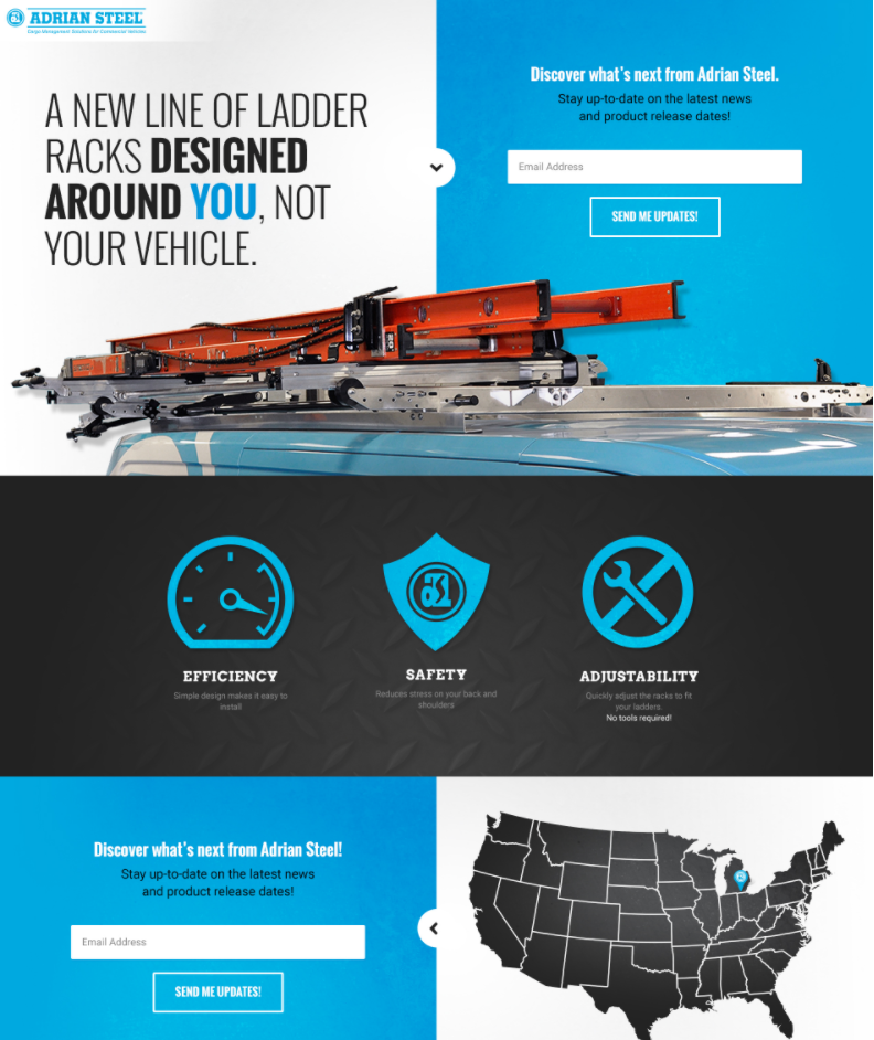
The landing page for Adrian Steel is very simple and straight forward, using mostly blue, white, and black in the design. The image of an Adrian Steel ladder rack holding a bright orange ladder accomplishes multiple things: 1) It adds color; 2) It adds texture; 3) It shows the user what the product looks like when it’s being used; 4) It visually separates the call-to-action at the top of the landing page from the information in the lower section.
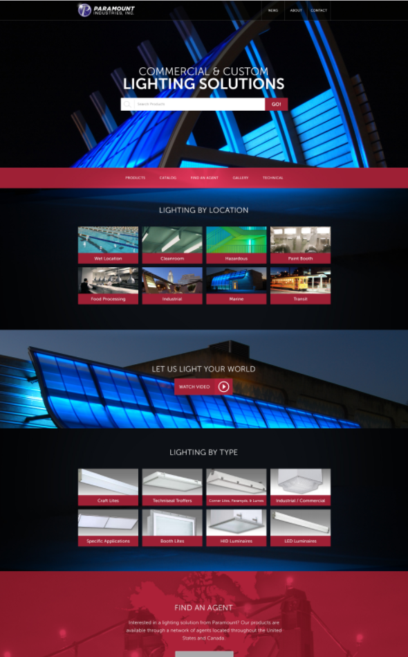
Another landing page uses stunning photos to achieve an intriguing design. As the web design for a lighting company, the design is dark. Not only does this reinforce the concept of “light,” it also makes the images look amazing. With a dark design like this, the user’s eye is drawn to the images and text – which is exactly what you want them to do!
Jackson Area Transportation Authority Uses Photos
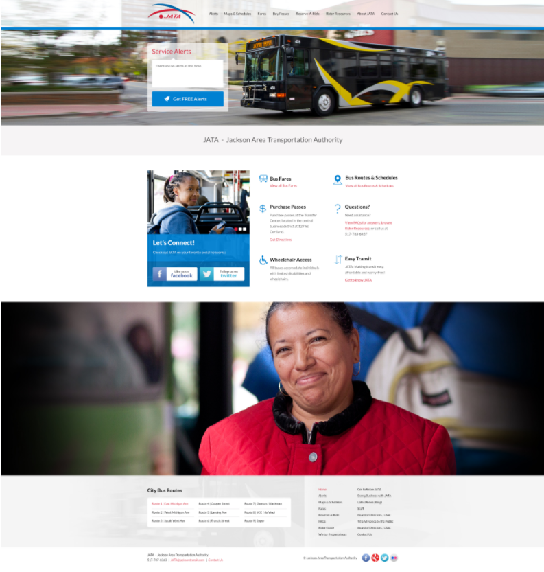
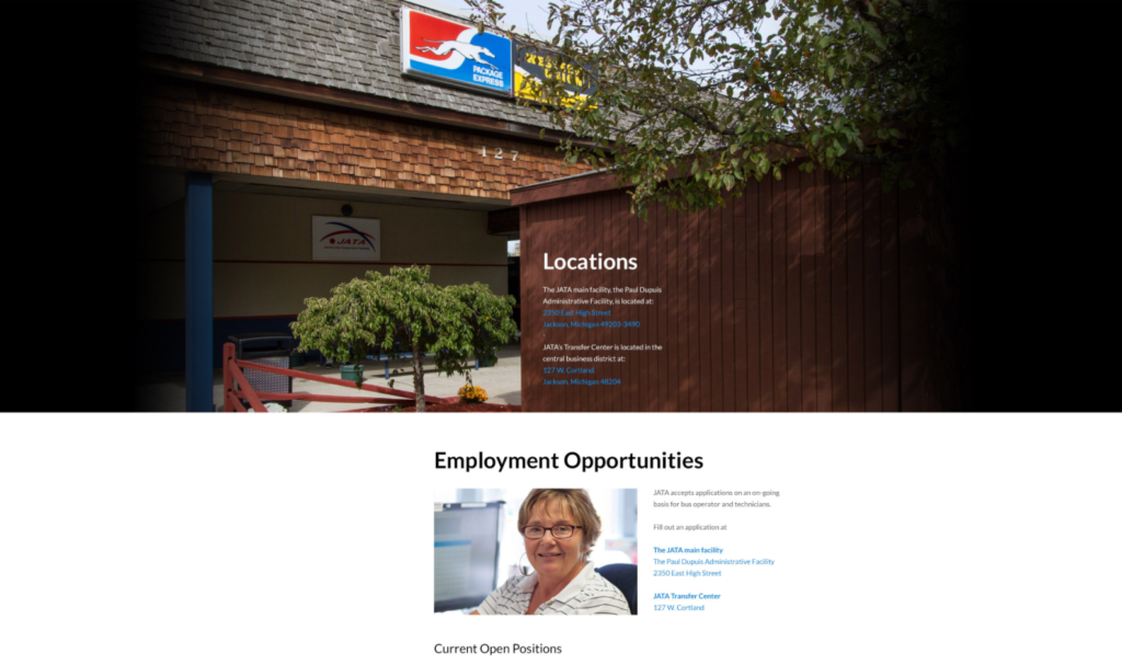
The Jackson Area Transportation Authority (JATA) invested in beautiful, high-quality photography for its website redesign. The photos showcased the things that JATA is all about: the city of Jackson, the buses, and the riders. The photos are beautiful and real; they really give the website an authentic feel.
The JATA web design also includes gorgeous photos throughout the website. The images are used to highlight sections of content in addition to increasing appeal and attractiveness. There are two images used on the subpage design shown below. The first image serves as a background to important text (it also shows users what the outside of its building looks like). The second image is small, surrounded by text, and highlights an employee (the text refers to employment). Both images enhance the overall web design with legitimacy and beauty.
On the subpages of the JATA website you’ll find another intriguing photo behind an aqua-blue overlay. It’s subtle, because the buttons are there to help users find additional information. If the information was similar in design to the text lower on the page (contact information and the site’s navigation) would be lost. 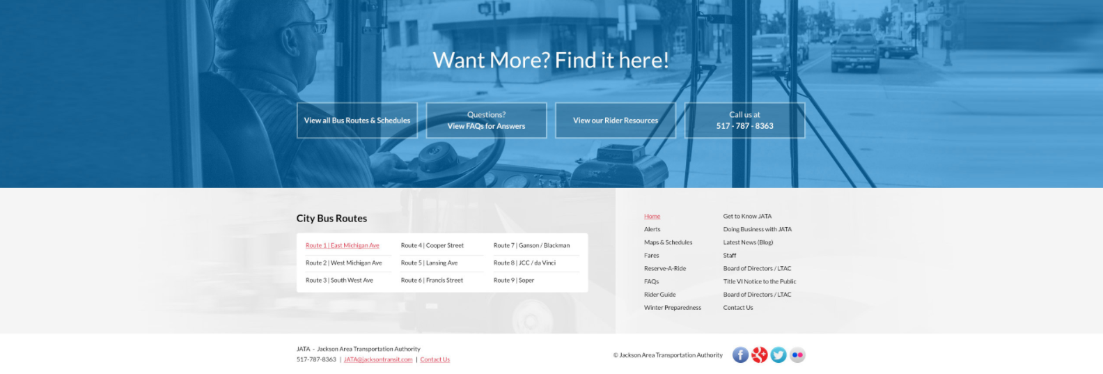
This is a wonderful website, and it’s worth a closer look.
Real Photos Show 3D PT in Motion
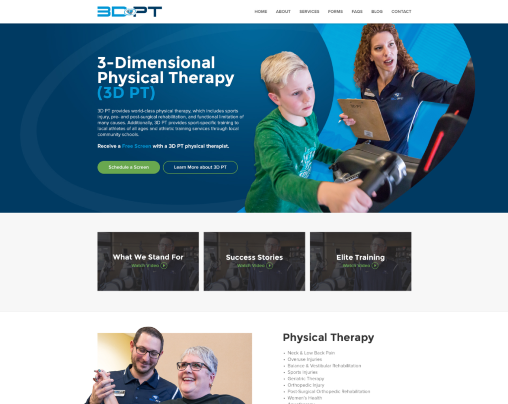
The physical therapy center, 3-Dimensional Physical Therapy or 3D PT, is truly client focused. The center shows that it cares for its clients with photos of therapists and clients at the actual center locations in Adrian and Tecumseh. All the clients and trainers are completely real – there are no models! The homepage banner in the design draft below shows the co-owner and therapist working with a young client. Lower, you’ll see another therapist also working with a client (and both have lovely smiles on their faces). This is what your users want to see on your website!
Real Estate Demands Top Quality Photography
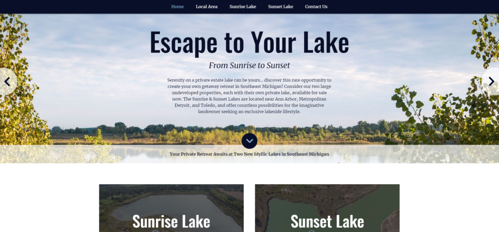
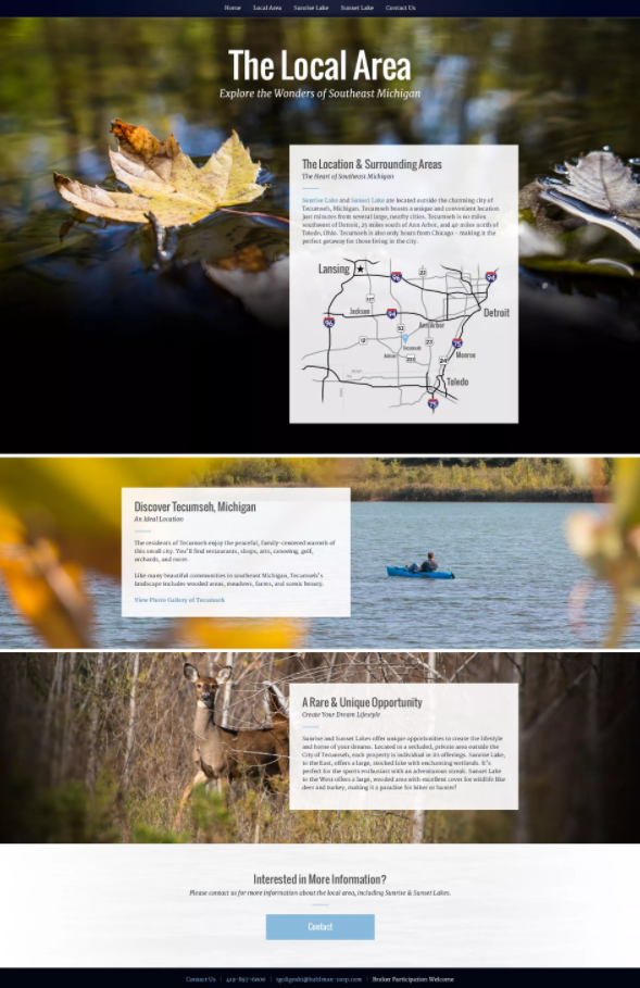
If you want to sell a property, you must have photos and video of the location. Not only that, but the images and footage must be very high quality, especially if your property is in a coveted lakefront location. The homepage banner uses an image of the property very effectively to frame the title and opening paragraph on the website.
The subpages on the site also use gorgeous, authentic photos. On the subpage below, you’ll see that content is excellently highlighted with a white box on top of a full-color photo.
More Resources for Web Design Photography
Thinking about designing a website for your business? Consider adding an element of legitimacy to your design with custom photography.
This free ebook, 10 Stats About the Value of Photography & Videography in Web Design, is a must-read for any business exploring website design and thinking about photos. Inside, you’ll find solid stats that make the case for custom photos and videos on your website. 10 Stats About the Value of Photography & Videography by Ashlee
Say Hello!
Give Artonic a call or email us if you’re interested in website design, development, or marketing.
Michigan, USA


