Let’s talk about the 2018 Web Design Trend Cinemagraphs. What are cinemagraphs? Cinemagraphs are photos that contain just a little movement. The movement is usually small and repeated over and over, although it creates the illusion that it is continuous.
In early 2011, photographer Kevin Burg and designer Jamie Beck first used the term “cinemagraph” to describe the technique they used to animate their photographs (check out the 2011 article, Cinemagraphs: What it looks like when a photo moves from Washing Post) Since then photographers and designers have used cinemagraphs in their work. Most cinemagraphs are created as animated .gif files.
When to Use Cinemagraphs in Web Design
You do not need to be a design studio or fashion designer to use the web design trend cinemagraphs in your website design. Cinemagraphs can be used on any website, as long as they are used well.
Use cinemagraphs to grab users’ attention and keep it. Delight your website visitors with the unexpected. Stand apart from your competitors and elevate mundane pages into another stratosphere.
Want to use cinemagraphs in your website design? Check out the following examples of website designs that effectively use this alluring trend.
Immerse Your Visitors: Budweiser
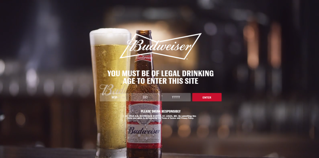
Want to immerse your visitors in your website experience? This trend is for you! Check out the entrance page on Budweiser’s website: the bubbles in a tall glass of Bud swirl in front of your eyes.
Unfortunately, once you enter the website, the cinemagraphs disappear. The website is still highly enjoyable to navigate and explore – but more rising bubbles in a glass of amber-colored beer wouldn’t hurt.
Get More Engagement: Italian Design Studio Marani
Cinemagraphs are used intelligently on the banner for Italian design agency, Marani, to fascinate their audience (potential clients) with playful movements captured in professional photography.
In a banner design for this website, a man fires a dart gun and the dart flies across the screen. The text, “Register.it,” appears as the cinemagraph repeats.
The movement is subtle and quick yet engrossing. It’s amazing that such small movements capture and hold our attention. The web design trend cinemagraphs is used very well on this site. It grabs users’ attention and elevates the look and feel of the website.

The cinemagraphs are used sparingly and intentionally on the website to give website users a fun experience.
View this in a video:
Be Unique: Design Agency humaan
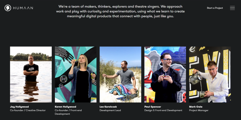
Another website to creatively use cinemagraphs in their design is humaan. On the About page for humaan, a design agency, you’ll find delightful cinemagraphs of each team member.
Cinemagraphs are used in this website design to highlight the team’s uniqueness. Each image immerses the visitor in a mini experience as it brings the photos to life. Each team member’s unique personality can be seen – and practically felt – in each cinemagraph. The overall look and feel of this page is clever, enjoyable, and individual.
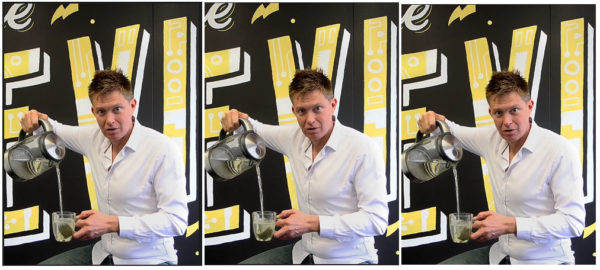
Each team member’s photograph is really an animated .gif with one main movement. In the images below, you can see the tea bag in different positions.
The photography is top notch, which is one reason these cinemagraphs are so effective. It’s also tricky to create continuity and beauty with multiple, detailed, colorful – and, now, moving – photographs arranged side by side; this is expertly done in this design.
View this in a video:
Show Off: Cinemagraphs by Burg & Beck
Cinemagraphs.com was created by Burg and Beck – the two artists who made their names synonymous with the term itself. You’re in for a treat when you visit this website. It’s elegant, modern, and beautiful to behold. The movement is captivating and used in ingenious ways to draw the viewers eye into the photography.
The homepage displays a collections of gorgeous moving photography – from a diaphanous red dress that spins in the breeze to sparklers that burst above a woman’s head – each stunningly gorgeous and artistic.
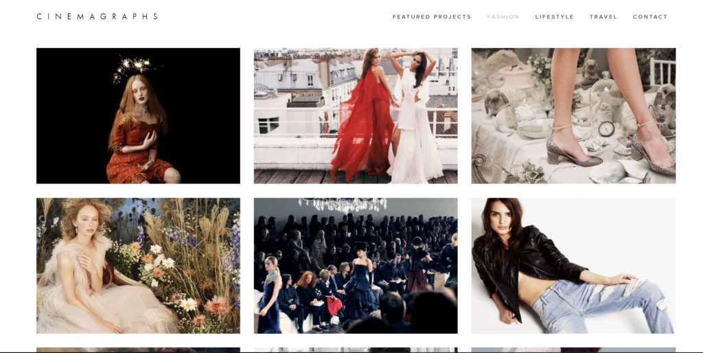
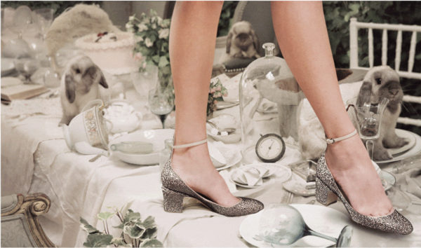
Select one of the photographs and click it to watch the subtle motion in the cinemagraph. For example, in the image below, of the woman’s shoes on a table with bunnies in the background, you’ll see the shoes on the woman’s feel sparkle and the bunnies move around as they explore the table. It’s enchanting!

View this in a video:
Bring Products to Life: Estee Lauder
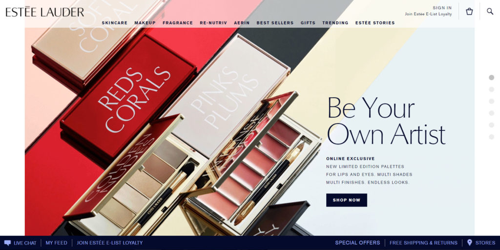
The homepage of mega beauty brand, Estee Launder, shows makeup palettes open then close. Adding simple animation to a product image is a great way to bring a product to life.
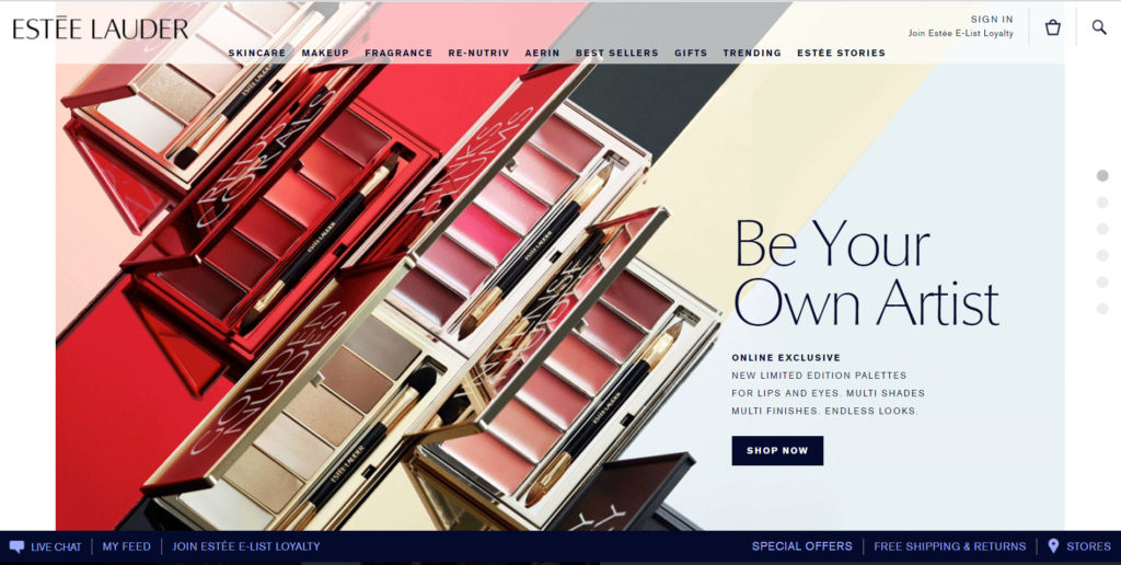
As you watch the palettes click open then closed, revealing lovely colors inside the cases as well as informative labels on the exteriors.
Cinemagraphs Require Expert Photography
If you want a cinemagraphy on your website, you’ll need to invest in professional photography. The photos you use for your cinemagraph will dictate the final result. High-quality photos will definitely make a difference if you plan to use this design trend on your website.
Professional Photography Examples
Many of our website designs include professional photography shot by Artonic. These images instantly elevate the legitimacy and appeal of a web design. Photography is essential when implementing cinemagraphs into your design.
Check out more examples in Artonic’s photography portfolio.
Say Hello!
Give Artonic a call or email us if you’re interested in website design, development, or marketing.
Michigan, USA


