Placing important elements above the fold isn’t as crucial as it used to be. Many users have become accustomed to scrolling with the integration of mobile devices into daily life. In 2018, many websites implement long scroll design to tell a story or mimic multiple pages by clearly dividing sections up visually.

What is a Long Scroll Website Design?
This trend is used in two ways: one-page website design and long scroll designs in multi-page websites.
One-Page Websites
A one-page website is a website that has only one page.
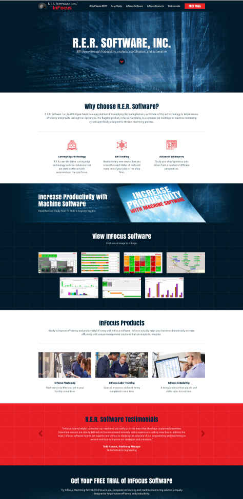
The design below shows a one page website. Looking at this design, it looks very similar to a multi-page website.

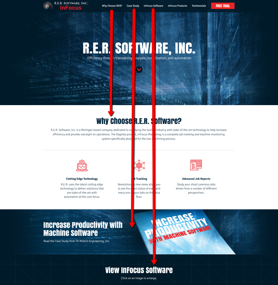
The website may feature a navigation bar just like any other website, but instead of linking to multiple pages, the navigation links to different sections on the page. 
Long Scroll Website Pages
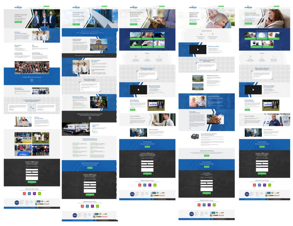
Another way this trend is frequently used is by creating long scroll designs for all the pages of a website. This may not even be an intentional design choice; it may be the necessary result of a large volume of content on a webpage.
In the example below, you’ll see five pages on the same website. Due to the amount of content on each page, they are all long scroll designs.

Tracing the Long Scroll Web Design Trend
We started seeing long scroll websites around 2014, and continue to see it in 2018. Of course, web design has changed over the four years that long scroll websites have been in use. With the advancements of development, using a long scroll in your website design isn’t as challenging as it once was.
Why is this Trend Popular?
Long scrolling sites open new doors to designers and developers. “Designers find they can do a lot with this setup, as content can more readily center around storytelling aided by parallax scroll, scroll-triggered animation, or Ajax/jQuery techniques.” (Web design trends 2015-16: the long scroll by Creative Bloq)
#1 Engagement – Long scroll web design allows for more user/website interaction.
#2 Appeal – This trend lends itself well to creative products, storytelling, and promotional websites.
#3 Adaptability – Long scrolling websites adapt well to a variety of screen sizes.
Why Engagement Matters
If you’re unsure what user engagement is, it “refers to how frequently and how long a user interacts with your website, app, or other product.” (What is User Engagement? by CodeFuel)
Interaction is key to engagement. When a user interacts with your website, she’s engaged. The longer or more often she interacts with your website, the more engaged she is.
An interaction can be anything from reading content to clicking a button to watching a video or sharing an article on social media. High website engagement indicates value, quality, a good user experience, and more.
“The value of any system can be measured by how often you interact with it.” (User Engagement – Why Does It Matter by RittmanMead)
Engagement matters because it’s evidence that your user finds your website interesting, useful, or entertaining. If your website user interacts with your website for several minutes or even an hour, you can tell that it is valuable to him.
Long scroll web design supports user engagement, usually because a longer web page means more content. If that content is unique and matters to your users, they will be engaged with your website longer. Long scroll designs offer the potential for more interactions with your users.
Appeal & Long Scroll Design
If your website has appeal that means people find it attractive and interesting.
“I want to appeal to everyone. Because I’m not saying I’m the best, but we the best.” – DJ Khaled
Appeal is both beauty and substance. Beauty captures a visitor’s attention; substance keeps it. If your web design is attractive and offers great content to your visitors, then you have an appealing website.
A long scroll website offers the opportunity to appeal to your website visitors in uncommon ways. You can use the length of a long scroll website design to tell a story or create an extraordinary experience. Let’s look at how long scroll design is used for creative products, storytelling, and promotional websites.
Creative Products: YouTube Rewind
YouTube Rewind 2017 has a very appealing web design. The amount of information on the website is vast – one page is a “deep dive” of 2017 with an interactive timeline of the biggest trends on YouTube. As you scroll, the timeline advances to the next trend.
Storytelling Website: Einstein 150
The website built for Einstein Hospital uses a long scroll design to keep visitors interested in its 150-year-old history. Instead of looking like a dusty textbook, the information is presented like a story with stunning imagery and poignant quotes.
Through the use of vintage photography, a consistent color palette, and the precise choice of typography, the website design offers a beautiful visual. However it’s the material – the history of the hospital – that adds substance. Together, the visual design and information provided create a highly appealing web design.
Promotional Website: Welcome to the Universe
The website design below is a promotional website for a book by Neil DeGrasse Tyson called, “Welcome to the Universe.” As a website visitors scrolls “down” the website, she is introduced to the concept behind the book with a series of animations and quotes.
A long scroll design is used to up the appeal for a new book release by taking the visitor on a journey that’s both visually beautiful and intellectually stimulating – that’s appeal.
Adaptability
“Mobile is now without a doubt the most popular device used to browse the internet.” (Is Paralax Scrolling Bad for Your Website by St. Andrews University) Because mobile devices are used more than ever now, so websites must be compatible with those devices. To a website designer, this means screen size must be considered. Long scroll websites have high adaptability to smaller screen sizes. In fact, the mobile trend is a major influence in why so many web designs use the long scroll.
“It translates well to mobile devices. The increased use of mobile screens has played a key role in the widespread acceptance of this technique: The smaller the screen, the longer the scroll. The gesture controls of mobile devices make scrolling intuitive and fun.” (Best Practices for Long Scrolling by Adobe)
Challenges with Long Scroll Websites
Long scroll websites have their advantages, but that doesn’t mean it’s the best choice for YOUR business or personal website.
User experience designers frequently bring up the following challenges when considering a long scroll website design:
#1 Load Time – “40% of people abandon a website that takes more than 3 seconds to load.” (How Loading Time Affects Your Bottom Line by Kissmetrics)
#2 Confusion – Too much information and poor navigation can leave visitors wondering where they are.
#3 Overwhelming – Website visitors may become overwhelmed by the volume of content.
Long Scroll Load Time
“Slow loading times are a common problem with long scrolling pages.” (Best Practices for Long Scrolling by Adobe)
Some websites may experience longer load times with a long scroll design. However, there are many ways to optimize your website so that it loads faster. (Check out 5 Brilliant Ways to Lazy Load Images for Faster Page Loads by Dynamic Drive for a few ideas.)
Confusion & the Long Scroll
Sometimes visitors are confused by long scroll design, especially if there is a lot of content to sift through.
“One of the biggest risks of long scrolling is disorientation — users may get lost along the way. This inability to determine current location and other navigation options causes annoyance and confusion to the users, and hurts the overall user experience.” (Best Practices for Long Scrolling by UX Planet)
A great way to battle confusion is with a sticky navigation menu. A sticky navigation menu stays at the top of the visitor’s screen, no matter where they scroll on the page. This allows them easy access to navigation, and allows them to choose another path, if they want to.
Overwhelming Visitors
A large amount of content can overwhelm your website visitors. Key considerations include the amount of content in each section, number of choices, visual cues, and navigation.
“Limit choices. Give users something to do in the design, but don’t overwhelm them with too many options. One call-to-action per scroll or story stage is enough.” (7 Ways to Ensure Your Long-Scrolling Website Is Successful by DesignShack)
“With appropriate visual cues and intuitive design, you can increase your visitor’s website time and use scrolling to turn prospects into customers. Apply these tricks to your website – you will not be disappointed with the result.” (How Scrolling Can Make Or Break Your User Experience by Usability Geek)
Long Scroll Web Design Done Right
The long scroll website design trend looks like it’ll be around for awhile, and that’s a great thing! The long scroll design is an excellent way for websites to present large volumes of content in an appealing way.
No matter what type of design you want, your website design should be based on your business goals and your website users’ needs. To see examples of web design done right, view Artonic’s Web Design Portfolio.
Say Hello!
Give Artonic a call or email us if you’re interested in website design, development, or marketing.
Michigan, USA

