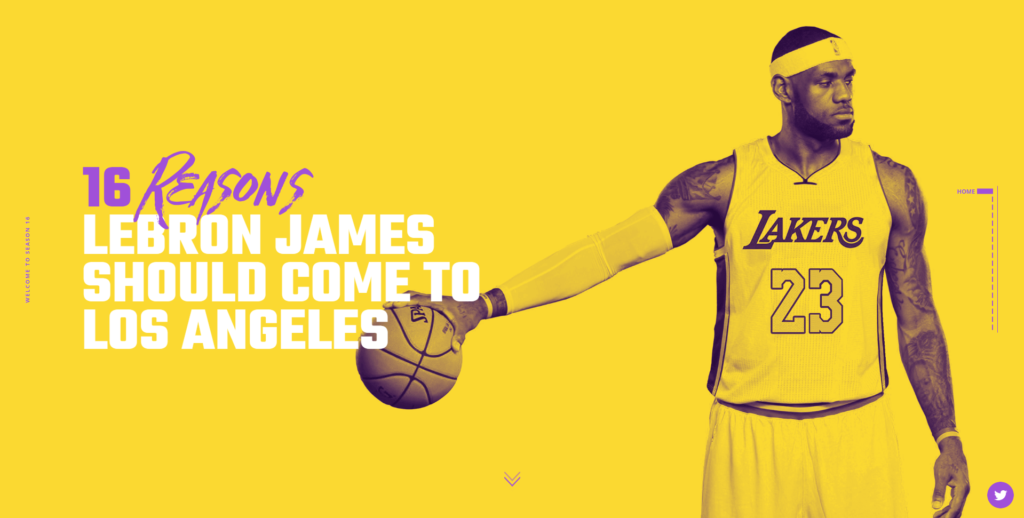
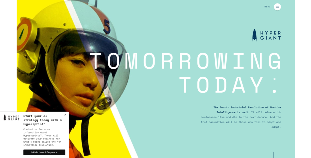
Yellow web design is here to take center stage. In many areas of art and design, yellow has burst onto the scene and staked its claim.
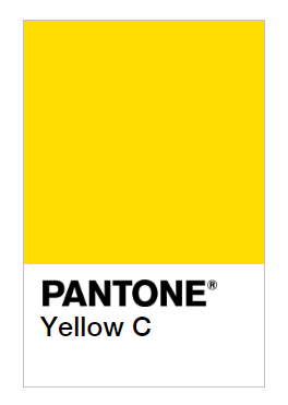
This color is warm and deeper than basic yellow thanks to the addition of red. Check out the juicy, vibrant shade Yellow C from Pantone, below.
Even though it’s gorgeous, yellow can be tricky to work with, because it’s so bright. In web design, it’s vital to use the right amount of yellow, and not too much.
Keep in mind that yellow must be balanced. Many web designs that use yellow balance its brightness with neutral colors like white or tan. This allows yellow to capture attention, but keeps it in bounds (so the design doesn’t get too colorful).
Yellow Moods
Yellow can be used in many ways. Its moods are generally lighthearted and non-aggressive.
- Not serious
- Lightweight
- Happy
- Creative
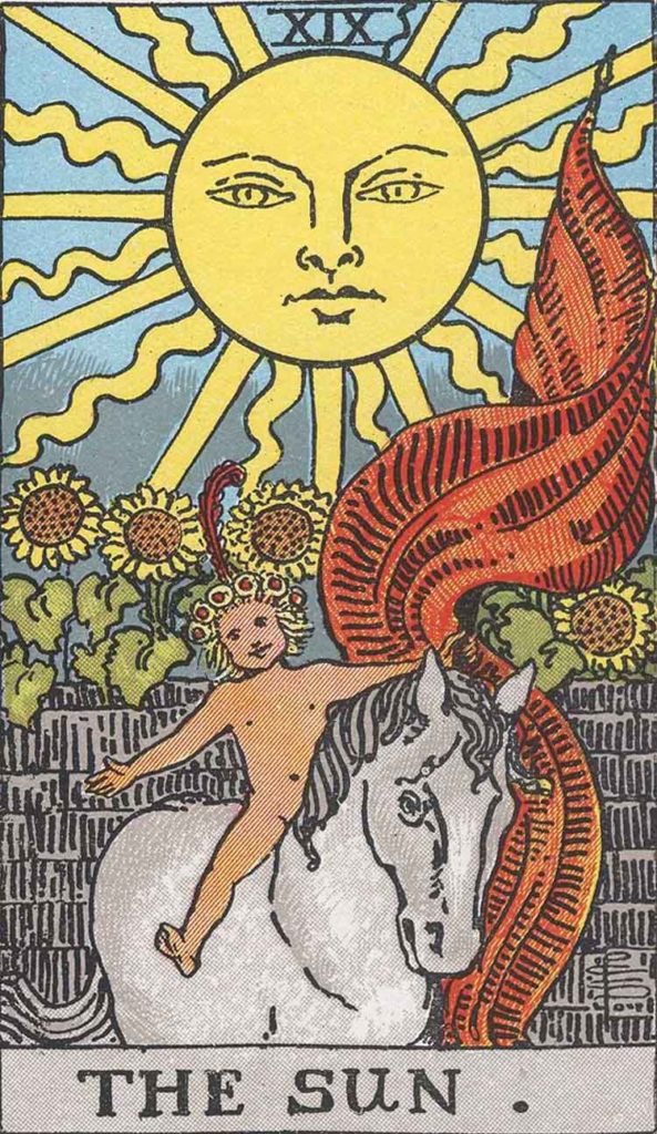
We associate yellow with the sun, warmth, light, and guidance. In the Rider-Waite Tarot deck, The Sun card represents the happy, optimistic impression many of us associate with the sun. This calls to mind Vincent van Gogh’s quote, “How lovely yellow is! It stands for the sun.”
Many people connect the color yellow to positive feelings, such as:
- Good fortune
- Joy
- Harmony
- Optimism
Kandinsky once said, “… a picture painted in yellow always radiates spiritual warmth…” The painting below, Chris Ofili’s No Woman, No Cry, is a moving example of using yellow to elicit strong emotion. Used here, the color yellow represents hope and deity.
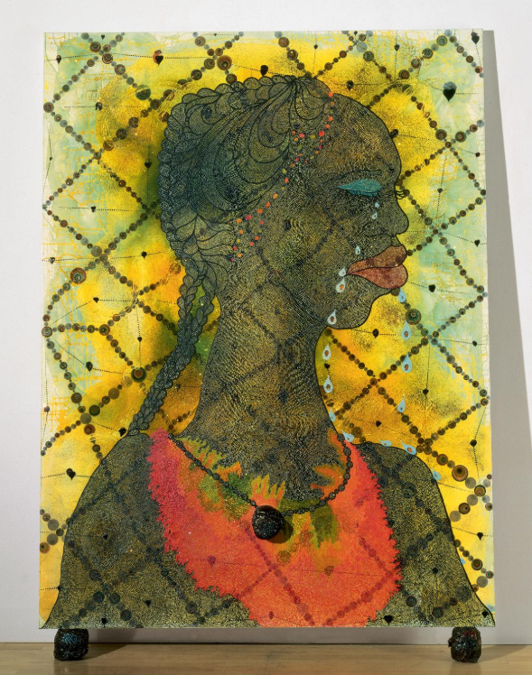
This color of yellow can be described as:
- Buttery
- Warm
- Bright
- Soft
Designers use yellow in many ways when it comes to web design. Just a hint of yellow can draw the user’s eye quickly; saturated yellow websites help fabricate a vibrant experience for users.
Yellow gets attention because it’s brilliant and novel. Use this to direct users to calls-to-action like Buy Now or Contact Us. You can also use yellow to distinguish yourself from competitors, as yellow is uncommon and unique.
Use Yellow as a Guide
Yellow is like a light when used in web design; it’s bright and catches the eye quickly. Use yellow this way when you want to lead your web visitors to something – think Yellow Brick Road.
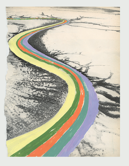
Danielle Kroll’s Rainbow Road is an excellent example of how to use yellow to lead a viewer’s eye.
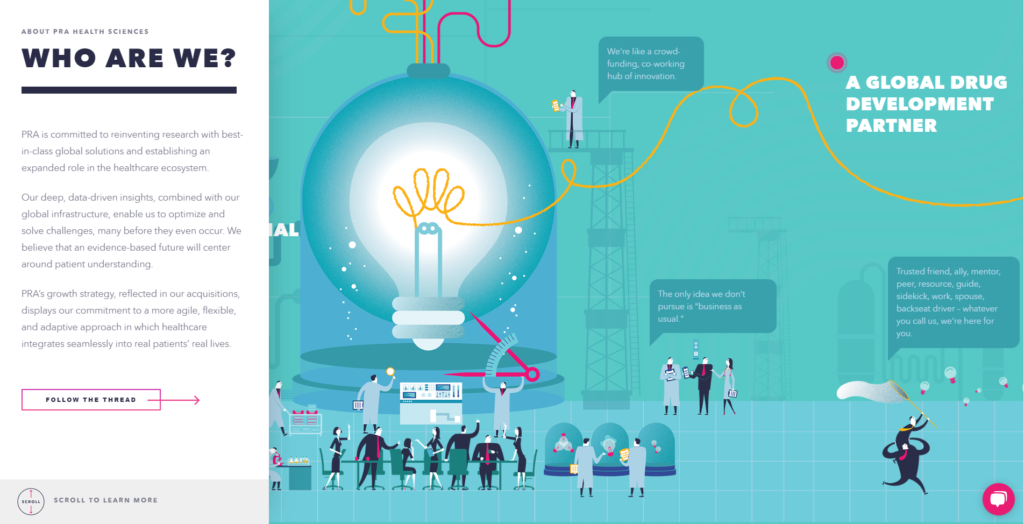
For example, in the web design below, yellow is used to direct users along their journeys; even the button tells you to follow the thread. The color yellow stands out against a cool, muted teal background.
This website uses yellow to orient the user as to her position on the website (as you watch the video, be sure to notice the yellow timeline bar at the top of the web design).
Yellow Text Pops
No matter what colors used in your website design, yellow will pop.
Nostalgia 3 by Amit Dutt represents the potency of yellow when used with neutrals – in this case, gray, white, and black.

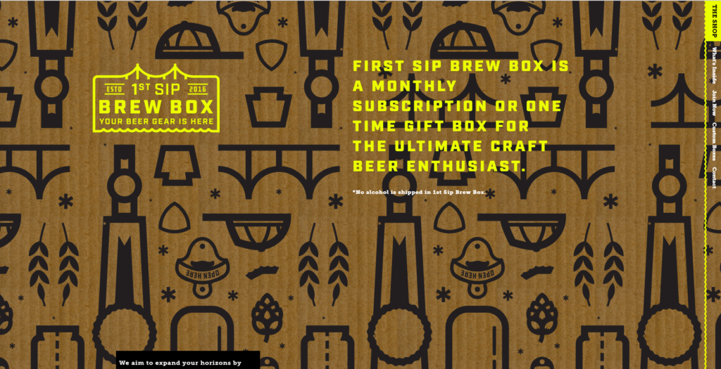
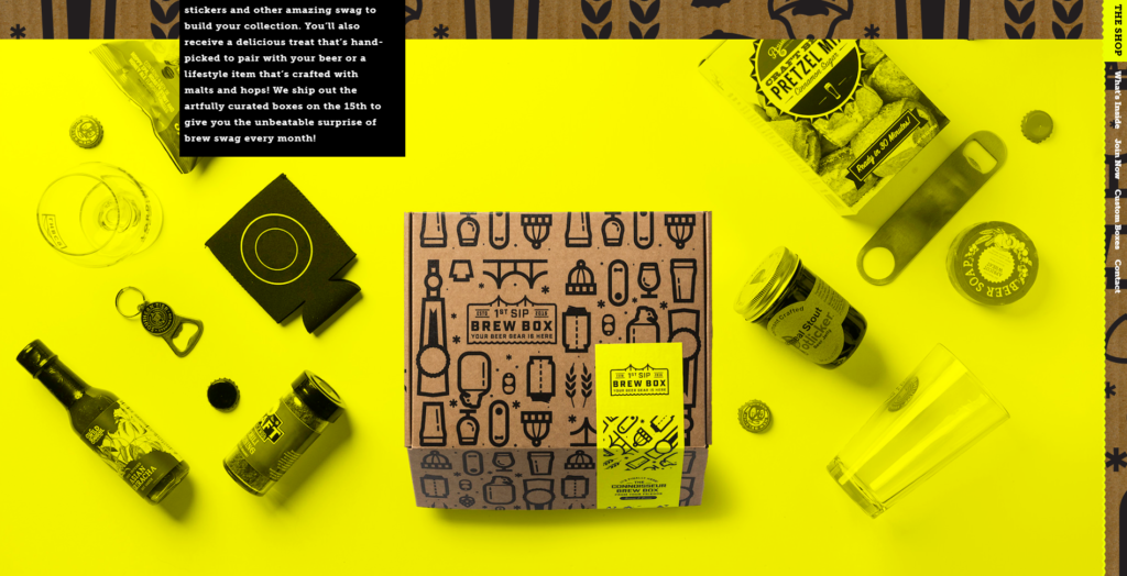
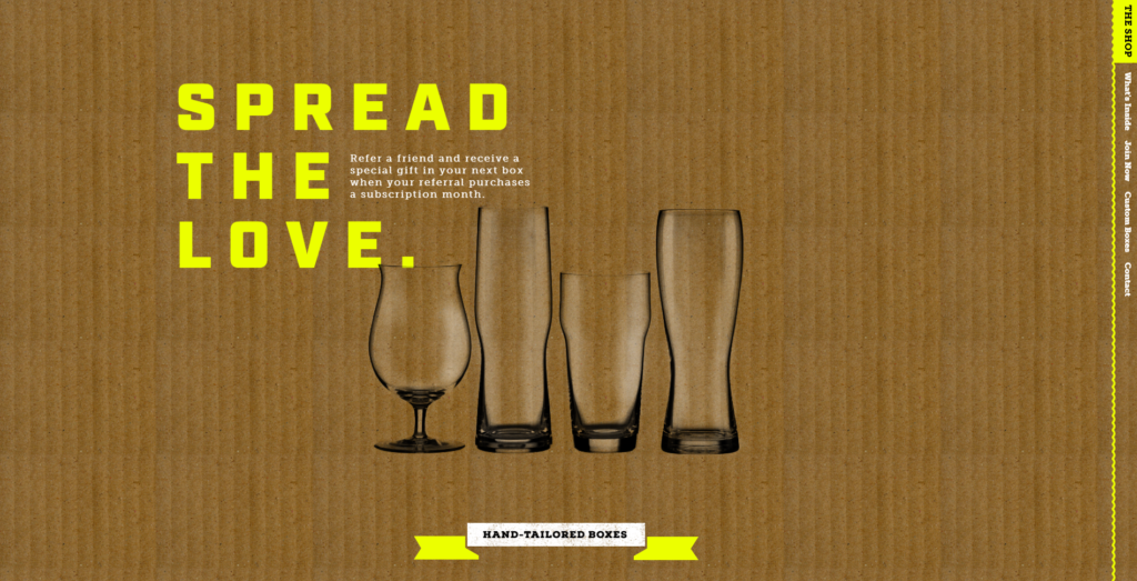
Below, this brand uses yellow with a minimal palette of cardboard brown and white.
Yellow is often used with neutrals for maximum impact. This website design uses extra-large yellow text to elevate the look of this simple website.
Yellow Signals Uniqueness
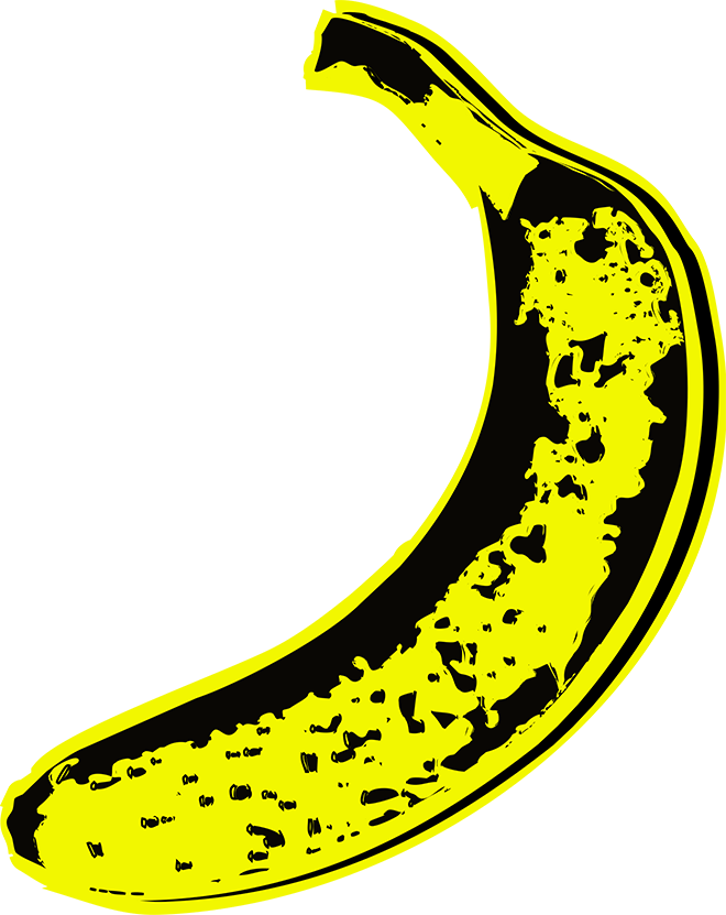
Yellow is a favorite color of artists and designers, because yellow is highly unique among other colors. The cover for The Velvet Underground’s album showcases Andy Warhol’s famous yellow banana.
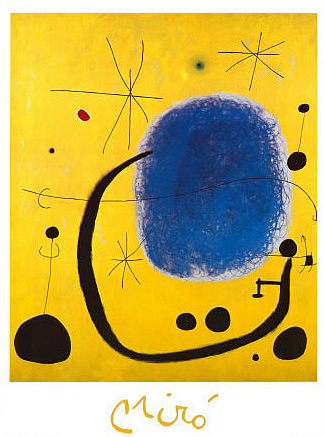
Joan Miro also uses yellow to express abstract thoughts. In L’Oro dell’ Azzurro, yellow creates a striking contrast to blue. Quirky shapes drawn in thin black practically bounce from the yellow canvas.
This artist’s portfolio website design, below, uses yellow to produce a funky, almost humorous, mood. Lots of neutral beige is used in the background along with dusty teal and blue to calm and cool the sunny yellow shade.
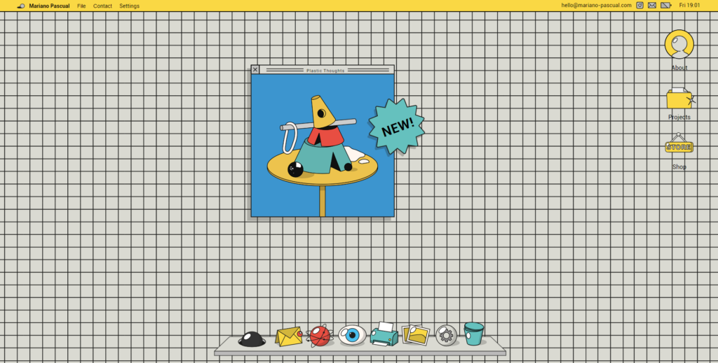
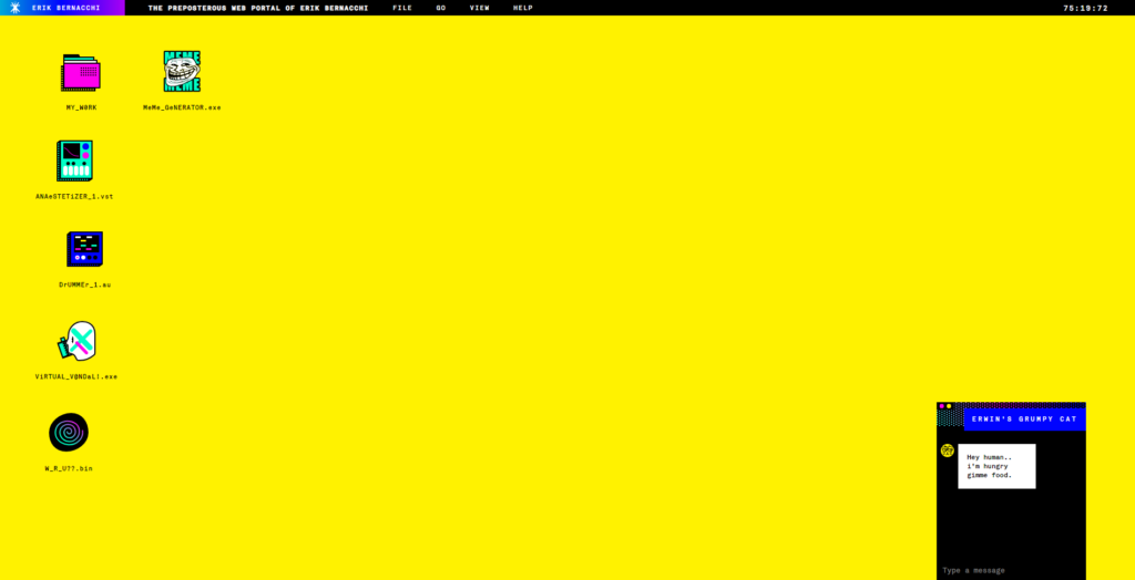
This yellow web design, below, is individual and recognizable. Rudimentary graphics, a dump of yellow, and neon accents alert the viewer that this web design is for someone creative. Think users will remember this website?
Yellow used this way creates something iconic, much like Harvey Ball. “I made a circle with a smile for a mouth on yellow paper, because it was sunshiny and bright.” he once said.
Use Yellow for Attention
Yellow gets attention due to its unusual, bright hue. Use this to your advantage if you want all eyes looking at something on your website (like a button). Yellow is a great choice, because unlike red, it isn’t aggressive.
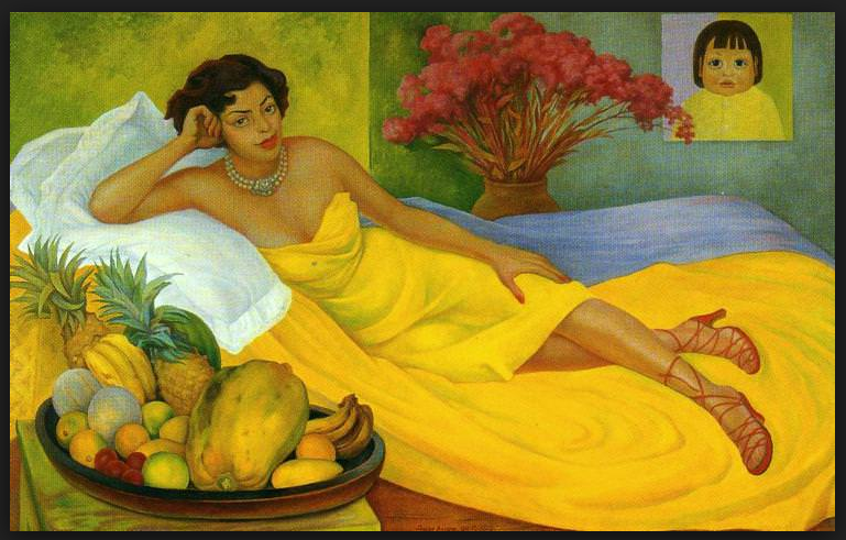
Web designs use yellow as a central color to create a full, luxurious experience, similar to Rivera’s painting, Portrait of Sra Dona Elena Flores de Carrillo:
In the website design below, yellow is used to grab your attention and hold it.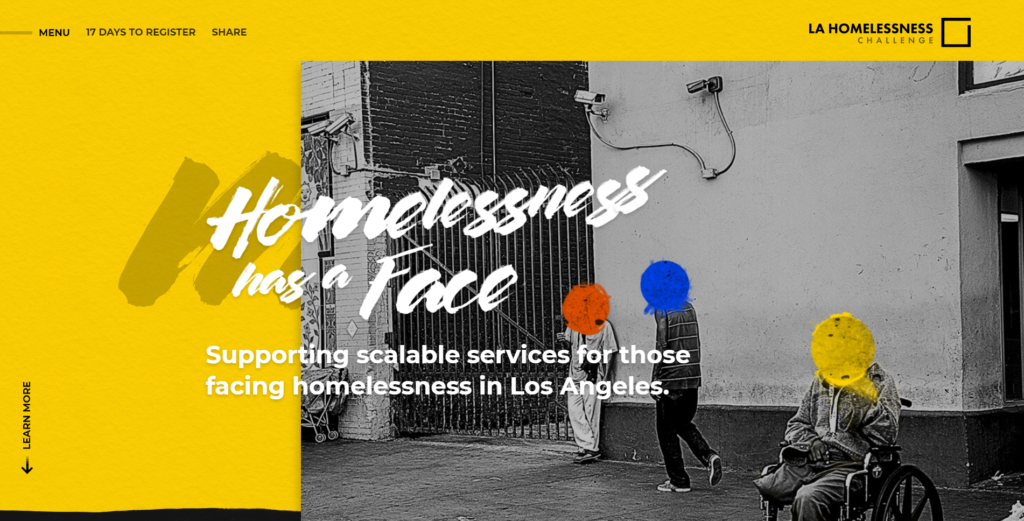
Likewise, the following web design is saturated in rich butter yellow to get your attention and highlight the company’s brand colors (the brand is a significant part of the website’s message).
Yellow Plays Well with Others
Yellow takes on different moods when paired with another color.
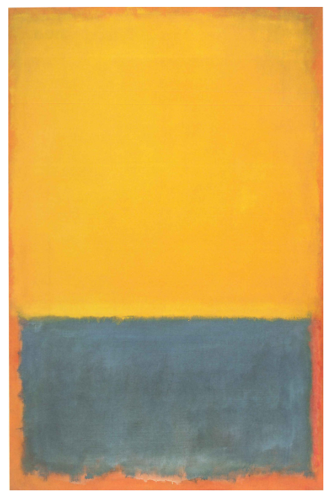
Yellow looks beautiful with warm colors like burnt orange and muddy brown. Check out this example from Mark Rothko:
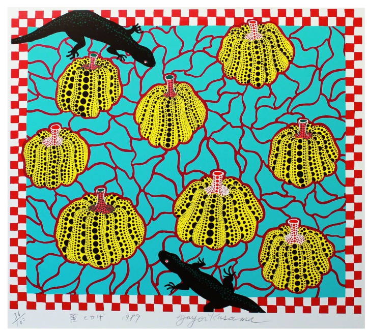
Yayoi Kusma demonstrates the vibrancy of yellow when used with other, equally vibrant colors like red and teal.
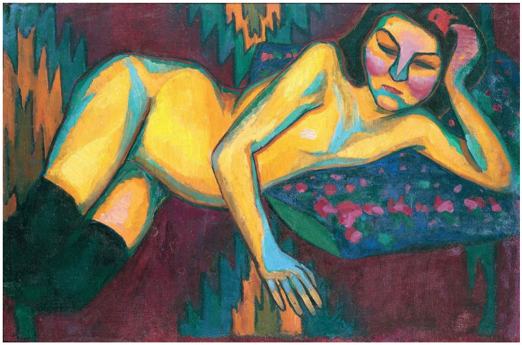
In Yellow Nude, Sonia Delaunay uses maroon and pink along with teal to create a striking painting
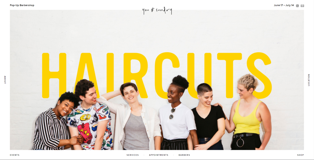
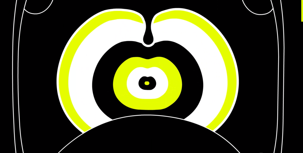
Below, this website design uses black and white with a lime-yellow accent. The result is chic, stylish, and certainly eye-catching.
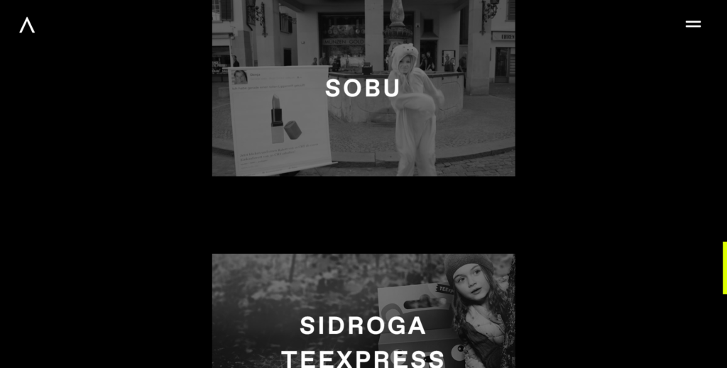
This website uses robin’s egg blue and a touch of orange alongside yellow to create a vintage-feel. The block of yellow slants along the model’s face like sunlight.
Yellow Web Design Resources
The Color Yellow in Art – Schirn
Chris Ofili, No Woman, No Cry, 1998– Tate
Danielle Kroll Artwork – Danielle Kroll
Yayoi Kusama – Artsy
Important Art by Sonia Delaunay – The Art Story
Web Design Best Practices

How do you create a website that entices your customers to buy the things you sell? And what kind of marketing strategy is best? These questions are something we answer for clients all the time!
Discover what it takes to build a success e-commerce website online with our whitepaper: E-commerce Web Design Best Practices.
Say Hello!
Give Artonic a call or e-mail us if you’re interested in website design, development, or marketing.
Michigan, USA


