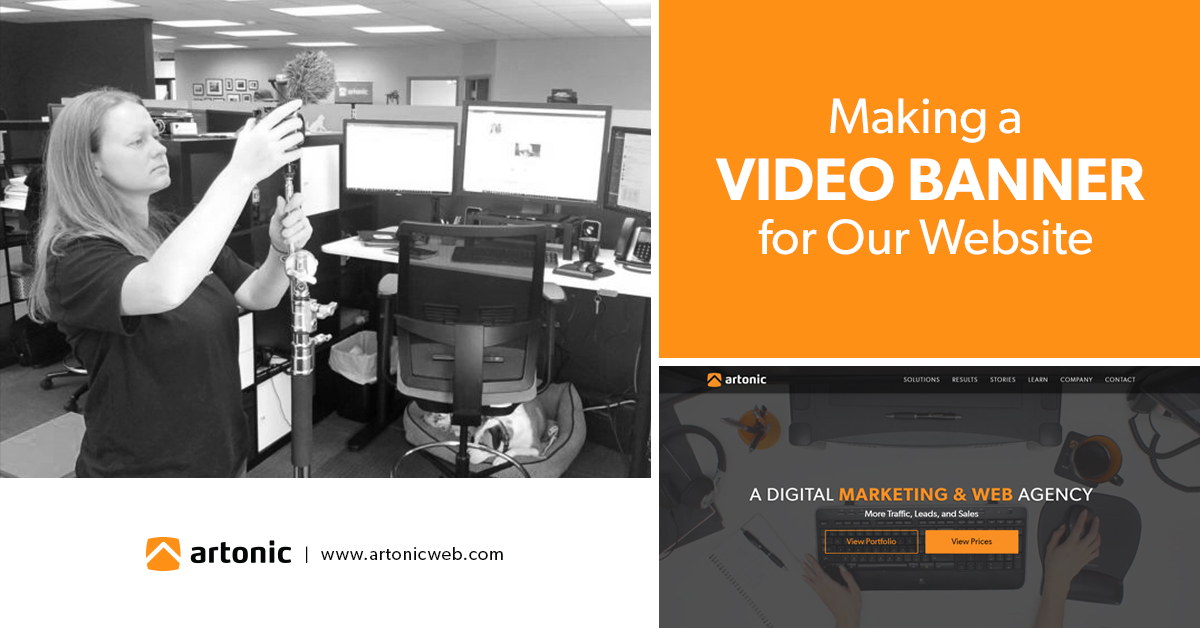
When Facebook updated its banner features for users, Artonic decided we wanted to create a video for our Facebook banner. Then we decided to use the video for our website, too. Here’s the story of making a video banner for our website.
First Things First
Once we decided to make a video, we determined that we wanted something short that could be played on a loop. We settled on a video of a worker at a desk, performing routine tasks. (Want to know why we think it’s important to show visuals of your team doing what they do every day? Check out Photo Stories: Onsite with Doctor Flue.)
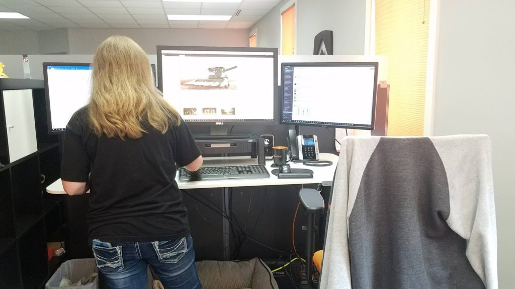
To that end, we chose Ashlee’s work desk as our location. She arranged items on the desktop like a cup, mouse and mouse pad, headphones, and a branded Artonic folder.
Equipment Set Up
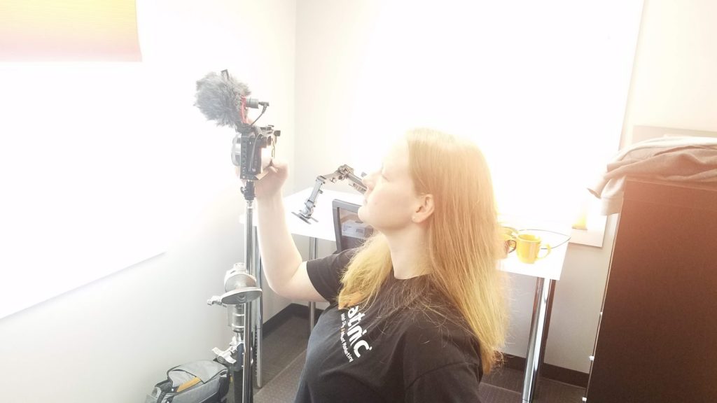
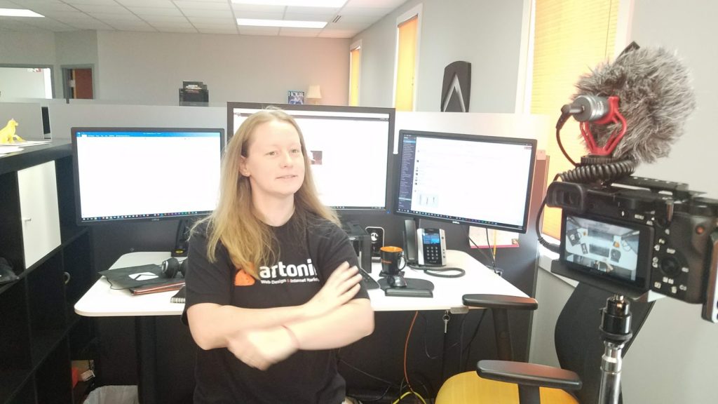
Next, she set up her equipment: a camera, tripod, and a mic to capture audio. This was placed behind the desk, as though watching the individual from the back.
We Need a Puppy
Ashlee’s dog was in the office the day we were making the video banner, so we included her in the footage. Her bed is under Ashlee’s desk, so she was in the perfect position.
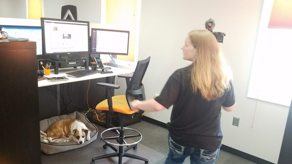
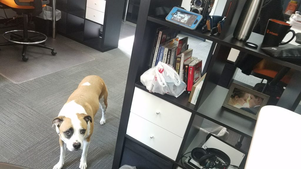
Quinn is naturally gorgeous, so we love to include her in photos and videos when it makes sense. In this case, her presence was perfect, since she’s in Artonic’s office quite often, she adds interest to the video footage, and she’s visually beautiful.
Photos of the Video Process
While Ashlee set up the shot, we took a few photos to document our work.
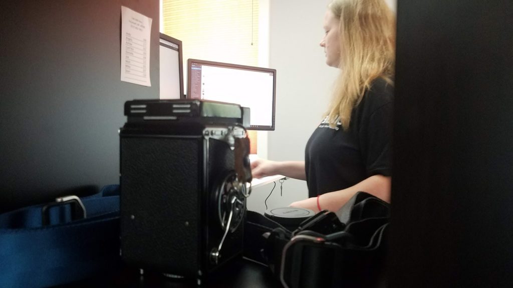
We decided on a simple video – sitting at a work desk, typing, writing, and drinking coffee. We placed an Artonic mug on an Artonic coaster near the model’s right hand. It would be thirty seconds or less, so we didn’t need much footage.
This is actually a really smart thing to do – document the every day things you do and write a blog article about it or post the images on social media. It’s a great way to connect with your audience by showing them the authentic side of your business.
Another View
Ashlee decided to shoot the video from above for a different type of viewpoint. To do this, she positioned the camera and mic above the model.
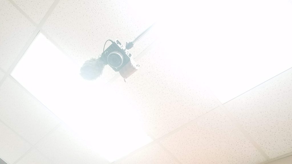
This was actually a lot of fun, and it didn’t take very long. Ashlee was quick to set up her equipment and the location, and we only filmed for a short time, about ten minutes. We used only one point of view with zero cuts, so editing was much less time-consuming than usual.
Watching the Footage Live
She used her mobile phone, placed on a shelf, to view the overhead image as it recorded. This also allowed the model to glance at the screen and see what the shot looked like.
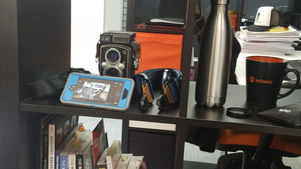
Another reason this video was so quick and easy to shoot was the location. We didn’t have to decorate or even clean up very much, because our office is beautifully branded.
Audio
We recorded audio so that we could have soft background noises included in the video banner. Loud audio that plays automatically when your website loads is not what we’re going for. Instead, we wanted subtle noise to enhance the viewing experience.
Envato makes this statement about auto-playing audio on your website, and we agree:
People browsing the Internet will often be playing music of their own. When another sound comes out of nowhere it’s either a brief shock or a persistent annoyance. Even if you assume most visitors will have their speakers turned off, is it really worth the risk?
Do the right thing and just mute background videos. Trust me, you and your visitors will be happy you did.
Props
We shot at Ashlee’s desk with branded materials, like a mug and a folder. We incorporated a bunch of flowers, but ultimately decided against including them.
Artonic’s desks are white and the props we used – computer monitors, phone, mug, and folder – are black with orange accents. Because our office is excellently branded, it is the perfect setting to shoot an Artonic-themed video.
Video Length
We wanted a short video that we could play on a loop, because we didn’t want the video to slow down our website or overwhelm viewers.

Check out Sitepoint’s view on video length from 10 Guidelines for Better Website Background Videos, “You should always limit the length of your video to 30-40 seconds at the most, or even better, find a short video that loops seamlessly, so that it seems like a longer video, but could be less than 1MB or 2MB in size, depending on the length.”
The Final Video Banner
Our video banner was just completed and submitted to our developer to implement. As soon as he does, we’ll update our post to show you!
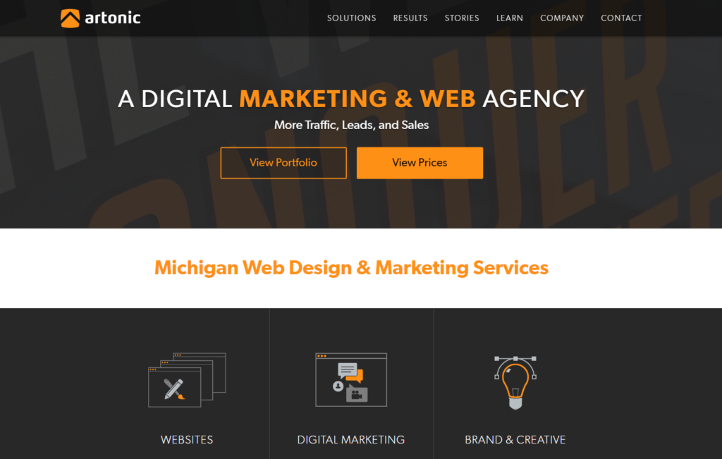
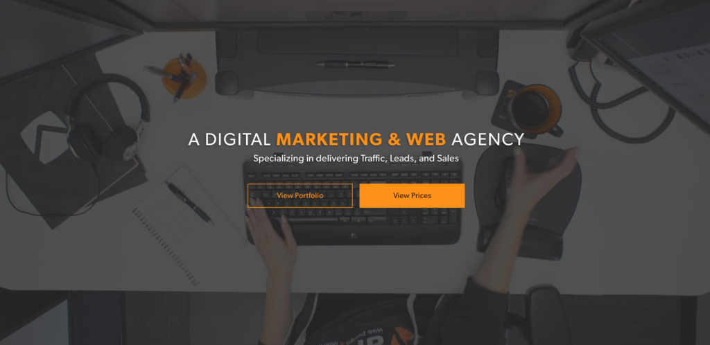
For now, this is what the design of our homepage will look like, with the video banner:
More Resources for Website Video Banners
Want to add a video to your website? Great idea! Videos have been shown to increase conversions online, so why wait?
This free ebook, 10 Stats About the Value of Photography & Videography in Web Design, is a must-read for any business exploring website design and thinking about photos. Inside, you’ll find solid stats that make the case for custom photos and videos on your website.
View Artonic’s Videography
View examples of web design videography by Artonic
Read more information about Artonic’s videography
Check out Artonic’s YouTube channel
Say Hello!
Give Artonic a call or email us if you’re interested in website design, development, or marketing.
Michigan, USA

