What is Storytelling?
By now, you’ve likely heard of storytelling as it relates to business. So, what is it? Basically, it’s your brand story. The story of why you exist and what your purpose is. It’s your marketing message put into the form of a story. A storytelling website is a website designed around this story, so the message is communicated in a clear and creative way to the visitors of the site.

“Storytelling has emerged as a prominent trend in the business world as organizations look to enhance brand awareness and loyalty by telling compelling stories about their products and services.” (A Look at Business Storytelling Skills, Plus Examples by The Balance Careers)
Why Use Storytelling
The reason storytelling is so vital to brands is due to the connection it creates with your audience. People are drawn to visually attractive images of other people – especially of people smiling and interacting with one another. (Check out the stats here.)
Stories get attention. People like to listen to enjoyable stories that evoke emotions and feelings, like joy, comedy, or awe.

Here’s how Coretta Scott King describes her story: “My story is a freedom song of struggle. It is about finding one’s purpose, how to overcome fear and to stand up for causes bigger than one’s self.” Sounds fascinating – and so much better than a stale marketing message.
Storytelling Website Design
Storytelling is a creative way to add value to your website. Websites are excellent platforms to tell your brand’s story.
A current trend in website design is the long scroll. “Long scroll” describes a website that contains a lot of content, thus requires a long scroll to view. We’ve found that visitors respond very well to long scroll websites, as long as the design is user-centered. Here’s why visitors love long scrolling websites:
#1 Engagement – Long scroll web design allows for more user/website interaction.
#2 Appeal – This trend lends itself well to creative products, storytelling, and promotional websites.
#3 Adaptability – Long scrolling websites adapt well to a variety of screen sizes.
We’ve designed and developed several long scroll website designs, and find them very effective for storytelling and lead generation. When new author Ken Rusk approached Artonic for a website to promote his book, we suggested a one-page storytelling website design.
Meet Author Ken Rusk
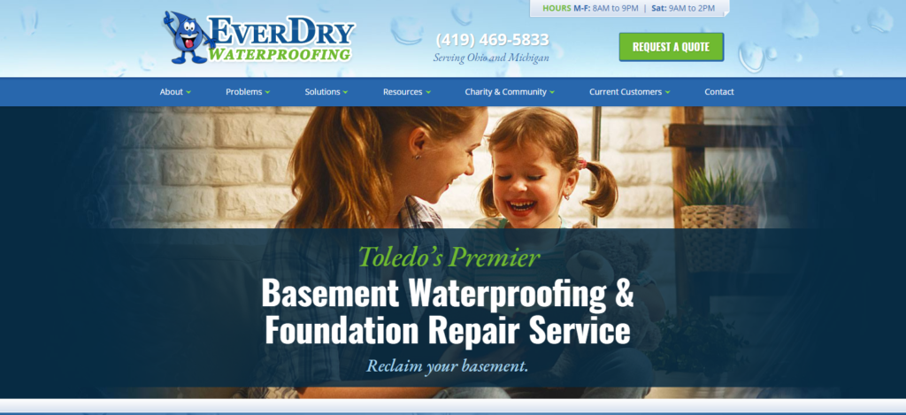
Ken Rusk is an entrepreneur and seasoned businessman. He’s worked hard all his life to build a strong, trusted brand throughout the Toledo area. Years ago, Artonic’s owner and Ken met, and it led to a friendly business relationship. Artonic even built a beautiful, custom website design for EverDry Toledo, one of Ken’s businesses.
So, when Ken decided to write a book, he spoke to Matt about his idea. The book revolved around Ken’s story of hard work in the blue collar business sector. He felt inspired to share his story of success as he heard more and more stories of young people graduating from college with no motivation, no clear path, and tons of debt.

When Ken needed a website for his new book, he chose Artonic. Ken Rusk values beauty, quality, and honesty – all principles that Artonic values dearly, too.
Authenticity
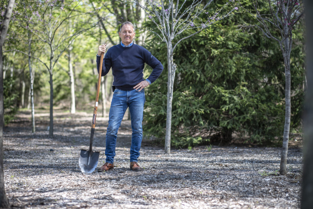
The photo and video sessions were essential to this beautiful storytelling website. Authentic photos are of utmost importance to being unique and real – and to establish a strong bond with your audience.
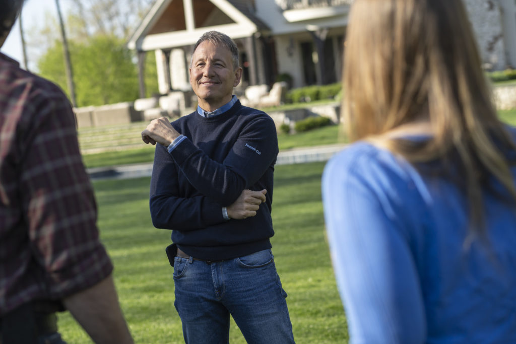
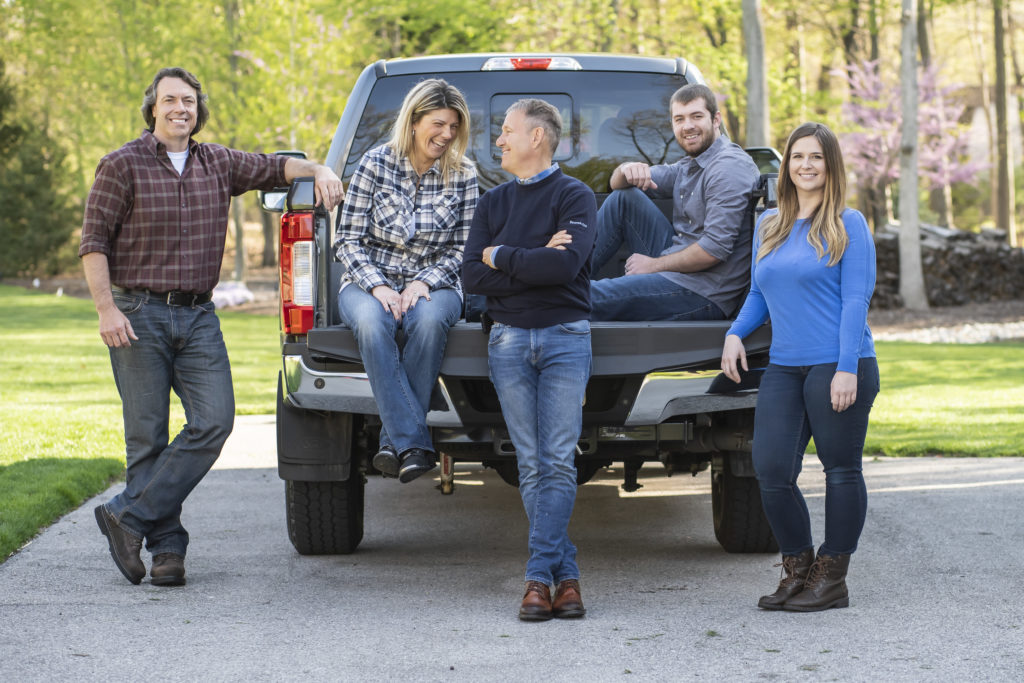
To get these shots, our team arrived at Ken’s home early in the morning. We set up outside and took candid images as the group spoke to one another. Letting them talk as we quietly faded into the background allowed us to see Ken as he really is – and his authenticity shines in the photographs.
Building a Storytelling Website
The photography and video footage captured during our sessions with Ken were the foundation of his storytelling website design. Without this, the story would fall flat and feel fake.
This reason is why Ken chose Artonic to create his author website: to build the best, most authentic website possible. As art-loving, custom website designers and developers, our team was made to build this website.
Research, Planning
Our team poured hours into researching a variety of web designs, from publisher’s websites to established author websites, to identify the level of competition in the market (high) and the expectations visitors currently hold (also high).
We found that many authors’ websites are pretty average, with a heavy emphasis on marketing. There were few authentic photos and videos. The content felt oddly wooden like it was written by marketers, not real authors or artists.
We wanted Ken’s website to be different.
Photography
The first, most important piece, was to capture footage of Ken to use on the website. Thankfully, he approached us during Summer and we were able to get beautiful images filled with green grass and budding trees.
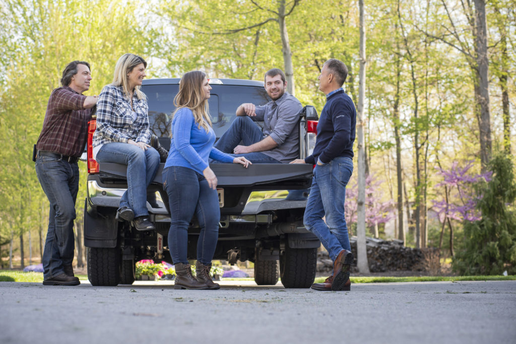
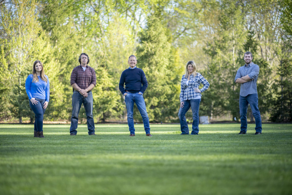
Several important individuals in Ken’s life were also involved in the photo and video sessions.
These people represent those who Ken has worked with as a mentor and guide. He’s helped them in the way he wants to help others, through his book.
Videography
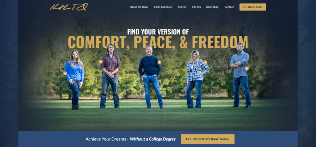
On the homepage banner is a gorgeous hero image of Ken and those he’s mentored. Each has a “+” next to her shoulder; this opens a video of that person.
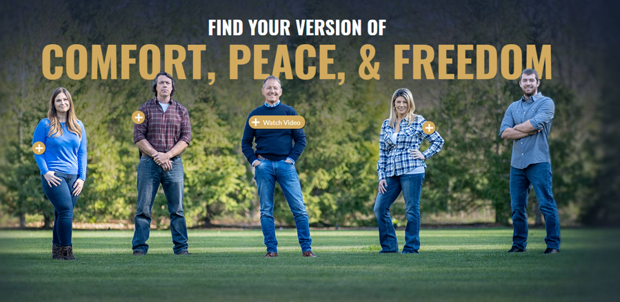
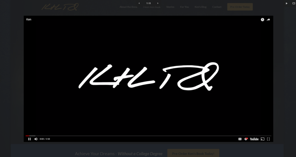
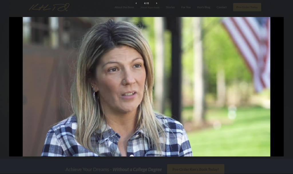
The first thing you’ll see in the videos is Ken’s signature, followed by an interview with the individual. (To watch the videos, visit Ken’s website.)
Farther down the website is a section to showcase each Story video.
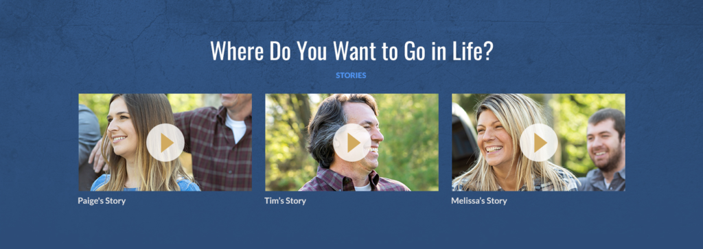
As we captured the video footage, the women and men that Ken had assembled spoke freely, unscripted, for several minutes each. We let them speak and say the things they needed to say to tell their personal stories. These stories are the heart and soul of Ken’s book – and on his storytelling website design.
Content
The words on the website were heavily influenced by Ken’s book and the video footage of people telling their personal stories. The website content represents Ken’s story and is written to connect with readers.
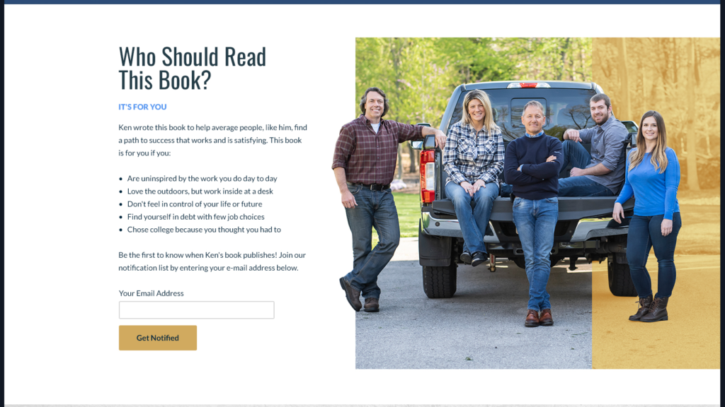
For this section, “Who Should Read This Book,” we spoke with Ken about the people for whom he wrote the book. We focused the content on these people and wrote this section for them.
Adding CTAs
A CTA is a Call-To-Action. This represents an action you want your visitors to take on your website. The CTA on Ken’s book is “Pre-Order Today.” This button encourages people to get Ken’s book; once clicked, an e-mail submission form pops up and the visitor can leave her e-mail. This allows Ken to build an e-mail list of interested readers for his book – a list he can use in his marketing campaigns.
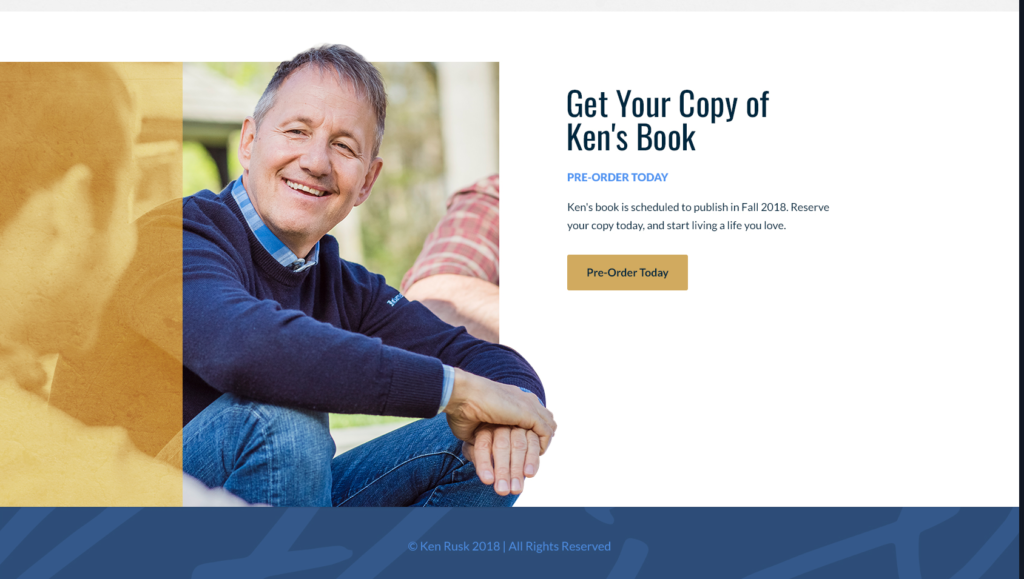
There can be more than one CTA on your website. Just be sure to include a CTA that makes sense. For an author’s website, “Order Now” or “Join My Newsletter” or “Get In Touch” all make sense in certain instances. It’s important to remember balance and strategy when placing and designing a CTA.
Lead Generation
A website strategy was planned for before Ken’s website was designed. To bring visitors to his website, we included a blog. This allows Ken to share his thoughts and promote his book.
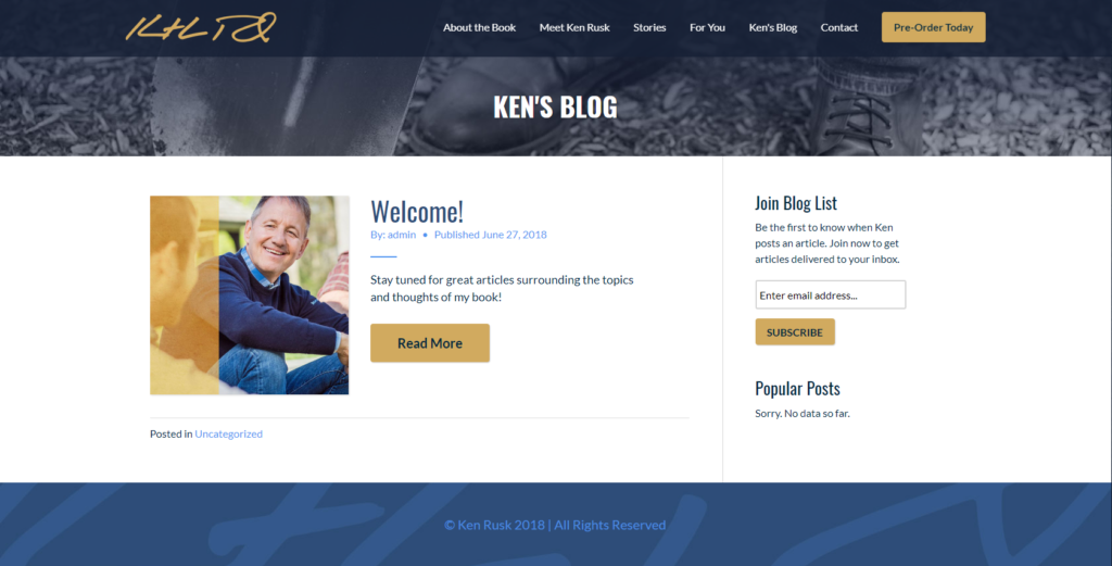
But the blog also allows our marketers to optimize it for Google and include CTAs and keywords in the content to persuade readers to take action on the website – either by contacting Ken, joining his blog newsletter, or pre-ordering his book.
Ken’s Storytelling Website Design
The final design utilizes the gorgeous photography and videography we were honored to capture for this project. Our Sr. Graphic Designer chose deep blue, gray, and white as main colors, with a gold accent. This gives the website a very professional look and a relaxed, friendly vibe at the same time.

The palette also harmonizes with the natural colors used in the photography and video footage. The photos are cohesive and branded; they reflect Ken’s personality and the focus of his book. The CTAs are yellow with easy-to-read black text. Artistic details – the cut out photos, gold overlays, and textures – elevate the design above average – this website has the Wow Factor.
(This is a true custom web design. We build websites from scratch; we don’t use templates or pre-designed platforms. Find out why this matters in What Is Custom Website Design.)
Visit Ken Rusk’s website: www.kenrusk.com
More Resources for Web Design Photography
Thinking about designing a website for your business? Consider adding an element of legitimacy to your design with custom photography.
This free ebook, 10 Stats About the Value of Photography & Videography in Web Design, is a must-read for any business exploring website design and thinking about photos. Inside, you’ll find solid stats that make the case for custom photos and videos on your website.
View Artonic’s Photography
View examples of web design photography by Artonic
Check out our Photography Portfolio
Read more information about Artonic’s photography
Say Hello!
Give Artonic a call or email us if you’re interested in website design, development, or marketing.
Michigan, USA


