Why a Design a Custom 404 Website Error Page?
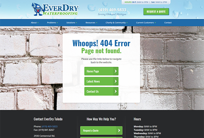
A custom 404 page is much better for usability than the standard 404 page. We recommend a custom 404 page design for several reasons. One, a custom error page is much more attractive to users than a standard design. For example, check out this simple yet appealing 404 website error page design for EverDry Waterproofing in Toledo:
This custom webpage design is much nicer to look at than the standard 404 webpage design.
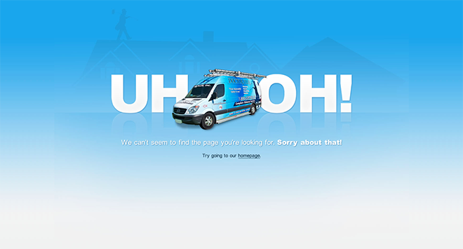
Another reason we recommend custom 404 pages is to boost your brand. When your 404 page is properly branded, your website visitors will know that, when they land on this page, it is still part of your website. Here’s a great example from Doctor Flue of Michigan:
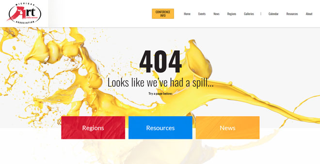
Three, your custom 404 website error page design helps users find the information they want. With easy to identify buttons or links to additional webpages on your site, your visitors can easily find the correct page.
The design for Michigan Art Education Association is vibrant, branded, relevant, aesthetically appealing, and offers helpful navigation links to users.
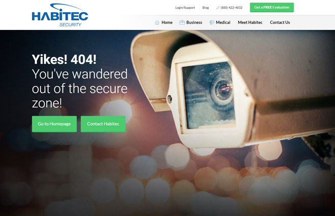
Four, a custom 404 page design can be created to look however you want! You can include a fun design, unique text, and links to other pages on your website. Check out this example for Habitec Security in Ohio:
404 Website Error Page Designs
Over the years, Artonic has designed a LOT of custom 404 error pages! We choose a photo and funny or appropriate saying, add helpful links, and we’re good to go! We’ve put together a list of our favorite – and most ICONIC – 404 website error page designs for this article. Please view them, and tell us what you think.
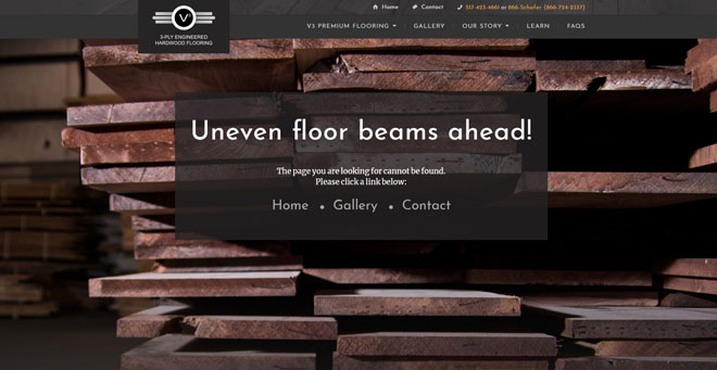
V3 Flooring by Schafer Hardwood
This 404 page design was created for Schafer Hardware of Michigan. The company, located in Macon Township, Michigan, manufactures and installs beautiful wood floors for its clients. The page design is created from custom photography shot onsite. We added a funny saying that was relevant to Schafer’s customer base, to help lighten any frustration users may feel. Last, links to the three most visited pages were included, so users can quickly go to the page they want.
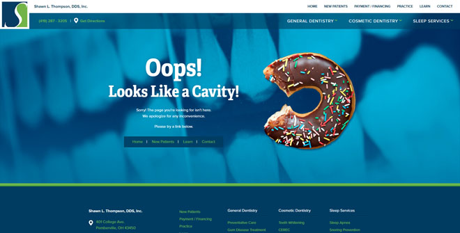
Dr. Shawn Thompson
Ohio dentist, Dr. Shawn Thompson offers dental services in Pemberville & Maumee. For his custom 404 page, we used a partially-eaten donut to grab attention. (The sprinkles add fun colors to the blue website design.) The text is silly and meant to make website visitors smile. It’s also very appropriate for Dr. Thompson to make a cavity joke!
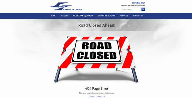
Semi Service
Regional commercial truck and van equipment dealer, Semi Service, is located in Salt Lake City, UT. For this company, Artonic chose a Road Closed theme for its page. The image is simple and offers a lot of contrast to the website design. There isn’t much text, but there are links to both HOME and CONTACT pages (two of the most vital pages to include in your website) to help users navigate effectively.
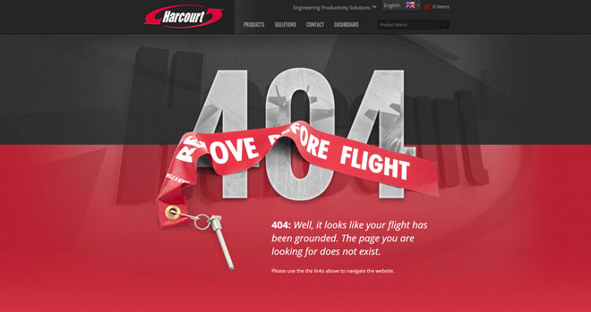
Harcourt Manufacturing
A beautiful custom 404 page was designed for Harcourt Manufacturing from Madison Heights, Michigan. Included is a flight ribbon, an element photographed at the company headquarters. This 404 is sleek and attractive. It supports the overall elegant yet bold Harcourt brand.
Grizzly Glue
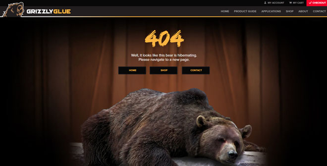
Want something less serious and a little more fun? Check out this iconic 404 page design created for Grizzly Glue, online Michigan-based retailer of famous Grizzly Glue. This 404 page design is a little silly, but it works! Users may feel a bit of frustration when they realize that they’ve landed on an error page, but the bear may help relieve a little tension. Plus, it’s perfectly on brand!
FH Mason Company
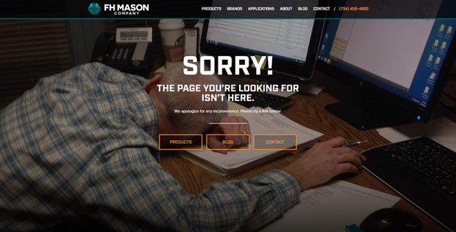
Another one of our favorite 404 error page designs was created for Michigan-based industrial equipment supplier, FH Mason. Again, Artonic used humor to connect to users and help relieve frustration.
401K Rollover Center
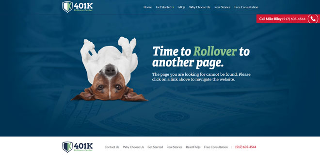
For those who want to rollover a 401k, there is 401K Rollover Center, located in Adrian, Michigan. This custom website showcases information and services associated with 401k accounts.
This 404 website error page is another favorite of Artonic’s because it’s so cute! The dog engages users by capturing attention and making them smile. Plus, the dog is rolling over – keywords for this company!
Leading Families Home
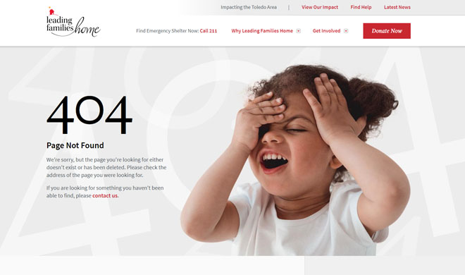
Toledo-based non-profit, Leading Families Home, is a wonderful organization in NW Ohio. The organization works with families who often have young children still at home. This image of a little girl is sweet, funny, and represents LFH’s target audience. We love it!
UpLevel Martial Arts
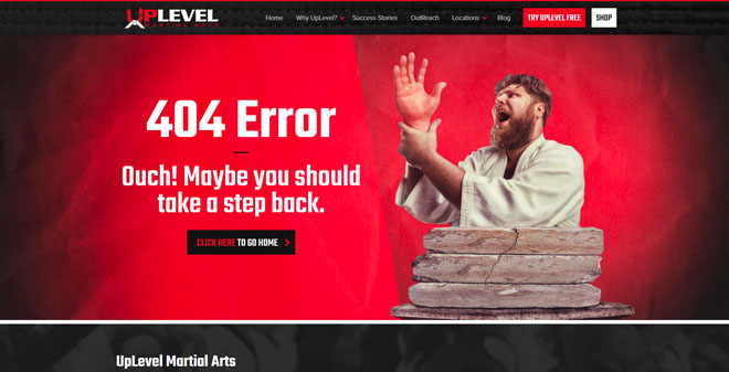
To match UpLevel Martial Arts‘ bold and energetic brand, Artonic created this 404 website error page design. A silly photo that incorporated martial arts was used to boost engagement. The text is large, to communicate to users, and there is only one button. This is a simple yet effective 404 page design, because it includes the brand, humor, one call-to-action, and very little text. The image is also relevant to the overall website design.
DIY Pole Barns
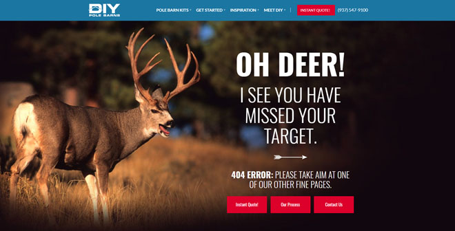
This 404 error page design was created to appeal to the users of DIY Pole Barns’ website. Many of the customer base enjoys the outdoors, and that includes hunting. A funny photo of a deer provided the inspiration for this design. We also decided to have a little fun with the message!
The design for this page clearly links it to the DIY Pole Barn brand and website. If a website user lands on this page, she will understand that she is still on the DIY website. In addition, she can navigate with the red buttons or use the navigation menu located in the header.
Slusarski Excavating & Paving
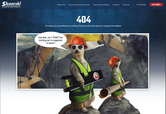
Local excavation company, Slusarski, is all about sitework solutions. The Michigan company offers several sitework-related services for contractors and builders as well as business and home owners.
This is a colorful and funny 404 error page design, intended to make people smile. As we’ve mentioned before, if a user encounters a 404 page, he may be frustrated. Help lower his frustration with a bit of clever fun.
Our Favorite: UNISORB
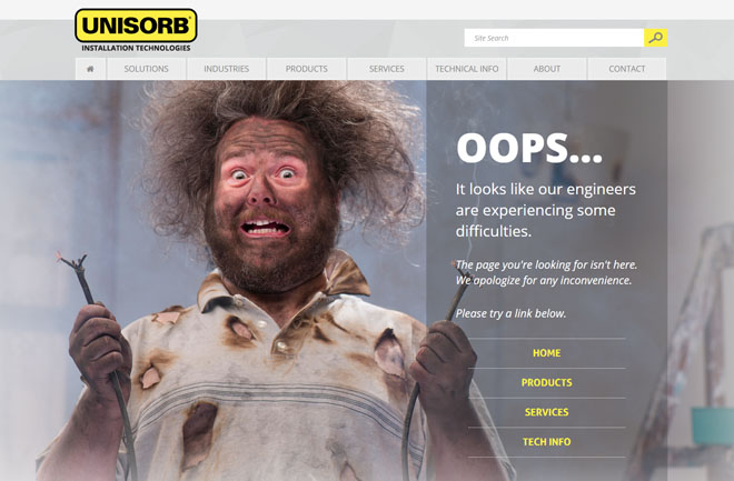
Finally! Our favorite 404 website error page (so far) is UNISORB! Located in Michigan Center, Michigan, UNISORB offers B2B installation technologies to manufacturing companies across the state. The company offers services as well as products. UNISORB was a fun project to work on, and our contact at UNISORB’s office was hilarious. We were inspired to create the following page, which we adore!
Need a Custom Website Design?
If you’re creating a website, it’s important to get all the details right. Need help? That’s why Artonic is here – to support your goals and make your website a success.
Each website we build is completely custom. We do not use templates. (Find out why a custom website design matters). Every piece of your website is created specifically for YOU – your goals, your audience, your strategy, and your brand.
Find out what it’s like to work with an agency to create the website of your dreams: View videos and read case studies about stories from our clients.
Say Hello!
Give Artonic a call or e-mail us if you’re interested in website design, development, or marketing.
Michigan, USA


