The Biggest Lie In Dental Website Design is that your dental website is unique.
This is a lie if your web designer created your web design with a template and stock photography. This is a lie if your marketing team uses the same blog on your website as is on another dental website.
Dental Website Design Lies
These designers lie and tell you that dental practices don’t need custom website design. Instead, these agencies push template designs built on WordPress (or another platform). These templates are used over and over again for dental practices throughout the country (we’ll show you several examples in this article).

Dental Photography Lies
Additionally, they’ll tell you that you can use stock photography instead of authentic photography. This is dangerous, especially if your competitors also use the same web design agency. When you use stock imagery in your dental web design, you’ll find that lots of other dentists also use the same stock imagery in their designs. (We’ll show you examples of this, too!)
Dental Marketing Lies
Another lie is that they already have the perfect plan to market your dental website – in fact, it’s the same plan they’ve used on many, many other dental practices. The lie here is that all dental practices are marketed the same way, using cookie-cutter marketing tactics without a long-term strategy.
The worst part of using a pre-planned, generic strategy to market your practice is that there is zero branding differentiation between your practice and your competitor’s practice. In fact, we’ve seen dental practice blog articles, tweets, Facebook posts, and e-mails that are identical to one another except for the dentist’s name and address.

Template Dental Website Designs
Do you have a template web design? You can answer YES if your website is built on a platform like WordPress or Joomla. Your web designer may have told you that your website is custom – but if it’s built on a platform, it’s not a custom website design; it’s a customized template.
The following dental website designs utilize the same template. Notice the location of design elements – see any similarities?
Adrian Dentistry in Adrian
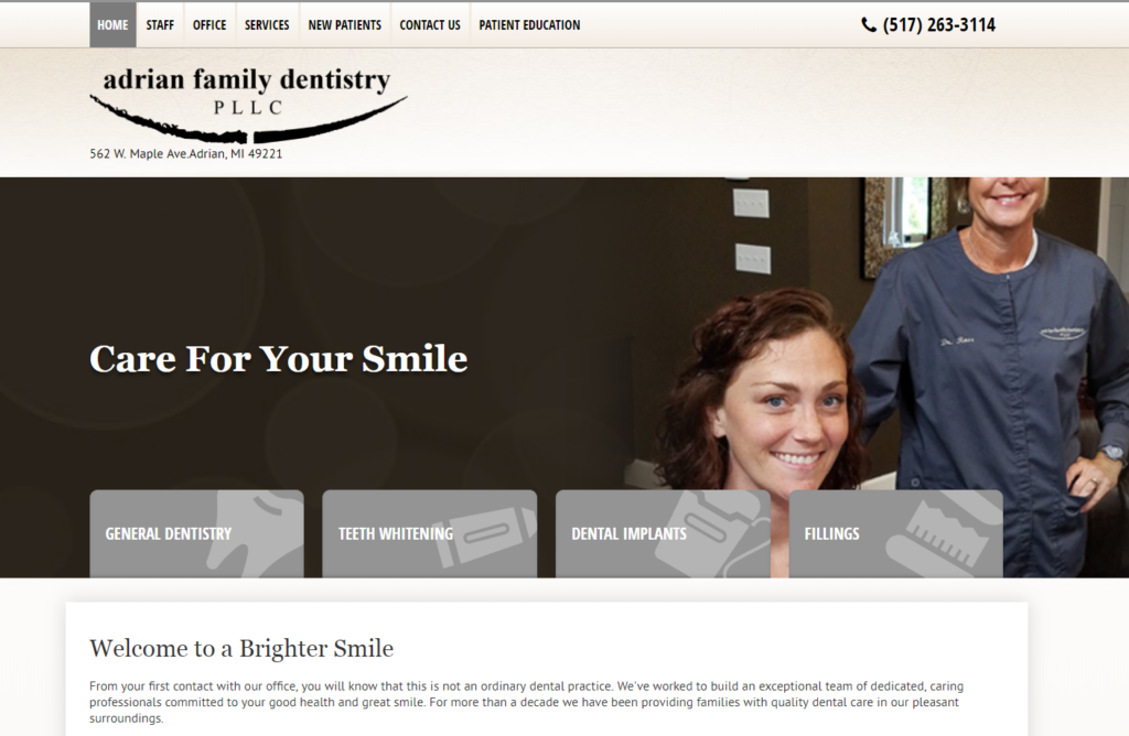
Adrian Family Dentistry uses a template that looks identical in layout to several other dental websites in the local area.
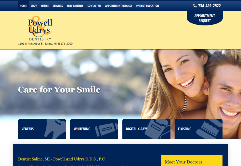
Powell & Udrys in Saline
Compare Adrian Dentistry (above) to Powell & Udrys (below). Both dental websites use the same template.
Stock Photography
Frequently, dental website design features stock images. Stock imagery can enhance a website design if used correctly and in conjunction with authentic photography.
Using stock imagery alone – with zero authentic images – is not a great idea. Many of the images look very fake and staged. Also, if you use stock images a lot, you may find that your competitors are using the same images.
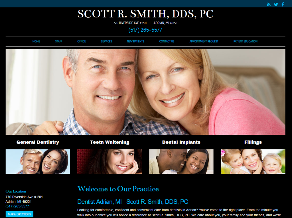
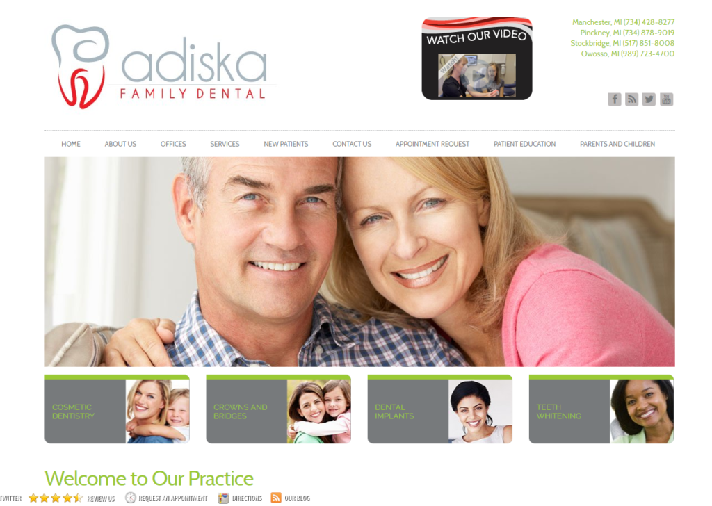
The dental website for Scott R. Smith, DDS, PC and Adiska Family Dentistry share identical banners. If you visit both websites, you’ll see that the websites use almost identical images. This wouldn’t be a huge deal – except that both dental practices are located in SE Michigan.
Scott R. Smith, DDS in Adrian
Adiska Family Dental in Adrian
Does this photo look familiar? Image searching for a dentist in Adrian and seeing the same images on two separate websites. Would this confuse you? Or make you think that the dental practice is low quality?
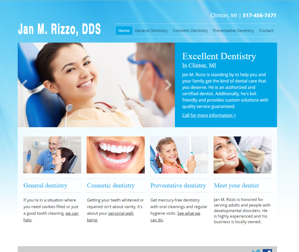
Jan M. Rizzo, DDS in Clinton
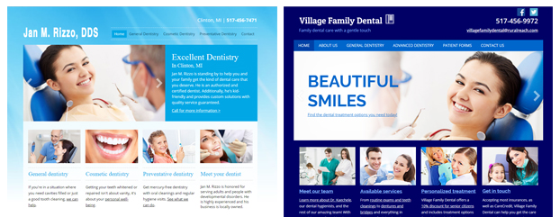
Again, we see two dental practices – Jan M. Rizzo, DDS and Village Family Dentist – with the exact same banner image. Both dentists are located in the same small village of Clinton, Michigan.
Village Family Dental in Clinton
Here’s the exact same image – used for a competitor in the same city.
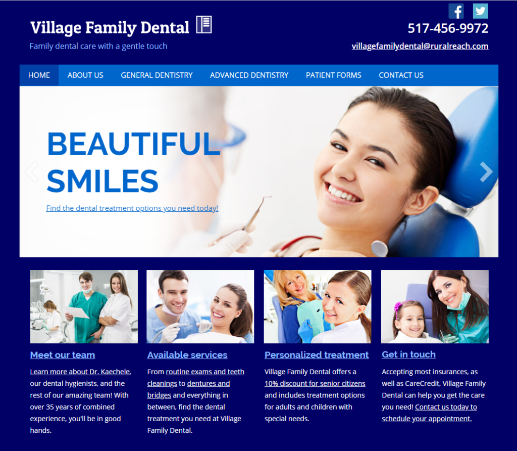
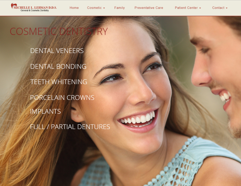
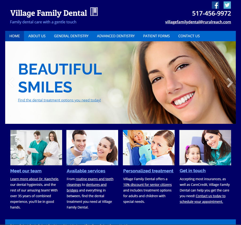
Village Family Dental may want to re-think its photography… The following images showcase the same model. All dental practices are located very closely to one another – one in Saline, MI and two in Adrian, MI.
Stock Images – Saline, Adrian, Clinton

Bad Dental Website Design
Don’t get caught in the lie that website design is unimportant – that’s just not true. The way your website looks is vital to your brand. It’s also a major way potential customers judge your practice, and could be the determining factor in their decision to contact you (or not).
Haddock Dentistry in Ann Arbor
This website design for Susan W. Haddock, DDS uses several different fonts, font sizes, and colors – all elements that make this dental website design look messy.
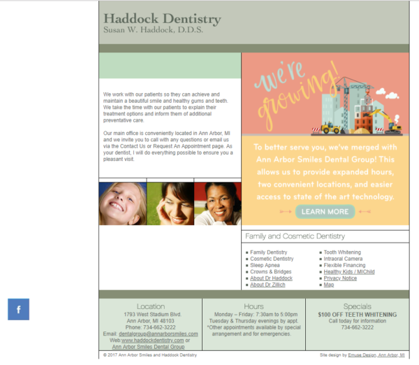
The lack of navigation may also hinder potential customers from finding the information they need.
Check out the bottom of the website – this is where Haddock Dentistry showcases its specials, hours, and location (all vital info for patients). Simply moving this info to the top of the website would greatly increase its visibility.
Josephine C. Weeden, DDS, MS, PC in Adrian
This website design has a 2014 copyright in the footer, which makes us wonder when it was last updated. How old is the photo of the dentist?
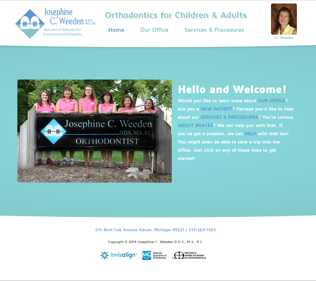
Additionally, the colors used for the text is pale blue and pale sage green. These are not high-contrast colors and may be difficult or impossible for certain people to read.
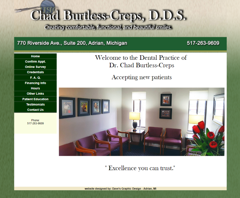
Burtless-Creps, DDS in Adrian
This dental website design is visually unbalanced. It uses drop-shadows, which is outdated from a design standpoint and is difficult to read from a user-experience standpoint.
Love Family Dental in Adrian
Another Adrian website design is Love Family Dental. This is the homepage:
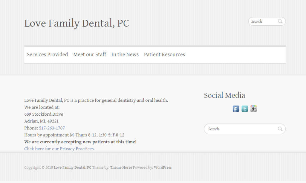
The lack of images makes this website very drab. There is no content under the page Patient Resources.
Generic Marketing
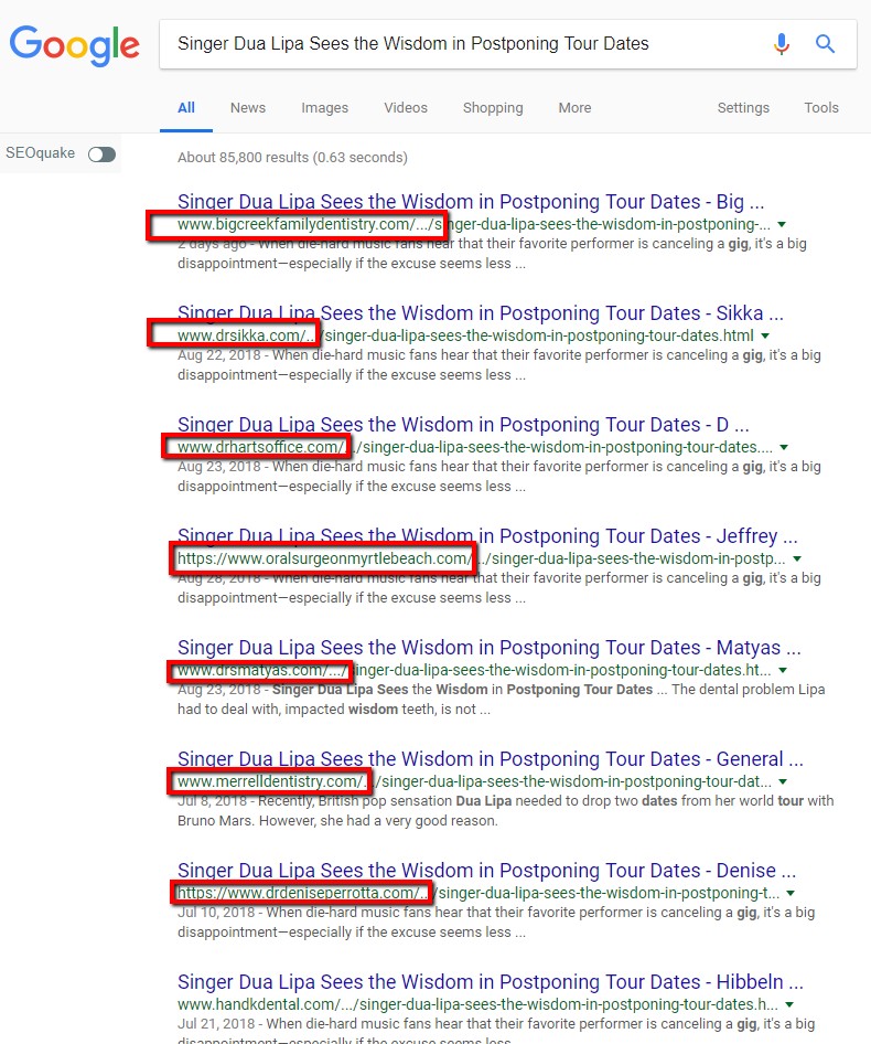
Think your dental blog is unique? Think again. Many dental practices are exploited by low-end marketing companies that post the same blog over and over again across the Internet.
Singer Dua Lipa Sees the Wisdom in Postponing Tour Dates

The blog Singer Dua Lipa Sees the Wisdom in Postponing Tour Dates listed on Scott Hood, DDS’s website is replicated across multiple dental websites. As you can see below, every single one of these dentists has published the exact same blog:
Zero Marketing Strategy
If your dental practice partakes in generic marketing, you probably have little to no real marketing strategy.
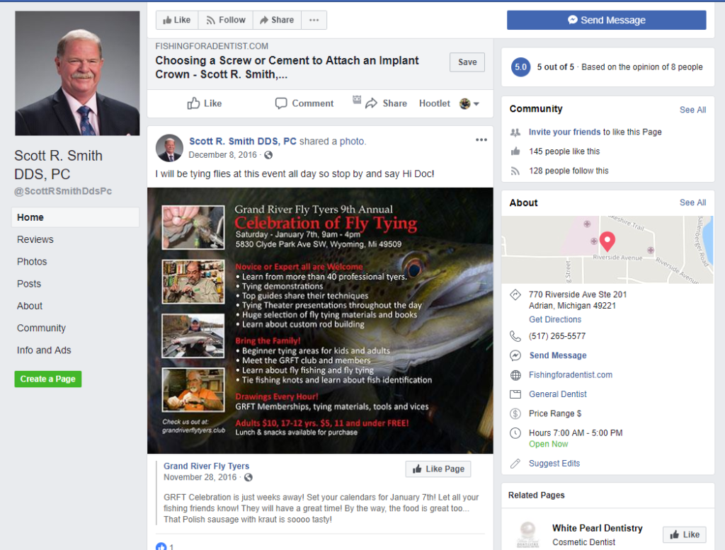
For example, the Facebook page for Scott R. Smith, DDS shows photos and info about fly fishing in addition to his dental practice.
Custom Dental Website Design
If you’d like a website that is truly unique, please consider Artonic in Michigan. We plan, design, and develop completely custom dental websites – websites that are built from scratch.
We also offer photography, videography, logo design, and branding. Artonic has a full-service digital marketing team as well, to promote your brand and grow your business.
Say Hello!
Give Artonic a call or email us if you’re interested in website design, development, or marketing.
Michigan, USA


