
Get More Website Sales – 7 Rules of Engagement
Ready to get more website sales on your e-commerce website? Then you’re ready to learn the 7 Rules of Engagement to increasing leads and sales.
First, think of your website as “home base”; it must be safe, inviting, uncomplicated, and made for clear communication. It should be the opposite of a minefield; don’t dig ditches for your users to fall into.
Second, honestly review your battle plan. Is your website designed to attract leads and increase online sales? Do you have a strategic marketing plan in place focused on your target audience? If not, don’t worry! Follow our tactical battle plan outlined below, and soon new opportunities will begin to appear on your radar (or in this case, your Google Analytics dashboard).
Rule #1: Gather Intel
As a soldier, preparation is vital. Gather as much Intel as you can – meaning, get to know the people you’re selling to.
- Know, understand, and listen to your target audience. Prepare with research, testing, and surveys.
- Keep an eye on what your competitors are doing and differentiate yourself.
- Explore ways to keep in touch when your team (the people who use your website) isn’t visiting your website – use e-mail marketing, social media, your blog, and other ways to connect with those who matter most.

Rule #2: Measure Performance
Getting ready for battle? You must operate at peak performance. That means pages that load quickly, contact forms that work, questions that get answered, and any other functions that your website should perform. This is not the time to be sloppy; online shoppers are ruthless when it comes to poor website performance:
- 51% of mobile internet users say that they’ve encountered a website that crashed, froze, or received an error.
- 47% of consumers expect a web page to load in 2 seconds or less.
- 40% of people abandon a website that takes more than 3 seconds to load.
- A 1 second delay in page response can result in a 7% reduction in conversions.
(Stats from Kissmetrics Blog: How Loading Time Affects Your Bottom Line)
Rule #3: Build Camaraderie
Why is it so important that your website looks and performs a certain way? Because you’re trying to engage your website visitors by appealing to their emotional natures. If you can influence your visitors’ emotions, you’ll see sales increase.
How does this work? It’s because people are “creatures of emotion”:
“When dealing with people, let us remember we are not dealing with creatures of logic. We are dealing with creatures of emotion, creatures bustling with prejudices and motivated by pride and vanity.” -Dale Carnegie
Consumers make buying decisions that are heavily informed by emotions, not logic. Emotions are the main drivers in the decision-making process.
You can influence your website visitors’ emotions and persuade them to take the actions that you want them to (i.e. purchasing a product or signing up for a newsletter). How?
- Understand why your target audience buys from you and use this info in your brand messaging
- Communicate a consistent brand message online that’s customized for your target audience
- Use images that your buyers can relate and connect to
- Make your website easy to use (we don’t want frustrated customers!

Rule #4: Avoid Danger Zones
Potential minefields ahead! Consider soldiers crossing a minefield – that’s how certain website elements can appear to users. Danger zones refers to anything on your website that causes users to think of your company as untrustworthy and unauthentic.
Website builders and stock photography are potential danger points for your e-commerce website.
Watch Out for Website Builders
A website builder allows anyone to build a website, using design templates. This isn’t necessarily a bad thing; template websites can be the best choice for a very small business or a contractor. They are also great choices for personal websites, like websites created to display photography or to plan a wedding.
However, if you own a large company and are serious about competing online, a custom website is probably a better choice for you.
Custom websites are tailored to your specific needs and designed for maximum performance and seamless user-experience.
A custom e-commerce website is built to your specifications and unique needs. Not only does it load quickly, it beautifully supports your brand message.
Dodge Perilous Stock Photography
The imagery you choose for your website is very important. Not only is it a way to connect with your audience, it also raises the appeal and attraction of your website.
Does it really matter if I use professional photography on my website? Studies say YES!
- Web visitors can figure out whether a photo was professional or amateur 90% of the time
- Professional photos are twice as appealing to subjects; they are more likely to be shared online, viewed longer, and considered ‘memorable’
(Stats from the National Press Photography Association (NPPA): Study Finds that Professionally Captured Photos Are More Memorable Than Amateur Ones)
Stock photography can be used in certain instances, especially for shots that are difficult to capture. Be aware how much and what type of stock photography you use; you may be giving your web visitors the wrong impression of your company. Plus, be on the lookout for overly posed (“cheesy” or “fake”) photos.

Keep the End Goal in Mind: Sales
When someone lands on your web page, the goal is to make them stay on your website, explore your website, and return to your website again and again. Custom photography and a custom website design are vital to helping you accomplish this goal.

Rule #5: Map the Terrain
UX/UI are abbreviations for User-Experience/User-Interface. User Experience describes the interaction your visitor has with your website. You want your visitors to have great user experiences when they use your website. User Interface is the design that facilitates your user’s journey through the website. This is how your website is laid out and how it looks. UI design heavily influences UX.
UI guides your website visitors along their journey through your website. This is similar to providing your (army) with a map. How accurate is your map? Is it easy for visitors to find what they’re looking for? Or do unclear signs create confusion? Offer a guided experience that is easy to follow and understand.
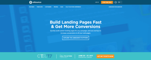
Specifically, if you want a user to click a button, make the button stand out: make it very large, a different color than your color scheme, and be very direct with the text on the button. Use an action word – the action you want the user to take. Support the call-to-action with an engaging visual and a heading that speaks to your target audience.
The example below is from a landing page conversion company (they know what they’re doing). Where do you look first? Is it the orange button? That’s intentional. Be intentional with your layout and CTAs, and see conversions (sales) increase.
When someone lands on your home page, it’s an opportunity. It is your opportunity to take them by the hand and guide them through their journey, from interest to conversion (sale) and beyond.
An unattractive and poorly designed website can be a battlefield for users. But a detailed and easy-to-read map makes the journey enjoyable and easy for users.

Rule #6: Communicate Clearly
When communicating with your troops, be clear and direct. Don’t waste time on unnecessary words or graphics that don’t make sense. Par down your message so it’s easy to understand and easy to consume. Also, listen to their questions and answer them. Make those answers easy to find.
Give Clear Orders
Give your troops clear orders: let them know where you want them to go and what you want them to do.
Want a user to sign up for your newsletter? Make that very clear by writing concise, to-the-point text and separating it graphically from the rest of the content.
Listen & Answer
Not sure what your target audience wants? Here’s a great place to start while you gather market research: The Big 5: Blog Article Topics Guaranteed to Drive Traffic, Leads, & Sales by Marcus Sheridan.
Some of these topics may be difficult to write – The #1 question most users want answered before they engage with your company is PRICE! How much is this product or service going to cost me? Do not be afraid to list the cost of your services on your website. Give them what they want!

Rule #7: Educate & Engage
Keep troops engaged with interesting content that they want to consume. This goes back to Rule #1 – know your target audience so that you can give them what they want.
- 72% of marketers say relevant content creation was the most effective SEO tactic
- 47% of buyers viewed 3-5 pieces of content before engaging with a sales rep
- B2B customers are more than 2x as likely to consider a brand that shows personal value over business value, because they perceive little difference in the business value between suppliers
(Stats from Hubspot Marketing Statistics, DemandGenReport.com 2016 Content Preferences Survey: B2B Buyers Value Content that Offers Data and Analysis, and MarketingWeek B2B Branding: Where Is the Love?)
When creating content for your website or blog:
- Educate the end-user on what it is like to do business with your company and relevant/helpful topics related to your industry.
- Create topics based on frequently asked questions and things you want your audience to know.
- Use Google AdWord’s Keyword Planner Tool to find the words and phrases that your audience uses.
Engagement in the Wild
We have a “Learn” tab on our website to serve content to our audience. The more relevant content you publish to your website (based on your products, services, or industry), the better for your potential customers.
Conclusion
Now you’re equipped to get out there and use your website as a “weapon of mass attraction” – you’re ready to get more website sales! If you have questions about how to apply the 7 Rules to your sales strategy, let us know – email Artonic at [email protected].
Get the Free eBook: E-commerce Web Design Best Practices
