Your website is quite likely your customers’ first impression of your business.

You know how important first impressions are; what impression does your website give your customers? If you haven’t redesigned your website in a few years, it’s likely that your website gives the wrong impression online.
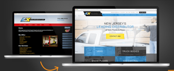
Do I Really Need to Redesign My Website?
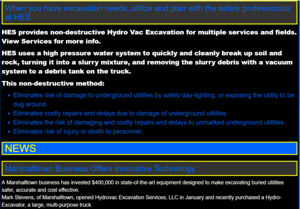
Websites, much like houses and hairdos, need to be updated. You really don’t want to be the last person with the mullet, or the “framed” coding and comic sans font, do you?
Depending on the business you are in, you probably need to redesign your website every two to five years.
Take a good hard look at your website, and ask yourself some of these questions:
Is Your Design (Style) Outdated?
Look at your website with the eyes of someone seeing it for the first time. The first impression of the design, or style, of your website creates an emotion in your visitor.
Not sure if your website design is out of date?
Your website design is outdated if it’s…
-
Unbranded
Your website should match your brand. Are the colors and fonts correct? Is your logo used properly? Does your website have the same feel, tone, voice, and look as your brand?
-
Inconsistent
We’re not just talking about your design being inconsistent with your brand; we’re talking about your design being inconsistent overall. Do you use a consistent color scheme? How many different fonts do you use? Do all of the pages on your website have a consistent look?
-
Distracting
Your website design should support the goals of your website. If your website design calls too much attention to itself, it could be a distraction to your shoppers.

Is Your Technology Outdated?
Technology changes quickly, and if you want it to work for you, you have to stay on top of it.
Your website technology is outdated if it’s…
-
Incompatible
There are many different ways to view websites now with five major browsers, wider monitors, tablets, and smartphones. Do you know how your site looks on all of them? Is your website compatible with the main browsers (Chrome, Firefox)? Have you checked your site on both Androids and iPhones? What about different sized tablets? Make sure that everyone has an enjoyable experience on your website, no matter how they view it.
-
Broken
Do you have errors or broken links on your website? Make sure all of your links are working and current, including internal links. Broken links frustrate your website visitors, so be sure all your links actually lead somewhere. (Read more about links that go nowhere in the article, Quick UX Lesson.)
-
Unusable
Has a usability study ever been conducted on your site? Track visitor activity on your website to determine what is being viewed, and which areas are of the most interest. This knowledge can help you in modifying your services and product areas to those with the most interest, and lead to increased sales.
-
Unaccommodating
You may want to consider adding a shopping cart, forms, a place for requests, customer log-ins, or even online appointment setting to further assist your customers.
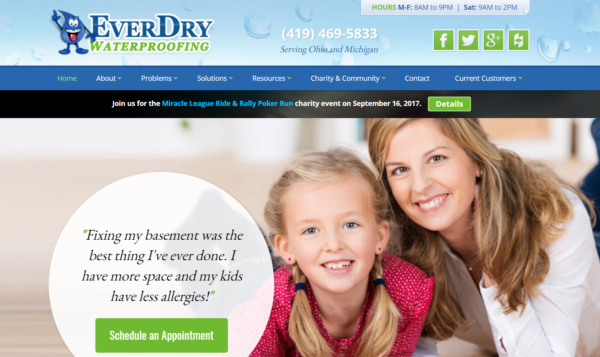
Is There A Reason To Come Back?
Is there a reason for your customers to revisit your website?
Generate some interest to get repeat visits, as well as new traffic. This can be fun and creative or informative. Get your customers to come back, again and again, with:
-
Sales, Specials, & Savings
Think about adding specials, coupons, sales, or new arrivals.
-
NEW!
Post statistics related to your business, how-tos, recent work and projects you have completed, before and after pictures, a portfolio, or customer stories.
-
Reviews
Allow a place for customers to give their feedback, which in turn, will help you better your business.
-
Blog
Writing a humorous or informational blog, a monthly newsletter, or a calendar with upcoming dates will bring those customers back for more!
How Does Your Website Rank on Google?
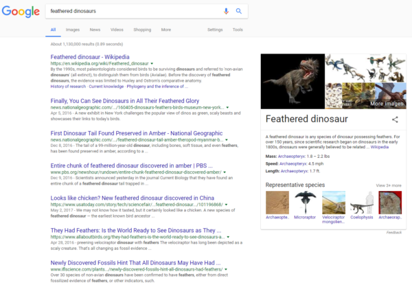
How does your site rank in Google? This is an important part of how your customers find you today. Make sure that your website is being found!
Check out these things:
-
Keywords
Are your keywords up to date? Does your text contain an appropriate ratio of important keywords?
-
Content
Update your written content frequently to increase your ratings.
-
Bad SEO
Be careful not to flood your keywords, because this will do more harm than good.
Most customers will not browse past the first few results pages when they do a search. Ask us how to help your company be on that first page!
Is Your Website Easy to Use?
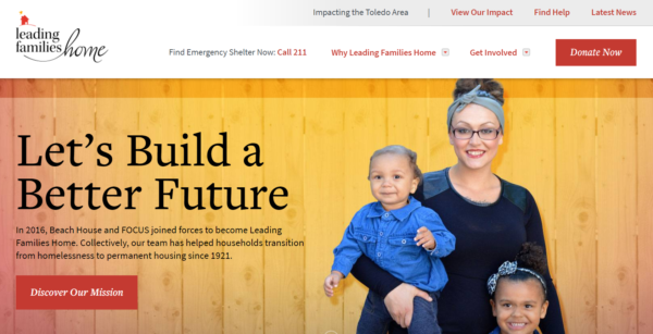
When people come to your site, is it user friendly? Your layout should not only be pleasing to the eye, but easy to use. An easy-to-use website is a website on which people can find what they’re looking for, quickly and easily. A user-friendly website guides your website shopper along her journey. Everything is easy to find and easy to read.
-
Intuitive
Can customers find what they are looking for easily? Do customers ever complain that it’s difficult to find certain things on your site?
-
Legible
Make sure the text is the right size and in good contrast to the background. If your background is a picture, it can be difficult to read text over this.
-
CTAs (Calls-To-Action)
Not only should customers be able to find the information, they should be naturally led to other interesting parts of your site as well. Make sure your links and buttons are prominent and all your information is easy to find.
Does It Represent Your Company Today?
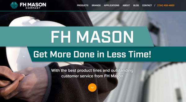
When you first built your website, it was a big step. How long ago was that? Does your website still represent your company? Or does it represent how your company was, years and years ago?
-
Growth & Change
Has your company grown or changed since then?
-
Branding
Have you changed your logo or colors?
-
Specialization
Maybe you specialized, or have become known in the community for excelling in an area.
-
Success
If you have won awards, reached goals, or received some great press, make sure to share that great news! Sharing your successes demonstrates that your business is doing well, and builds confidence with your potential clients.
Does Your Website Help Your Business Grow?
A decade or two ago, websites were designed like a yellow page ad or brochure.
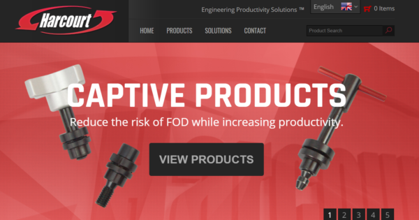
Today, a website is not only a customer’s first introduction to your business, it is the best source of information about your business. It’s one of the most important ways to serve your customers. Your website can also assist your sales team and help you get more leads and sales.
-
Answers
Are there questions that customers frequently ask you? Answer them on your site to further free up your staff’s valuable time.
-
Lead Generation
Use your website to turn visitors into hot leads! Your website can be a powerful tool that brings qualified leads into your business.
-
International Traffic
Do you need to think about business overseas? Websites are open 24 hours a day, 7 days a week. Open your business up to local, interstate and international business markets. We can assist you with translation services. Reach specialized markets, and different demographics. With 1.6 billion Internet users in the world, there are certainly more people out there that need your product or service.

It’s Time for a Website Redesign
If you feel that it’s time for an entire new website, start gathering information on how you would like your website to represent you.
-
Make a List
Make a list of things you would want your website to have now and want to add in the future.
-
Focus on the Goal
Focus on the updates that will make the biggest impact and generate new business with both current and new customers.
-
Represent Your Brand
Make sure you are representing your company at its best, and keeping up with the ever increasing opportunities!
Download the DIY Case Study
DIY Pole Barns invested in a website redesign along with AdWords to explode its online business.


