Japanese Website Design
Website designs from Japan offer endless inspiration through intelligent outside-the-box ideas, seamless development, and the latest technology. Current Japanese web designs are fascinating and beautiful.
Here is a quick compilation of the website designs featured in this article:
Always a source of inspiration, artists and designs from Japan love to keep things fresh. Many of the web design trends we see in Japanese website design are found in Japanese fashion, photography, and modern art.
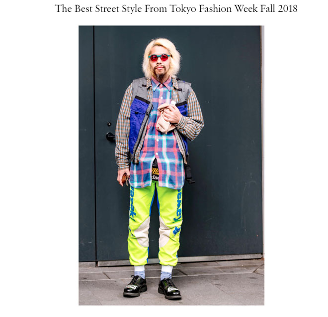
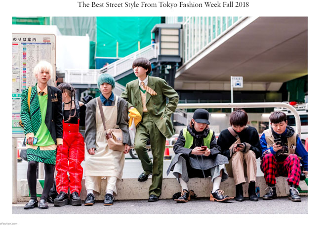
Tokyo’s Fashion Week happens in the fall. This year we saw many fresh, fearless styles from the iconic city. Japan continues to surprise and delight us with its intelligent, quirky take on modern fashion.
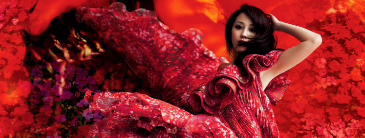
Similarly, Japanese photographers reflect current culture and push boundaries in their art. Photographer Mika Ninagawa offers “simultaneously a traditional and ultra modern view of Japan” through her lush, vibrant images. (source)
These same elements can be found in web designs created by Japanese web designers.
Surprise Delight Happy
The first trend we’ve seen from Japanese web designers are the elements of surprise, delight, and happiness. Celebrated artist Yayoi Kusama fills her works with these elements.
How do you use delight and surprise in website design? Check out the following examples Japan web designs.
USHIO CHOCOLATL
by Junsuke Takeda (Japan)
https://ushio-choco.com/
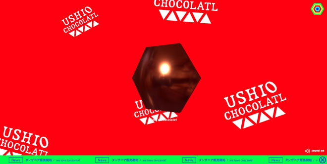
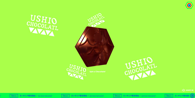
The website for USHIO CHOCOLATL, a chocolate factory in Onomichi, Hiroshima, is a true delight. Vivid neons provide colorful backgrounds to the brand’s logo which spins around the image of a chocolate in the center of the homepage banner.
The design uses neon colors and movement to create a fun, unique web experience. The icons – a large rainbow-colored button in the top right corner, the huge arrow your mouse becomes as you navigate the site – are simple and huge. Along with the neon green banner at the bottom of the website, the buttons add an old skool vibe to this website design.
CALAR.ink
by calar-ink (Japan)
https://calar.ink/
Another delightful website design is the official site of creative unit CALAR.ink. From a quivering, hand-drawn logo to strobing background colors, this Japanese website design is a sight to see!
So, what is CALAR.ink? Here’s what it says on the website:
“CALAR.ink (color dot ink) is a creative unit formed by members with diverse skills such as art, design, technology and space… Like a colorful ink that mixes and spreads randomly, it aims to create works that can penetrate deeply and vividly into the memory of each person.”
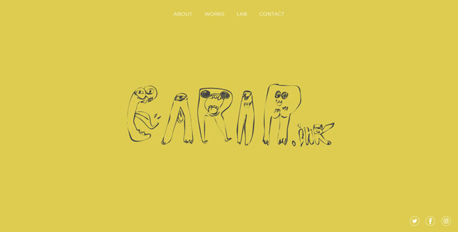
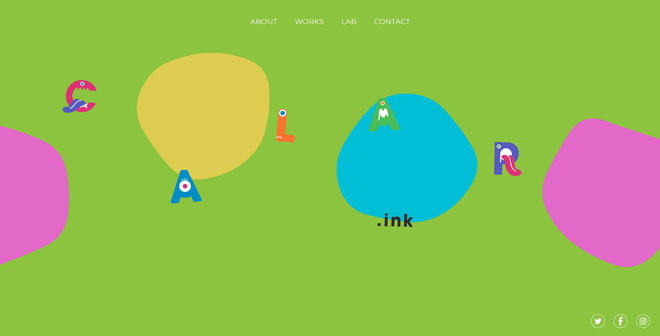
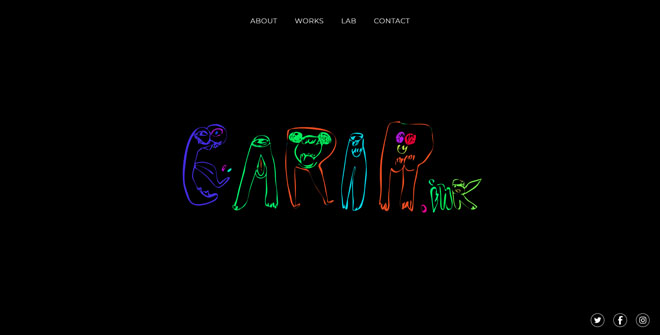
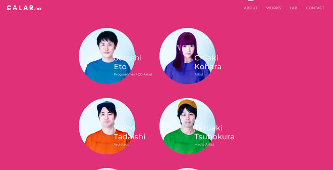
The abundance of creativity and color offer great delight to visitors. Navigating this website feels like playing a game or watching a cartoon (lots of fun).
Note the “ABOUT” page portraits; they’re simple and colorful. This page is an excellent example of how design impacts content. Even though this page offers basic information, it’s still wonderfully designed.
Quirky Unusual Irreverent
Another trend to surface in Japan lately is an unconventional, quirky style. This style is closely tied to the trend that incorporates delight into design, but in contrast this style is a little cheeky.
Japanese photographer Motoyuki Daifu showcases a similar irreverence in his photography. His works are non-conformist, multi-layered, and burst with color.

+Ring by school (Japan)
https://ringer.tokyo/
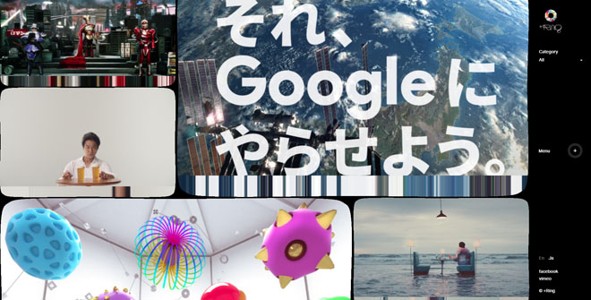
Check out the web design for +Ring, a “creative post-production company that uses high-end CG, VFX, editing, and sound design to provide optimal solutions for a wide range of media.” This Japanese company’s web design is flippant, colorful, and decidedly quirky.
The Shift by Garden Eight (Japan) with 7.21
https://theshift.tokyo/
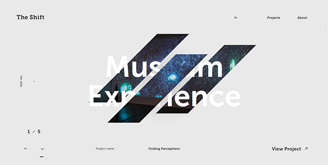
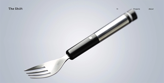
Another unconventional website design is for The Shift by Garden Eight with 7.21. This company assists businesses or organizations with change or shifts. “The Shift was created for things and people desiring a shift – a movement, a change – in business, organization, space, product, or service.”
The homepage showcases the company’s recent projects. Scroll down and watch the banner change from one project to another. The movement is seamless and interesting.
Complex
Another trend we’ve noticed from Japan web designers is their use of complex visuals in web design.
SUMMER 2018 | BAKE CHEESE TART
by BAKE Inc. (Japan)
https://cheesetart.com/lp/summer2018/
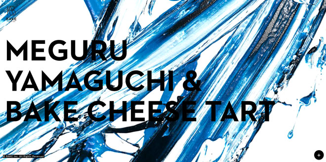
One of our favorites is the website design for Bake Cheese Tart’s special summer package campaign site. The campaign is a collaboration between BAKE Inc. and New York artist Meguru Yamaguchi. The design uses Yamaguchi’s paintings as a background. As you can see, the homepage banner showcases brilliant blue brushstrokes as a backdrop to plain black text.
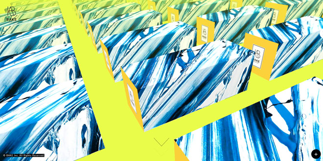
Scroll through the website to view impressive visuals created from a fusion of Yamaguchi’s art, vivid colors, and elaborate movements. This Japanese website design is highly engaging and visually stunning.
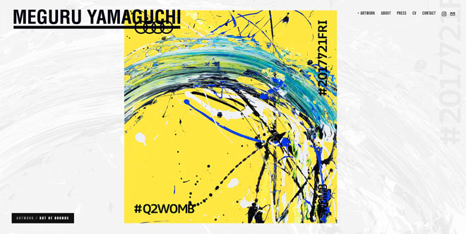
To view more of Yamaguchi’s art, visit his website at https://www.meguruyamaguchi.com/.
DESCENTE FUSIONKNIT
by EPOCH/QUOITWORKS/Re:design (Japan)
https://allterrain.descente.com/fusionknit/
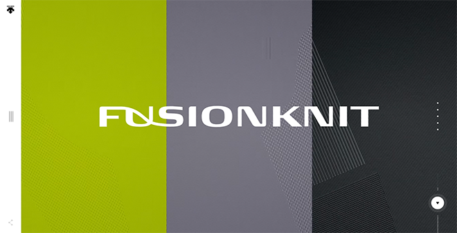
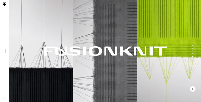
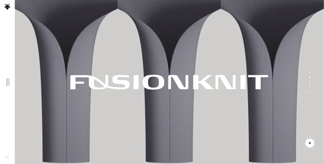
Another impressive website design is one for FUSIONKNIT, a unique knit product. The design uses multiple videos in a constantly moving color-block design. The resulting design elegant, fresh, and innovative.
Glamour Luxury Excess
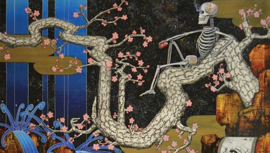
The complex nature of many Japanese website designs is evidenced not only with sophisticated development and high-end visuals. It’s also evidenced through the thoughtful composition of color, texture, and text. This trend calls to mind Japanese mixed media artists like Yuki Ideguchi.
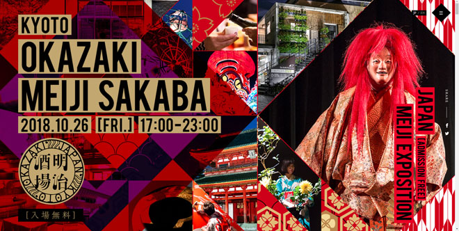
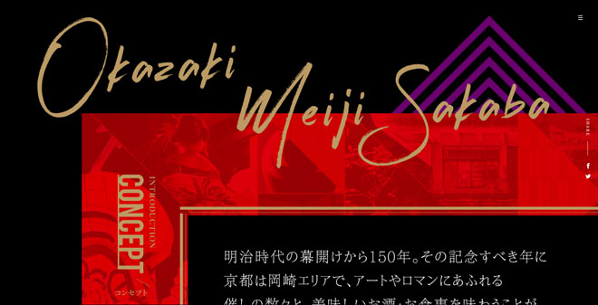
KYOTO-OKAZAKI MEIJI SAKABA
by Sei Sakamoto (Japan)
An excellent example of this is the website for the Okazaki Meiji Sakaba, a festival in the Okazaki Area of Kyoto that features art, traditional crafts, and delicious food and sake. The website design for this event is quite like the actual event: colorful, full of textures and wild visuals, with a surprise around each corner.
IN FOCUS
by IN FOCUS (Japan)
https://www.in-focus.co.jp/
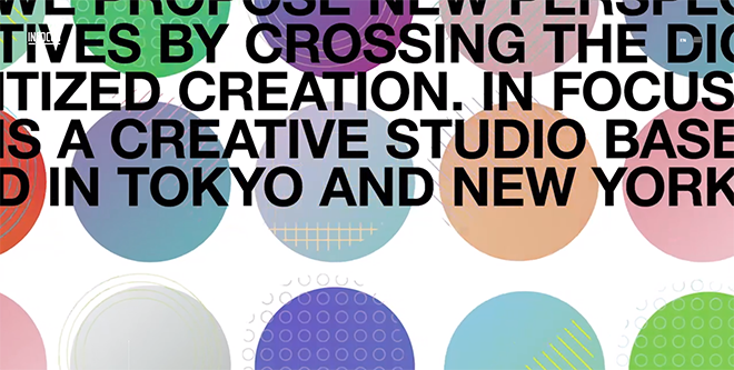
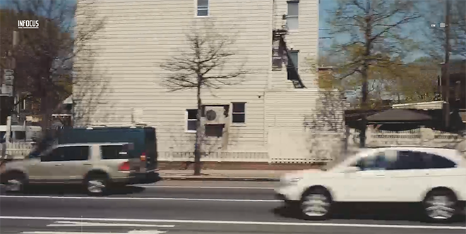
Another website design from Japan that offers a visual feast to visitors is IN FOCUS. This creative studio with locations in Tokyo and New York, excels in “new perspectives” through unique creations. The homepage banner mixes video, illustration, and photography to showcase the company’s considerable talents.
Resources
Japan Modern: Prints in the Age of Photography by Freer|Sackler, the Smithsonian’s museums of Asian art.
Japanese contemporary art: The hot list by CHRISTIE’S Auction House
Japanese art by New World Encyclopedia
Japan’s Most Incredible Contemporary Artists by ATI (All That’s Interesting), “a site for curious people who want to know more about what they saw on the news or read in history books.”
10 Japanese Contemporary Artists To Know by Culture Trip, a “global hyper-growth startup that creates stories that reveal what is unique and special about a place, its people and its culture.”
Need a Custom Website Design?
If you’re creating a website, it’s important to get all the details right. Need help? That’s why Artonic is here – to support your goals and make your website a success.
Each website we build is completely custom. We do not use templates. (Find out why a custom website design matters). Every piece of your website is created specifically for YOU – your goals, your audience, your strategy, and your brand.
Find out what it’s like to work with an agency to create the website of your dreams: View videos and read case studies about stories from our clients.
Say Hello!
Give Artonic a call or e-mail us if you’re interested in website design, development, or marketing.
Michigan, USA


