We hear it all the time.
“I want it to pop.”
The website design, of course, is what you’re talking about; you want the design to pop.
It’s almost like a cliché, we’ve heard it so many times. When clients say this to us, we nod and smile a little; we get it. We know what you mean.
You want your design to slap people in the face with its awesomeness.
And guess what? We want your design to POP, too. But it’s not always up to us. In fact, you, our client, have more impact over that factor than we do many times.
As your website designers, we can control many things. We can visualize a stunning design that supports a custom digital marketing plan. We can structure your navigation (what pages are on your website) to cater to the needs of your audience. We can guide your website visitors through the website in a defined path. Our team is excellent at strategy, layout, and design. We want every single one of our website designs to shock people with its beauty.
And that’s what you want, too right?
But that’s impossible to do without one thing.
Images.
Do you have the Images to Support Your Website?
That’s what it comes down to: photos.
Photos can make or break a website design, and many times, they break it.
Usually bad photos happen to good websites because photography and videography are undervalued or overlooked. That creates an imbalance between the design and the images. Ideally, your design and photography are seamless; if they’re out of harmony, your design will not pop.
I promise. This is not a case of, “We’ll use stock photos and no one will notice. It’ll be awesome.” Please, please listen to me on this one. It’s very difficult to unveil a truly breathtaking website unless the images are on par with the design, layout, and content.
This can happen when the images are great, but are the wrong size or in an awkward location. Or maybe the image fits the context of the page, but it’s blurry or over-processed and the quality is low.
Great Website Photography
There are several factors that go into producing great website photography and using it effectively, but we’ll concentrate on three essentials today:
1) Quality
2) Size
3) Context
Quality
“Invest in good photo shoots: a great photographer can add a fortune to your website’s business value.” — Evidence-Based User Experience Research, Training, and Consulting, Nielsen Norman Group
Probably the most important and obvious, a photo must be high quality to be “good.” If you’re using a photo on your website, then that photo ultimately represents your brand.
The images below are from a transportation website (http://www.glmtransport.com/About.aspx). The subject matter is great – smiling, happy employees – but the lighting is poor, the subjects are out of focus, and the color is unbalanced.
Compare the images above with the image below.
Which is more professional? Which is a reflection of the company’s brand? Which is more appealing and easier to look at?
The example above shows how important quality is to overall design. A high-quality, professional image communicates on multiple levels; an amateur photograph may catch your eye for an instant, but overall, it distracts from the website design and doesn’t support the brand image.
Size
“Whatever story you want to tell, tell it at the right size.”
–Richard Linklater
Many times a gorgeous photo isn’t given room to show off and that degrades the photo itself. If you have an amazing image, show it off. Don’t bury it in a lineup of tiny pictures or within a graphic-heavy design.
Here’s an example. Paramount Lighting is a successful company with several amazing photos on its website. But…the images are small and used in a rotating banner.
The stunning images would be much more impactful if used purposefully.
For example, the design below uses one image to strike a chord with viewers. Instead of overwhelming users with too many small images, one image is showcased for maximum impact:
As you view the two images above and compare them, note how they make you feel. Which is more stressful to view and which more relaxing? Which image makes you want to look deeper and which makes you want to look away?
The comparison will show how size can make an enormous (ha ha) difference in the overall design of your website.
Large images create a more intense feeling in viewers while smaller images may frustrate or confuse viewers. Bottom line: select only the very best images to use on your website, and make the most of each image’s size.
Context
“For me context is the key – from that comes the understanding of everything.”
–Kenneth Noland
Where the image is placed is also extremely important. People are sensitive to a photo’s context and location; if it doesn’t make sense, people are likely to dismiss it, whether or not it’s a visually pleasing photo.
Eye-tracking studies by Nielsen Norman Group found that website visitors were quick to dismiss decorative images that were irrelevant to the context of the page.
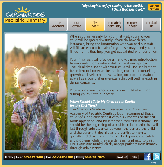
For example, this pediatric dental website (http://www.calkidds.com/) shows a photo of a child in a field next to content about a child’s first dental visit.
Would you be more interested in the photo if it depicted the actual dentist with a real patient?
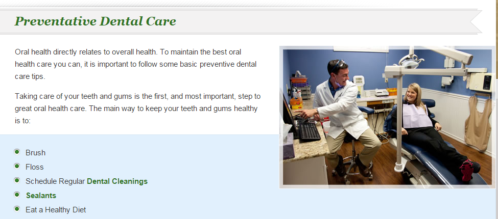
Take the image below. It shows the actual dentist with a patient in the office – an image of a “dental visit” next to content about a dental visit:
Users appreciate photos like the one above, where the image supports the website content. The photo is also professional and represents the brand image well.
The Real Value of Photography
In conclusion, pay attention to the images on your website. They’re valuable. They matter to your website visitors. They’re a great investment – and studies prove it.
A 2014 study published by the National Press Photography Association (NPPA) found the following:
- Subjects could tell the difference between professional photography and amateur 90% of the time
- Professional photos were twice as appealing to subjects; they were more likely to be shared online, to be viewed longer, and to be considered ‘memorable’
- Subjects value seeing faces and relationships containing real people and products
If you’re interested to learn more about how important and valuable photography is for your website design, check out our eBook free whitepaper below.
10 Stats about the Value of Photography & Videography in Web Design.
Download the free whitepaper today and ensure that your website designs POPS!


