You understand what a logo is: an image that represents a brand. That’s simple enough, right? But do you understand what a good logo is?
Read below for expert tips on the creation of an excellent logo, plus examples of good vs. bad logo design.
Is Your Logo SCALABLE?
- Design your logo using vectors. Vectors allow for maximum scalability, which means you can make it very large without losing quality.
- Good Logo Tip: A successful logo looks great on everything from pens to billboards.
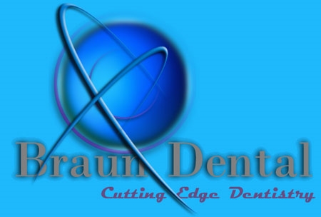
If your logo has a lot of shading, graphics, shadows, and fonts, it may not be easy to scale. Which of these logos looks especially un-scalable?

Keep it SIMPLE
- Most successful logos are simple.
- Keep it to one or two colors
- Simple shapes and imagery
- Avoid long names, taglines, or titles; 1-3 words max
- Your logo has only a few seconds to make an impact. Don’t clutter your logo with a lot of words, images, and colors; it’ll overwhelm your audience.
Does it look good in Black and White?
- No matter how good a logo may look in color, it is inevitable that it will find its way to a photocopier or black and white printer
- A successful logo will translate well in black and white, grayscale, and color
Simple logos keep things basic. They also look great in black and white. Can you find the logo that may not be as basic as it could be?
Is your logo Timeless?
- A successful design will always feel fresh and relevant. A successful logo should be just as effective 50 years from now as it is today
- Bad Logo Alert! If someone can point at your logo and tell which decade it was created in, it may be time for a re-design.
Which logos look timeless to you?

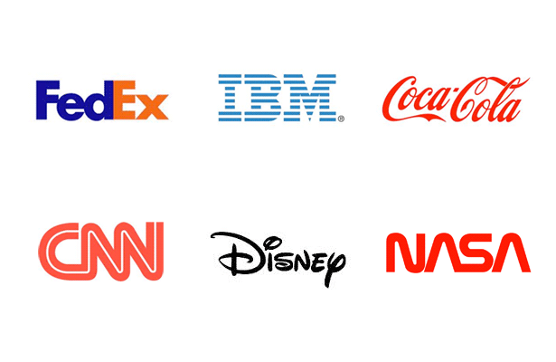
Is It Memorable?
- Make an impression; stand out from the crowd!
- Good Logo Tip: A great logo will remain memorable enough that a person who has seen it once will be able to recall the design or describe it to someone else
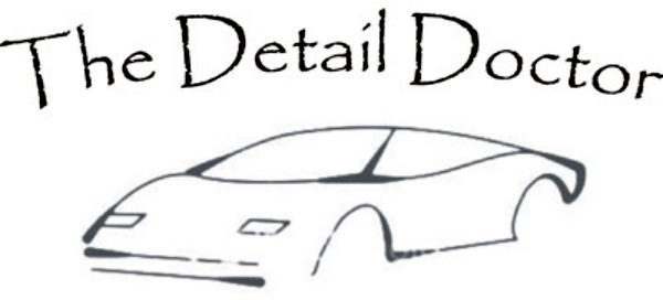
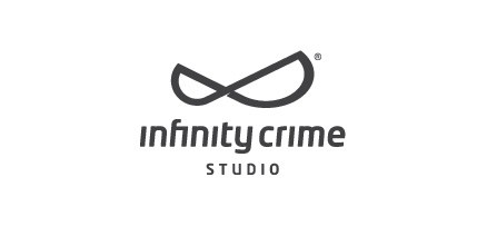
Both logos below are simple, but only one is really memorable.
Logo Design Done Right
If you’re considering a new logo design – or redesign – look around: which logos capture your attention? Do you recall the details? Do you know what the logo represents? Pretty soon you’ll be able to point out what’s great, or not so great, about any logo you see.
Logos designed by Artonic:

