You know about responsive websites; now it’s time to learn about the 2018 web design trend responsive logos.
Just as a reminder, a responsive website design is one that changes based on the screen size of the device it’s being viewed on. For example, if you view our website, www.artonicweb.com, on your desktop computer, it will look a certain way. If you view that same website on your tablet or mobile phone, the layout will change to fit your screen size. Check out this video for a quick explanation of responsive design:
Responsive logos are just like responsive design: they change based on the size screen on which you view the website.
What’s a Responsive Logo Look Like?
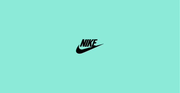
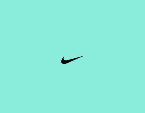
A responsive logo will have several designs or looks. A logo will appear at its largest and most detailed when viewed on a desktop or laptop computer (or large screen). The logo will reduce in size and detail as the screen on which it’s viewed changes.
An excellent example of this can be found online at responsivelogos.co.uk/. Here is an example of the Nike Air logo changing as the screen size gets smaller.

Why Use Responsive Logos?
A responsive logo serves the same purpose as a responsive website: it changes to better fit the user’s screen size. That means a responsive logo is (usually) more user friendly than a non-responsive logo.
And it’s catching on. Responsive logos are becoming more and more popular. As one blogger noted last year,
“A few years ago, this crazed, demented talk of altering a logo would have been dubbed as a design taboo, earning you the wrath of the holier-than-thou branding moguls. But today, with a probability that a company will use its logo on anything from a mammoth billboard to a tiny smart watch, the initial shock at the scandalous “responsive logo” idea is wearing off.” (Read the full article.)
The Responsive Logo: Early Days
Responsive logos have been discussed between web designers for several years. Looking back, we find evidence of this web design trend being talked about in 2013 on the online forum CSS Tricks (a website frequented by developers and coders): How to make top logo responsive?
An article published in 2014 by eConsultancy is an interesting review of responsive logos as they appeared in 2014, titled, Brand Logos in a Responsive Design Age. It considers what a logo should look like if the logo design is not square or rectangle (those logos are much easier to make responsive).
Here’s a screenshot from the article that shows the responsive logo on the Ford Motor Company website in 2014. The logo includes the tagline, “Go Further” beneath it:
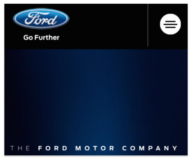
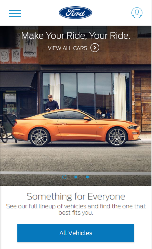
Looking at the same website today, the responsive logo design is different. The additional text, “Go Further” has been removed (although it still appears on the larger screen size).
Here’s another example: A.V. Club. The image below shows the logo as in its original design on a desktop computer. You see a dark circle with light letters at the front, followed by dark letters against white. It’s simple and recognizable.
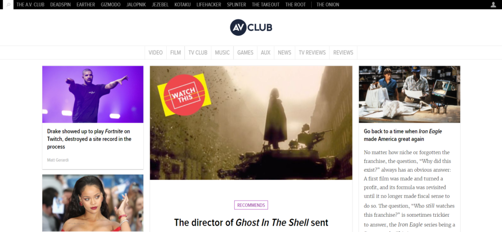
However, in 2014, when a user viewed the A.V. Club website on a mobile phone, this is what they saw. Instead of a dark circle behind the letters A.V., the logo was stripped down to just text. It no longer looked like the original logo; the responsive design of the logo had removed all identifying elements.

Now, in 2018, we see A.V. Club’s logo is back to looking like it does on the larger version of the website. It’s smaller, but it’s no longer so simple that it loses its unique design.

What About Your Logo?
Does your website design incorporate a responsive logo? If so, does your logo respond elegantly? In other words, does it look recognizable on all devices, regardless of their size? If your logo isn’t responsive, maybe it’s time to consider a responsive logo.
Keep in mind that not all logos need to be responsive; Artonic’s logo is rectangular, and is ideal for our responsive website design.
Here’s what our logo looks like on the desktop version of our website:

Here’s what our logo looks like on a mobile phone. Notice that our logo doesn’t change; its rectangular design adapts nicely to smaller screen sizes.

In contrast, a more detailed logo in a different shape may look much better if reduced in size and detail as the screen shade reduces. The Disney logo is a great example of this – the iconic “D” is enough of a logo for mobile devices; the large, elaborate Disney logo with a castle in the back isn’t necessary.



Great Logo Design
Interested in exploring logo design a little more? You may find the following eBook beneficial:
Artonic Logo Design
If you’re interested in a new logo for your business or a logo update, including a responsive logo design, Artonic offers logo design services.
Give Artonic a call or email us:
Michigan, USA


