Being able to recognize a good website design isn’t easy. If it were, there would be more of them! Unfortunately, as Paul Rand said famously, “[t]he public is more familiar with bad design than good design.” Why? Because bad design is all around us. The big brands do it, our competitors do it. It’s what we know, what we’re comfortable with.
But if you want to stand out from your competition and make your customers happy, you need to know what a good website looks like. And we’re here to help you figure it out!
The Details of Good Website Design
Good design can be seen in the details of a website. When trying to determine if a web design is “good” or “bad,” notice each element and consider if it reflects the qualities of good website design.
Inspect the following pieces of a website to figure out if it’s a good web design or not:
- Navigation
- Homepage Banner
- Layout
- Functionality
- Photography
- Content
Let’s go through each item to better understand its role in website design and the details that make it “good” or “bad.”
Navigation
What It Is: Navigation is how people get around a website. Navigation usually refers to a link from one webpage to another page. Navigation is how people find information on your website.
What It Looks Like: Navigation comes in many forms: menus, buttons, images or graphics, and text.
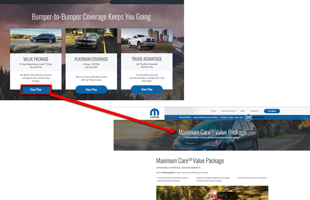
Below, the two image represent separate pages. When a user clicks the button on one page, she is linked to the other page. This is part of navigation or getting around a website.
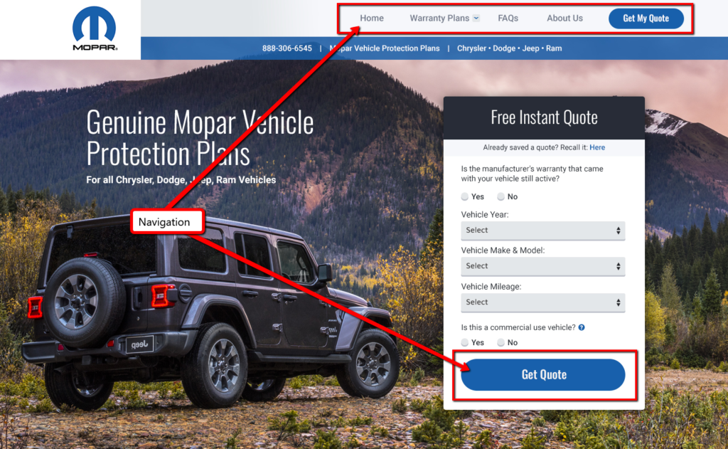
The following image shows two types of navigation:
- Navigation Menu – a navigation menu is a collection of links that go to the pages on a website.
- Button – this links to the next step in receiving a quote.
Design Notes: Navigation should be easy to identify. If a visitor cannot distinguish a link from plain text, then he won’t be able to use that navigational element.
Homepage Banner
What it is: The large image (also called a hero image) plus text (message) plus button (link or navigation).
Below, the homepage banner is highlighted:
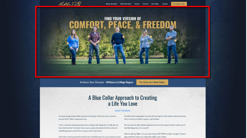
What It Looks Like: A homepage banner usually consists of an image or graphic element, a marketing message in text, and a link in the form of a button (also called a call-to-action).
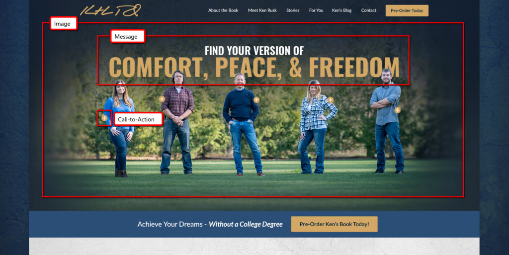
Design Notes: The banner on your website should visually appeal to a visitor, be emotionally impactful, and set the tone for the entire design. It’s the first thing a visitor sees when he lands on your website. Not only should your website banner look striking, it also must convey a message that means something to your visitors.
Layout
What it is: The layout of a website is how the text, images, and other elements are arranged on a page.
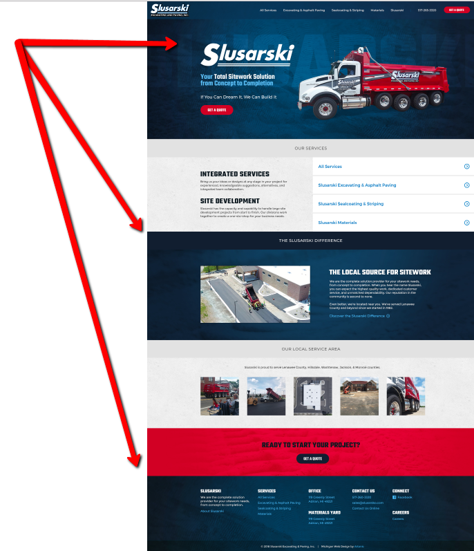
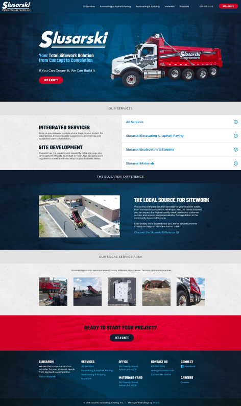
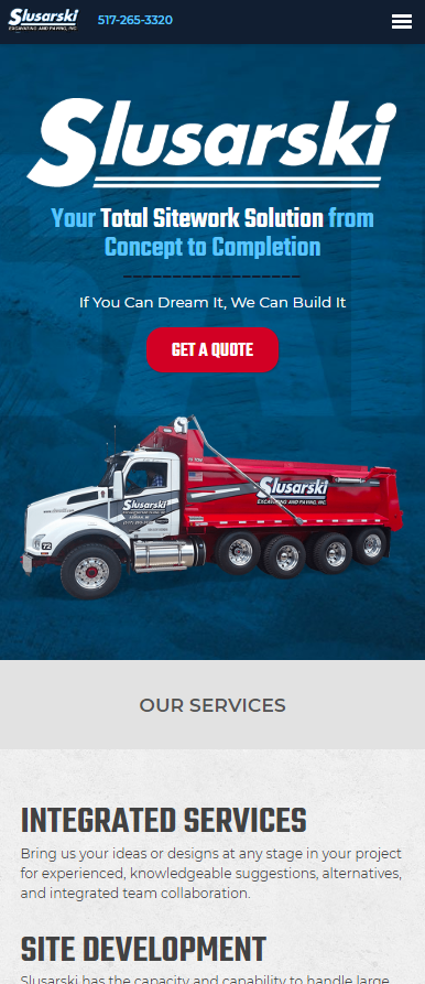
What It Looks Like: The layout of a good website is fluid, or responsive, which means that the website layout changes when it’s viewed on a phone or tablet.
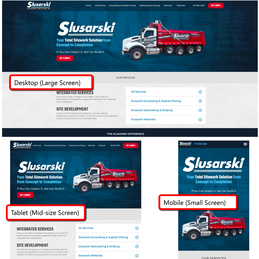
As you can see, the website’s layout changes, depending on how it’s viewed. The layout for the desktop version or large screen size utilizes the additional space to go out all out with design.
On a smaller screen, like a smartphone, the website layout re-aligns to save space and reduce clutter.
Design Notes: The purpose of a website layout is to enhance the user’s experience.
Photography
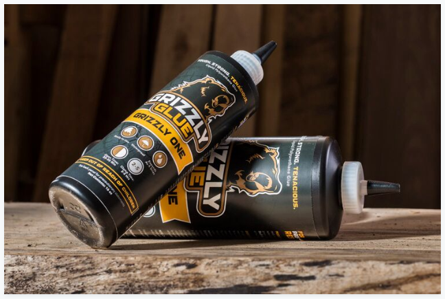
What It Is: Images used on a website. The images can be stock photography or custom. The image below is an example of a professional product photograph.
This is a portrait photograph. Just like the image above, this image is also custom (not stock),

What It Looks Like: Good website photography is professional, beautiful, and relevant to the design.
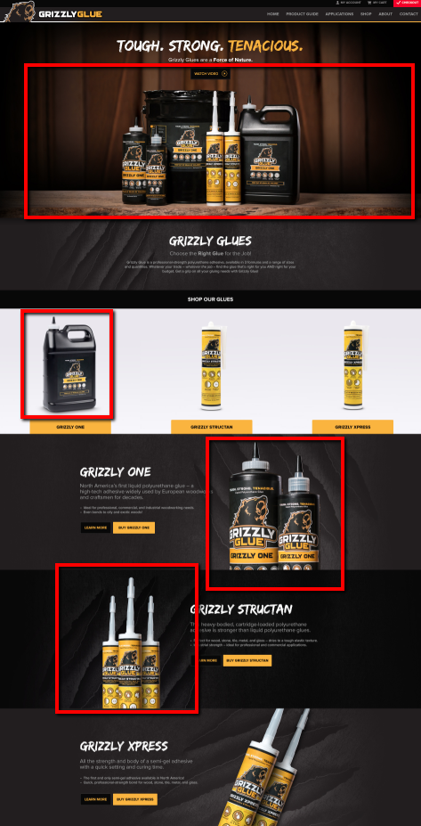
Design Notes: Photos are valuable for many reasons. They help visitors understand what your website is all about. Authentic photography helps your customers connect with your brand. It can also keep people on your website longer and make their experience more enjoyable.
Functionality
What It Is: Functionality, in web design terms, means what a website does or how it functions. Functionality includes a lot of things, like whether your website is mobile-friendly or how the drop-down menus work. Functionality is linked to specific features on your website.
In the website below, the top navigation menu drops down to reveal additional information. This makes it easy for users to find certain info fast for several locations, without going to another page.
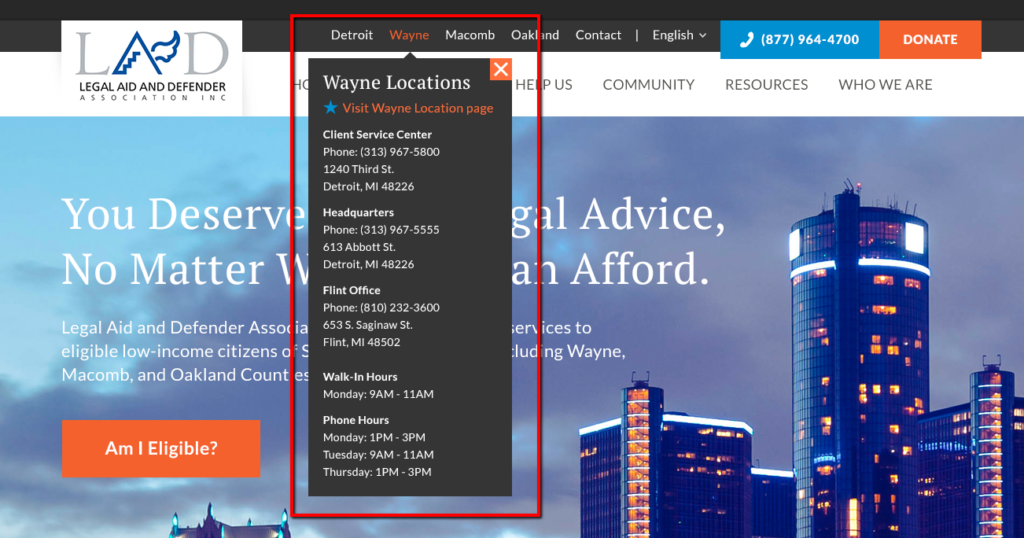
What It Looks Like: The design of a website feature should follow the same best practices as the other elements: balanced and beautiful. The feature should work seamlessly within the website.
In the example below, the format for FAQs includes an accordion menu. When someone clicks the “+” (on the far right), additional text appears to answer the question.
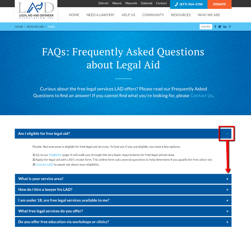
Design Notes: The essential piece to functionality is people: Can people use the feature easily? Does it work on mobile phones? Can people figure out what it is and what it does?
“Great design is a multi-layered relationship between human life and its environment.” –Naoto Fukasawa
If people can’t figure it out or use it easily, it’s not good design.
Content
What It Is: Content is, technically, anything your website visitors can consume, including images, text, videos, etc.
This website has several types of content on the homepage, including text, illustrations, and audio files. All of these are “content” that your visitors “consume.”
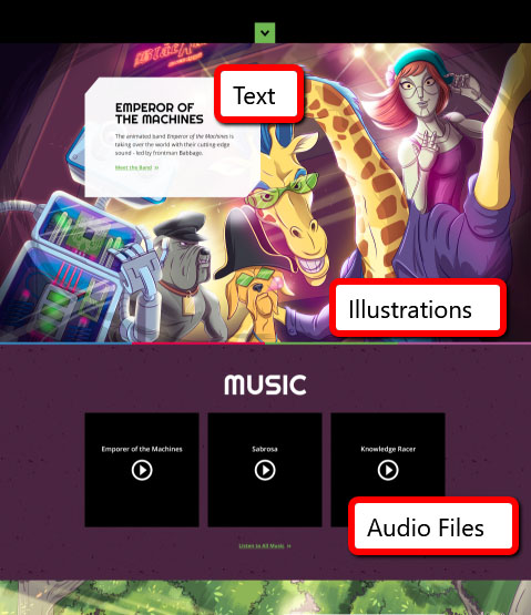
What It Looks Like: Content takes many forms.
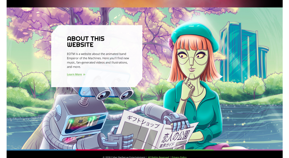
Design Notes: Content is made for people; it’s why they visit your website. Your content should be created for the people who will use it. The content should make sense when viewed individually and as part of the whole design.
Good website content is interesting. People want to read it (or watch it, listen to it, etc.) and share it with others.
“Content precedes design. Design in the absence of content is not design, it’s decoration.” –Jeffrey Zeldman
Good Website Design is Balanced
Balance is a basic design principle that deals with visual appeal. Balance means the design is in harmony; all elements work together to create unity.
The blog from Adobe Spark states this about balance:
Balance gives a design its form and stability and helps to distribute the elements evenly throughout your design; this even spacing will offer an appearance that is professional and attractive instead of being jumbled and messy. Balance doesn’t mean elements need to be the same size, or that they must be distributed evenly across the page — it can be symmetrical or asymmetrical. Symmetrical balance weights the elements evenly on either sides [sic] of the design, while asymmetrical uses contrast to even out the flow of design (i.e. dark elements are balanced out by light ones).
Read Basic Design Principles for more info.
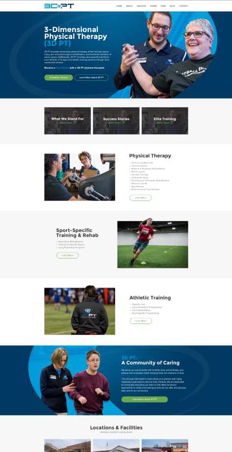
In the example below, the design is balanced, both in overall design and in each section.
Good Website Design is Beautiful
“Love of beauty is taste. The creation of beauty is art.” – Ralph Waldo Emerson
Visual appeal, beauty, aesthetics – all are vital to a good website design. A beautiful website design is more than attractive; it also supports the website strategy and goals.
The Usabilla blog identifies why beauty is valuable:
- Attract Attention – You have seconds to capture your audience. Beauty helps.
- Create a First Impression – Your website creates a first impression; if it’s beautiful, people will like it better.
- Build Relationships – People enjoy, connect with, and want to interact with beautiful design.
- Increase Tolerance – If design is beautiful, people think it works better.
- Evoke Emotion – Beauty elicits positive feelings in people instantly.
(Read The Importance of Visual Appeal in Web Design by Robyn Colllinge for additional information about the items listed above.)
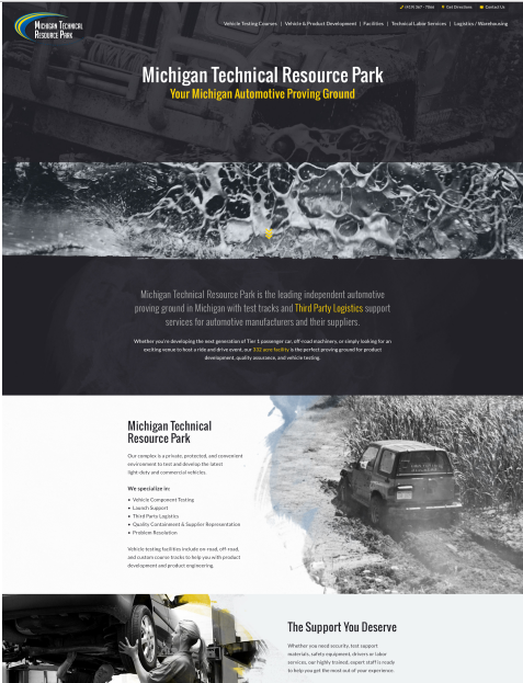
The website design below is visually beautiful, which means that it is appealing and is a pleasure to view.
Good Website Design is Easy to Use
“Design must be functional, and functionality must be translated into visual aesthetics without any reliance on gimmicks that have to be explained.” – Ferdinand Porsche
Good design means that beauty and usability are in balance. Don Norman, co-founder of Nielsen Norman Group, says this about beauty and functionality:
An object that is beautiful to the core is no better than one that is only pretty if they both lack usability.
In the quest for enhancement of life, let us not be usability bigots. Yes, products must be usable. But all the many factors of design must be in harmony. Marketing considerations must be accounted for, aesthetic appeal, manufacturability — all are important. The products must be affordable, functional, and pleasurable. And above all a pleasure to own, a pleasure to use. After all, attractive things work better.
To explore this topic in greater depth, read Emotion & Design: Attractive things work better
A good website is easy for people to use.
This means that people can find what they’re looking for quickly and access it easily. A good website works the way a person expects it to. Good web design doesn’t frustrate or confuse a visitor, it guides him in his journey through the website and makes the website a pleasure to use.
Making features work well is part of website support and maintenance. Functionality must be checked regularly to ensure optimal performance.
Good Website Design is Engaging
“There is no such thing as a boring project. There are only boring executions.” –Irene Etzkorn
People like to use good websites because good websites involve people in the experience. Good websites are fascinating and hold visitors’ interest.
If you’re unsure what user engagement is, it “refers to how frequently and how long a user interacts with your website, app, or other product.” (What is User Engagement? by CodeFuel)

Interaction is key to engagement. When a user interacts with your website, she’s engaged. The longer or more often she interacts with your website, the more engaged she is.
An interaction can be anything from reading content to clicking a button to watching a video or sharing an article on social media. Engagement matters because it’s evidence that your user finds your website interesting, useful, or entertaining.
Good Website Design is Relevant
“People ignore designs that ignore people” –Frank Chimero
Get a Good Website Design
If you’re creating a website for your business, it’s important to get all the details right. Need help? That’s why Artonic is here – to support your goals and make your website a success.
Each website we build is completely custom. We do not use templates. (Find out why a custom website design matters). Every piece of your website is created specifically for YOU – your goals, your audience, your strategy, and your brand.
Find out what it’s like to work with an agency to create the website of your View videos and read case studies about stories from our clients.
Say Hello!
Give Artonic a call or e-mail us if you’re interested in website design, development, or marketing.
Michigan, USA


