When you imagine any brand, chances are, the first thing coming to mind is their logo. It’s the essence of a company. A logo represents the customer’s expectations, the product’s quality, and a chance to stand out among competitors. But what happens when your logo negatively impacts your brand?
We all know a bad logo when we see one, but what makes it so bad? Maybe it’s the colors, maybe the layout. Or it could be just plain ugly. To understand what makes a bad logo, we also need to discuss what qualities a good logo has. Read below for a deep dive into bad logo qualities, with some of our favorite ugly logo examples.
A Bad Logo Is Not Scalable
Logos are meant to be a unifying factor for brands across everything they do. Whether it’s their products, services, advertising, or community involvement, a logo needs to be easily recognizable in any situation – and every size.
One sign of a bad logo is when it suffers from a loss of clarity when scaled down. Complicated or detailed logos can easily become difficult to understand or read when scaled below the size of their original design. Elements like gradients, fonts, and shadows can make logos difficult to resize if they were originally designed with a specific size in mind. If your logo looks good on something as small as a pen, and something as big as a billboard, you have a logo that is scalable!
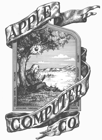
The first logo designed for Apple is a good example of a logo with bad scalability. Luckily, it didn’t stick around very long because Steve Jobs believed it would be difficult to reproduce in a smaller size. I agree! This logo was designed in an illustrative style and is very detailed. It may look great on printed material, but not on a pen. The image and surrounding text become lost when scaled down.
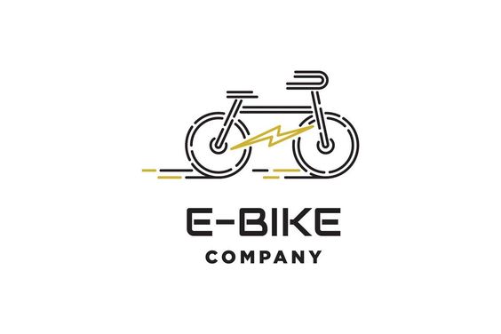
This E-Bike Company logo is a good example of a scalable design. The logo is vector, it can be scaled to fit any material. The text also can be read no matter what size. It doesn’t get lost in the design. That is thanks to an excellent icon to text ratio. This logo will look good on business stationary and on posters!
A Bad Logo Is Complicated
Successful logos are simple. You only have a few seconds to capture a person’s attention, and if a logo is too complicated, they will become overwhelmed and lose interest. Think about it this way. Will a person understand your logo on a billboard going 60 mph, or will your logo catch their eye at the grocery store amongst thousands of other logos? A simple and successful logo has one to two colors, simple shapes, and less than 3 words. Every design element is limited to keep the logo simple and clean.
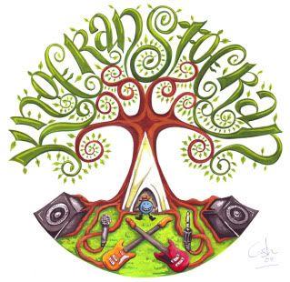
This logo for a music festival is very beautiful, but it is too complicated for a logo. The type in the leaves is too decorative to read. I gave up after looking at it a couple times, and it’s easy to believe that some might not even recognize the lettering when only given a few seconds to digest the logo.
Additionally, there are more than two colors and the shapes are very biomorphic and complex. The sum of all these elements is a logo that, while appealing and creative, can easily miss the purpose of a logo – being quickly recognizable. This design works better as an illustration compared to a logo.
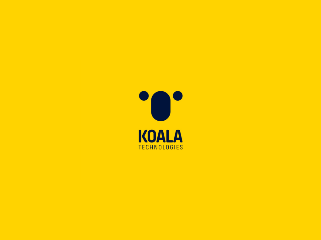
This design is so simple (and so CUTE!) A couple shapes, colors, and lines of text can go a long way. It is easy to understand, it is unique, and it is interesting. If this was on a billboard ad, it would be easily understood. The bright yellow color will also attract the eye of people passing by. Choosing the right color in a logo can be tricky, but the time investment is worth it.
A Bad Logo Is Outdated And Not Redesigned
Successful logos will always look fresh. A dated logo communicates that the business it represents is dated as well. Here is a design tip when designing or redesigning a logo. Do your design trend research! Like fashion or interior design, certain “staples” of logo design change over the years. It’s not just your specific logo that dates you, it’s the concept and style that make up the design!
Look for trends that return year after year. These are the trends that will always look fresh! If you follow the trends that don’t stick around, the logo will become dated faster than you want it to.
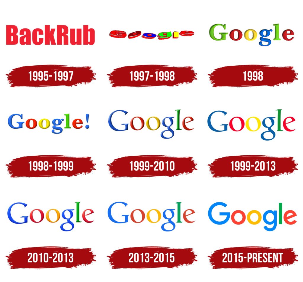
Google has redesigned their logo many times over the years, and it’s a good thing they did! Imagine if they didn’t adapt to the design trends of today and stuck with their logo from 1998. The glossy highlights and shadows are no longer popular design trends. The search engine would look outdated compared to others.

This logo for Modern Homes will stand the test of time. The icon is a solid shape forming a house with the letters M and H. The text is a nice standard san serif typeface. This design sticks to the classic design trends that keep coming back year to year.
A Bad Logo Will Be Forgotten
Like anything, the popular concepts of logo design such as simplicity are necessary to use in moderation. In the quest to create a logo that’s easy to recognize, it’s common to design something so bland it simply fades into the noise.
I think of this as getting lost in what I like to call The Logo Sea. This is where all the cliché and boring logos go because none of them are remembered. A logo needs to stand out from every other business out there! Will people be able to replicate your logo on the spot? When I say McDonalds, what do you think of? The golden arches, right? What about Nike? The swoosh. If your logo is too complicated or not interesting, people will forget it.
BT is a telecoms firm that has gone through many identities and redesigns. What makes their logo memorable or unique? Not much. A bold san serif font sits dead center inside a thick circle. There is no icon, color, or words. In fact, just by looking at this, no one will know what BT stands for. Since nothing about this logo stands out, it will be forgotten. I have another good design tip for you. Do not use logo builders or generators if you can help it. The same marks and designs are used for multiple businesses and it will be hard to stand out.
Nike’s custom swoosh shape is one of a kind and a great example of a memorable logo. It is simple and unique and can be replicated from memory on the spot. But why is it so memorable?
For starters, Nike’s logo is actually much more than the “swoosh” it’s known as now. Originally designed to represent the wings of Nike, the Greek Goddess, who used her wings to inspire courage in her warriors, the swoosh maintains that unique “winged” appearance. While the population at large may not be familiar with the source, the concept of the logo – a wing or a “swoosh”, still makes for an icon that’s easily associated with action.
Nike tied their brand to this story, but more importantly, they tied their brand to a visual concept of motion – fluid motion.
A logo can be unique, but it takes time to catch on and become memorable. Nike’s rebranding from Blue Ribbon Sports gave them an opportunity to create a logo that’s practically unavoidable in the sports world.
A Bad Logo Cannot Be Read Or Understood
The imagery of your logo is important, but a creative logo that’s unclear is an easy way to turn your idea into something ignorable. Every visual element should be readable, and text-based logos need to focus on legibility above high concept design.
Can people determine what your business is by looking at the logo? Can they recognize the icon or read the text? If people can’ t understand a logo, they will be confused and not visit your business.
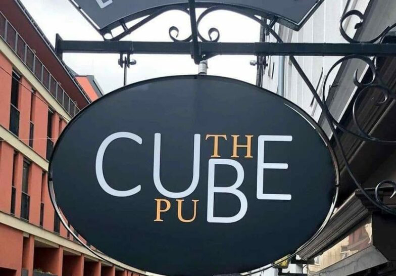
This is an example of a bad logo with zero readability. What words can you make out? Cube Puth, Cube: The Pub, or unfortunately, Cut the Pube? The positioning of the letters, choice of font, and color choice all add up to one confusing sign. Would you visit a business if you didn’t know what it was?
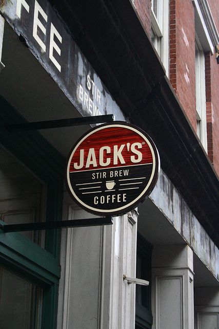
This is much better! Jack’s Stir Brew Coffee logo is easy to read and understand. There is no guessing on what the sign says. It is written in big, clean, san serif type reading from left to right.
A Bad Logo Does Not Follow Design Principles
Visual design is often quite literally a blank canvas open to any possibility. That freedom can lead to those without the right experience or knowledge to create something unappealing to the masses and detrimental to their business.
Logo design, like any visual art, has a variety of design principles surrounding it which can help any business or designer avoid common creative pitfalls. Like any artistic guidelines, these rules can flex, bend, or even break, but they’re important to understand to ensure a logo presents your business the right way.
Typography
A bad logo has more than two typefaces or has highly decorative typefaces. A good logo will only use one or two simple typefaces. Highly decorative type with flourishes makes the text hard to read and the logo too busy. Stick with simple typefaces to better communicate your brand. Type communicates more than the typed word. It shows the atmosphere and feel of the brand. San serifs say elegant and modern, while serifs say tradition and classic.
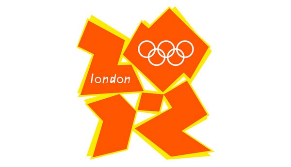
The London 2012 logo explores abstract typography, which is not a good choice for logo design. The text in a logo should always be crisp and clear to the viewer. We can see the Olympic Rings and the location, but what is the year? 2072? 2019? Oh yeah, the London games were in 2012, that must be it.

Supreme, a luxury clothing brand, used a single bold italic san serif font for their logo. The type is crisp and readable to the viewer.
Color
A bad logo uses too many colors with no respect for color theory and psychology. Making a logo very colorful can do more harm than good. It is better to stick to 1-3 colors that work well together. Research color theory and psychology and how you can use them for your business!
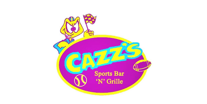
The color choice is very bright, and the colors do not belong together. It hurts the eye, and that is not a good quality to have in a logo. Besides that, the colors themselves appear chosen at random, or at least without consideration towards the final design.
Color theory is a concept in visual arts that helps guide color choice. The sheer range of options when it comes choosing colors or pairing them together can make the process feel chaotic or random to those who aren’t familiar, and color theory plays a critical role in avoiding mismatched tones that can be off-putting to see.
More importantly, the psychology of colors means making the right choice can subtly influence anyone who sees your logo. Have you ever noticed the frequency of reds, yellows, oranges, or browns in the restaurant industry? There’s a good reason for it – science has shown that these colors can impact how hungry someone might feel at that moment.
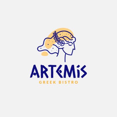
The Artemis Greek Bistro Logo is a good example of color choice for a restaurant logo design. This dark royal blue is the color of Greece, it is used in many Greek business logos successfully. The complementary color to blue is orange. The designer chose a light-yellow orange to compliment the blue. In color psychology, yellow and orange make people hungry.
Negative Space
A bad logo is crowded and has no room to breathe. Negative space is your best friend. If the logo is contained within a shape, make sure there is a healthy flow of space around it. When people look at it, it will give the eyes a place to rest.

The logo for Midtown Attorneys is crowded. The shape needs to be extended to allow the other design elements to breathe. The descender on the “y” in Attorneys is touching the “L” in PLLC. The space between the lines of text needs to be increased.
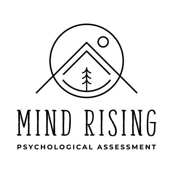
This logo has a nice balance of negative and positive space. The space between the icon and lines is comfortable, with enough room for the eye to travel from line to line.
Contrast
A bad logo has no contrast. The marks and typography get lost in the elements around it. Make sure your logo pops out from its background. Here is a good tip. Make a black and white and grayscale version of the logo. Can all the elements still be seen clearly? If they can, there is enough contrast. If not, the colors need to be adjusted.
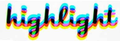
The layers of color in highlight’s logo make it lose contrast. Let us try the black and white and grayscale test.
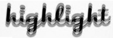
You can see that the blue, yellow, and pink all merge into one gray shape. The detail in the logo is lost. The word can still be read, but the color does not transfer well to black and white.
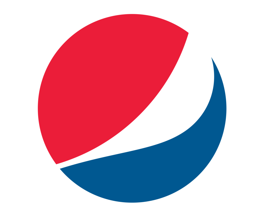
The Pepsi logo uses contrasting color hues, so when the logo is converted to greyscale, the logo still pops and is recognizable!
Imagery
A bad logo uses imagery, and even worse, stock imagery! Images are way too complicated for logos. They cannot be scaled to fit on different items, it gets very messy very fast. It is better to stick with a bold, simple, unique mark.

The Tree Doctor logo is a compilation of stock images and clipart. These images are widely available to the public, making this logo less unique. They are also pixel based, which means they cannot be scaled successfully.

The Wondery logo includes a bold, unique mark along with the text. It is still illustrative, but simple enough to be replicated on different objects. It is also custom, so it won’t be found on stock images sites.
Balance
A bad logo is unbalanced. It feels lopsided and uneven. People crave balance in their lives, and in imagery. A good logo can be symmetrically or asymmetrically balanced.

The Teacher’s Tech Toolbox logo weighs very heavy to the left. It makes the viewer feel uneasy. The big solid red “T” is visually heavier than the smaller, thinner text to the right of it.
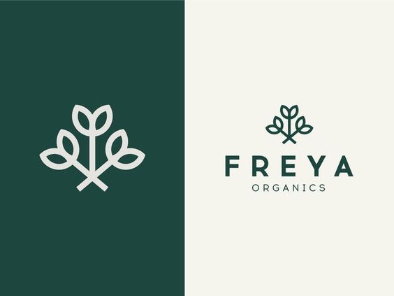
The Freya Organics logo is symmetrically balanced. Everything is center aligned and carries the same weight, making the logo look solid and stable.
A Bad Logo Is Not Relevant To The Company It Represents
The mark in a logo needs to match the business and what they do. Does it communicate what your company does without being too literal? Is it relevant to your intended audience?

This logo for a sushi restaurant does not make sense. The icon is not relevant to the business and is misleading. The fire over the chopsticks makes it look like a campfire. If the text wasn’t available, people would likely assume the icon was for a camping or outdoor apparel company. To make it more relevant, the icon could be replaced with a menu item icon or something that fits with their message as a business.

This logo is similar to the one above, but instead of fire, we have a piece of sushi. It no longer looks like an outdoor goods business, but a restaurant instead! It is more relevant to what the business is and what they offer.
There you have it! The seven qualities that make a bad logo. Now you know how to spot them, and how to avoid them.
Click here to check out some logos by Artonic!

